We’re in the business of designing brands for our clients – usually, we present a few options, and our clients pick the logo they wish to proceed to the next stage.

Occasionally, they find it hard to decide between them. If you discover yourself in this position, here are 5 tips (and one golden rule) to help you choose.


1. Is it distinctive and memorable?

If you saw the logo for only a split second, would you be able to recall it 10 minutes later? This is especially important if you look at a logo and think it looks too simple. Think about The Nike ‘swoosh’ or the McDonalds arches: Simple, but distinctive. You want your audience to see your logo once, and be able to recall it later.

Simple_logo_examples
Some examples of simple, memorable logos:
– Swiss International Air Lines, designed by Winkreative in 2011
– Sydney Mardi Gras, designed by Moon Communications Group in 2011
– Bookworld, designed by Interbrand in 2011
– Masterchef (update), designed by The Plant in 2013
– Channel 7, unknown designer, updated in 2003


2. Does it work in black and white?

There will be occasions when your logo appears in black only (also referred to as ‘Mono’). Examples include a newspaper ad or the back of a event program. Make sure your designer has thought of this and provides a black and white version.

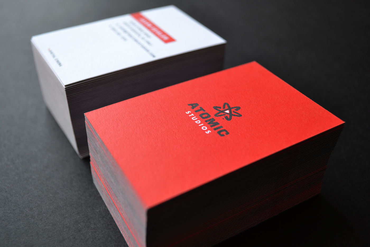
Atomic Studios business card


4. Do the colours, symbols and fonts suit the business?

This may seem obvious, but if your company provides financial advice, then cartoonish fonts and bright colours are probably inappropriate.

wendygough


5. What about personality?

If the logo was a person, would it have same sense of company values? Imagine that your logo is a person, or even a celebrity. The first time someone meets them, what do you want them to think? Barack Obama or George Bush? Katy Perry or Lady Gaga?
Telco logo examples Optus, Telstra and Vodafone. All mobile service providers, with very different logo personalities


The Golden Rule:

Choosing a logo isn’t a Facebook page: it’s not about what you ‘LIKE’

facebook_likeIt’s about what works for your business.
Always think about how people will perceive the business, if you’re not actually present to explain what you do, who you are and how you can help them.


Further reading:

Roosevelt University in Chicago overhauled their brand in 2011. Designed by Studio Blue, you can read about the process (and see which logo they chose).
logo_options

Recent posts

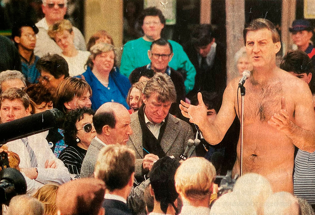
Jeff is undressed

I’ve kept this magazine article since 1993, and now I know why. On the cover, Jeff Kennett (the Victorian Premier at the time) stood naked, addressing a crowd of people. My eyes were telling me one thing. My brain was telling me it couldn’t be true.

ELMO’s 2024 HR Industry Benchmark Report

ELMO’s 2024 HR Industry Benchmark report is live. The report surveyed HR professionals across Australia and New Zealand to uncover trends, challenges and opportunities for 2024.

Artist Keith Haring with his Unfinished Painting

Keith Haring would not approve

Compare the two artworks in this post. You might recognise the artist as Keith Haring. On the left is his Unfinished Painting, created in 1989.

Follow us on Instagram

Sign up to our newsletter

Email hello@brandbyname.com.au
or call +61 3 9015 4014

Level 35, 477 Collins Street
Melbourne VIC 3000

© 2021 Brand by Name™

Subscribe!

Subscribe to our quarterly newsletter — Brand News — filled with Design tips, Creativity hacks, Brand news and Design-related goodness.

It’s short and sweet. Estimated reading time < 90 seconds…