If you saw the logo for only a split second, would you be able to recall it 10 minutes later? This is especially important if you look at a logo and think it looks too simple.
Think about The Nike ‘swoosh’ or the McDonald’s arches: Simple, but distinctive. You want your audience to see your logo once, and be able to recall it later.
There will be occasions when your logo appears in black only (also referred to as ‘mono’, or ‘greyscale’). Examples include a newspaper ad or the back of a event program.
Make sure your designer has thought of this and provides a black and white version.
This may seem obvious, but if your company provides financial advice, then cartoonish fonts and bright colours are probably inappropriate.

If the logo was a person, would it have the same sense of company values?
Imagine that your logo is a person, or even a celebrity. The first time someone meets them, what do you want them to think? Barack Obama or George Bush? Katy Perry or Lady Gaga?
![]() Optus, Telstra and Vodafone. All mobile service providers, with very different logo personalities
Optus, Telstra and Vodafone. All mobile service providers, with very different logo personalities
 It’s about what works for your business.
Consider how people will perceive the business, if you’re not present to explain what you do, who you are and how you can help them.
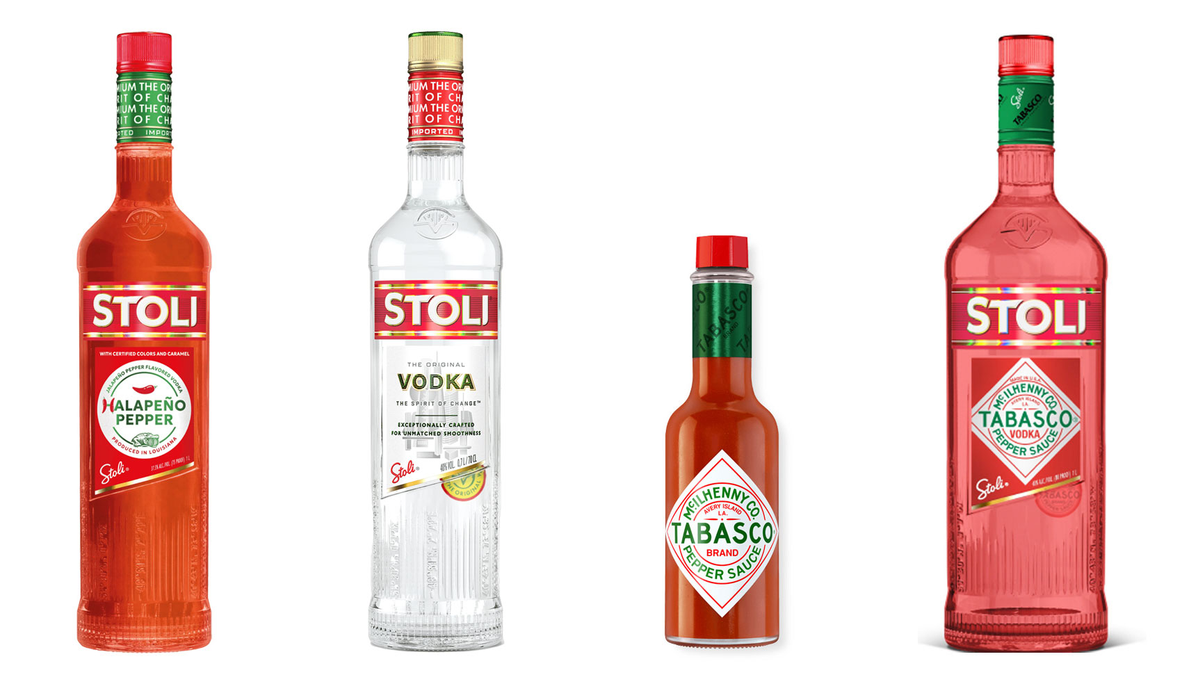
Have you ever heard ‘Change a logo by 10% and then you can legally use it’? We take a look at 2 examples involving Taylor Swift and Tabasco and explain why this is a myth.
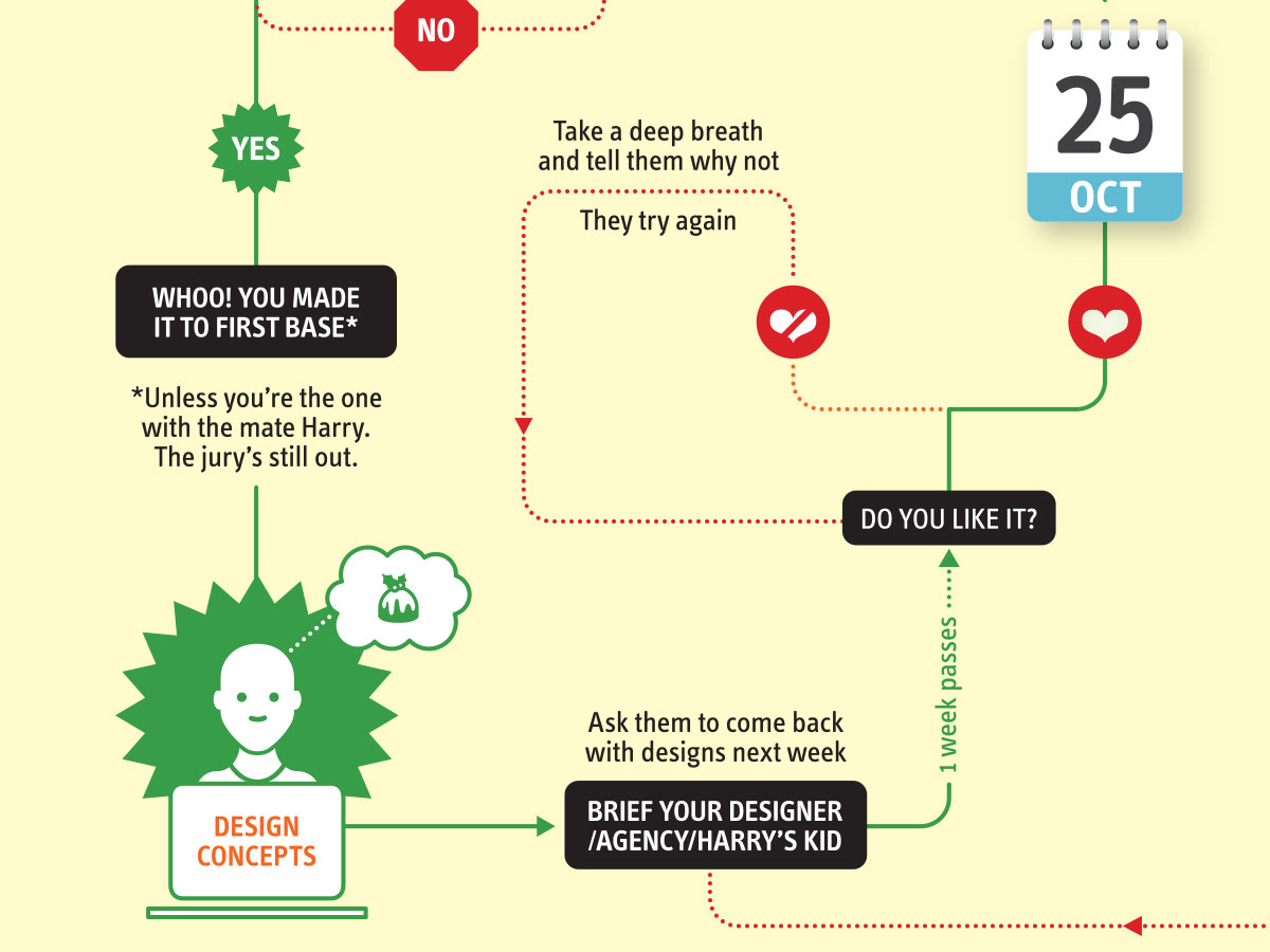
Whatever the brief is, it’s exactly the same. Every project. Every time. Every design. It‘s just one word.
It’s that time of year when we start looking forward to the end of the working year, changes in the seasons, and celebrations over the New year…
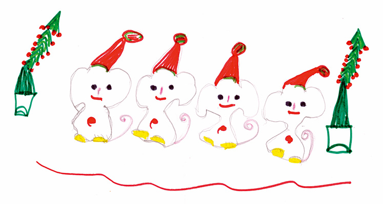
Sometimes it can be hard to think of Christmas Cards (especially when the holiday season is months away). So we present a few ideas to get your creative minds sparking…

For the 2024 President’s Dinner event at State Library Victoria, we created two visual concepts.
This is the concept that didn’t make the cut, and we share some of the additional printing and finishing details.

We have 3 rules when designing merch / swag / promotional gifts: 1. Sustainable
2. Usable
3. Quality