Established in 1989, Vitex Pharmaceuticals is a leader and innovator in the manufacturing and packaging of therapeutic goods. After a year of major investment and growth, it was time to update their brand (having had the same one since they began, some 15 years ago).

Vitex Pharmaceuticals
– Brand Identity
– Print Design
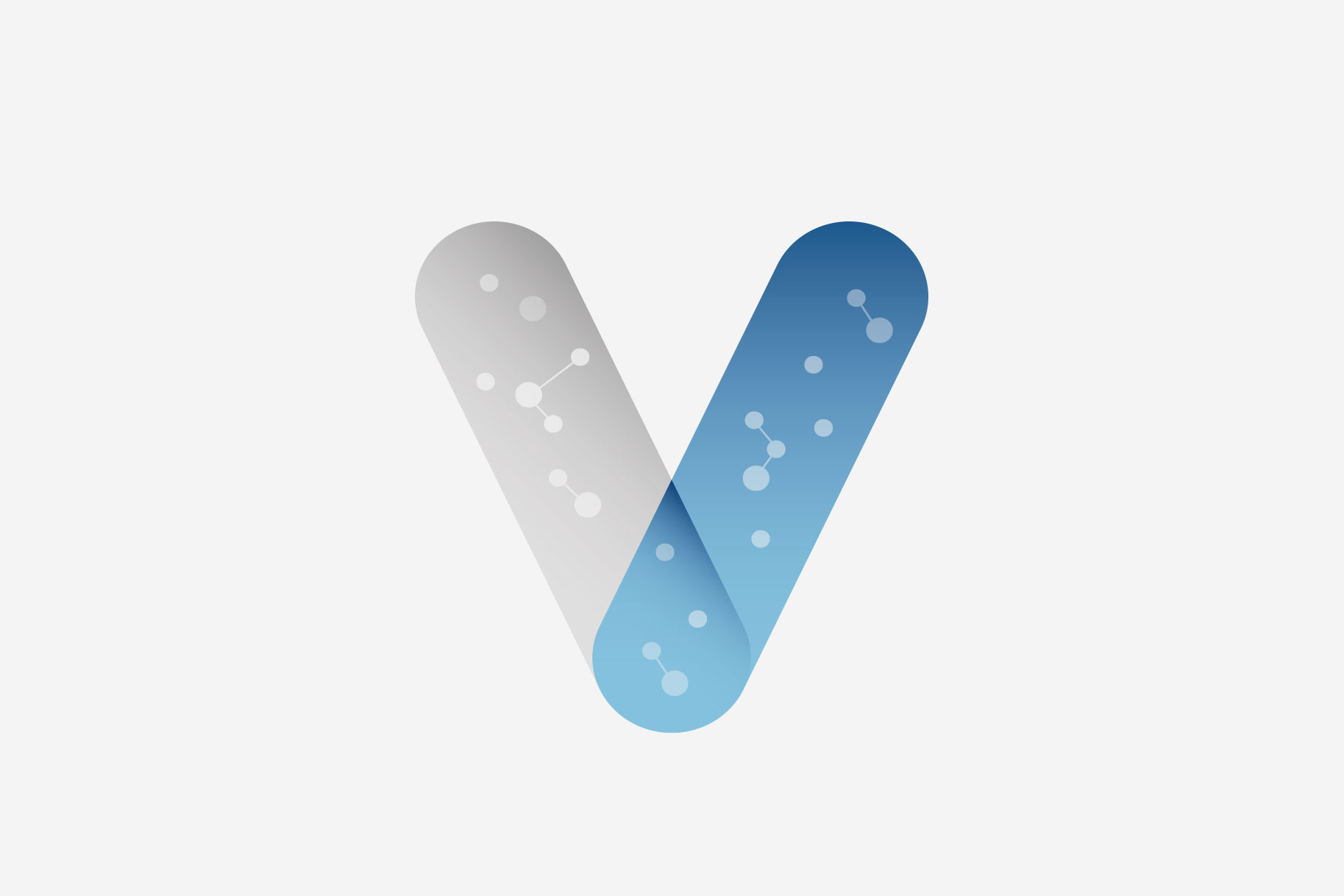
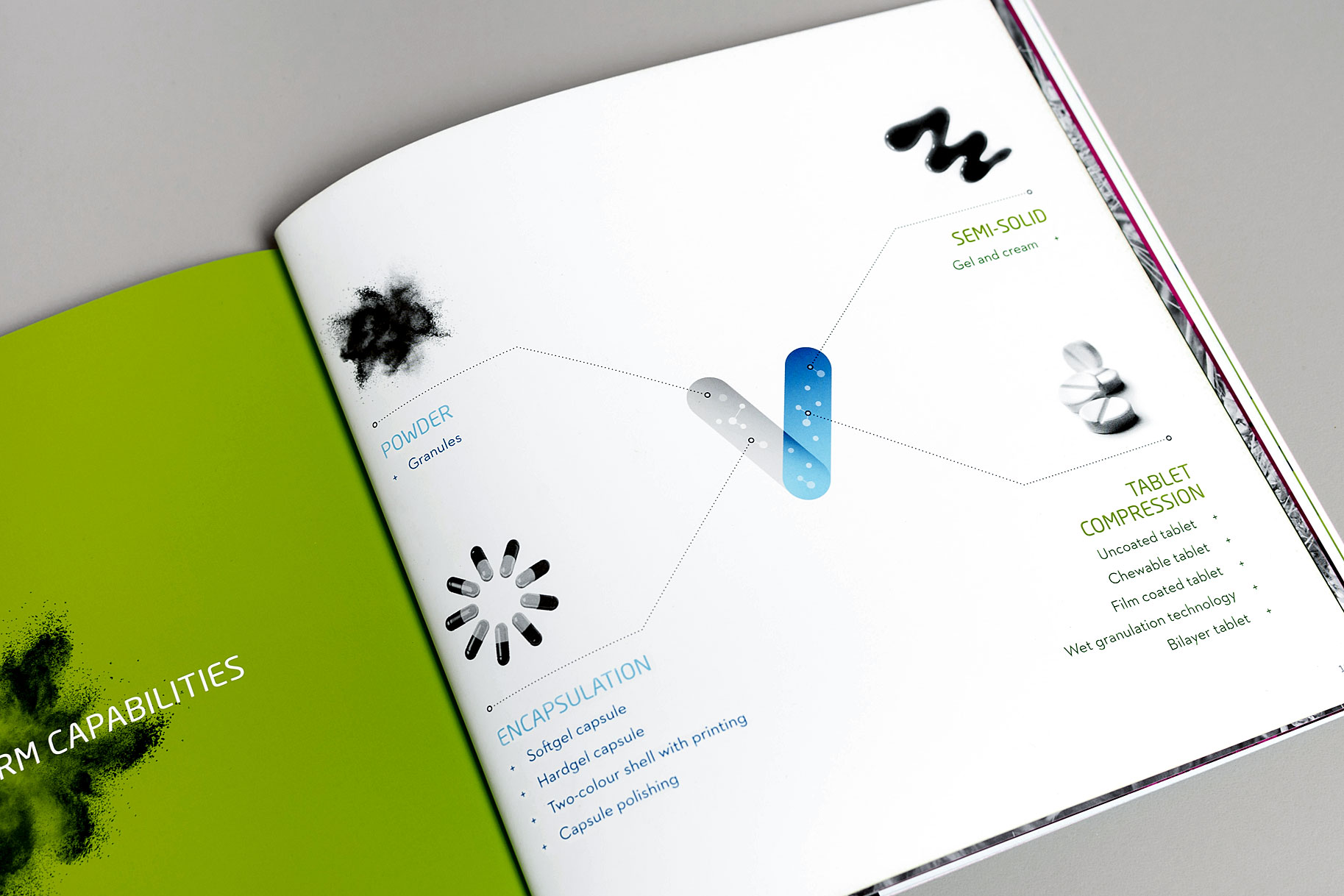
The new identity features curve-edged, solid rectangular shapes that fit neatly together to represent Vitex’s three tenets: integrity, quality and innovation.
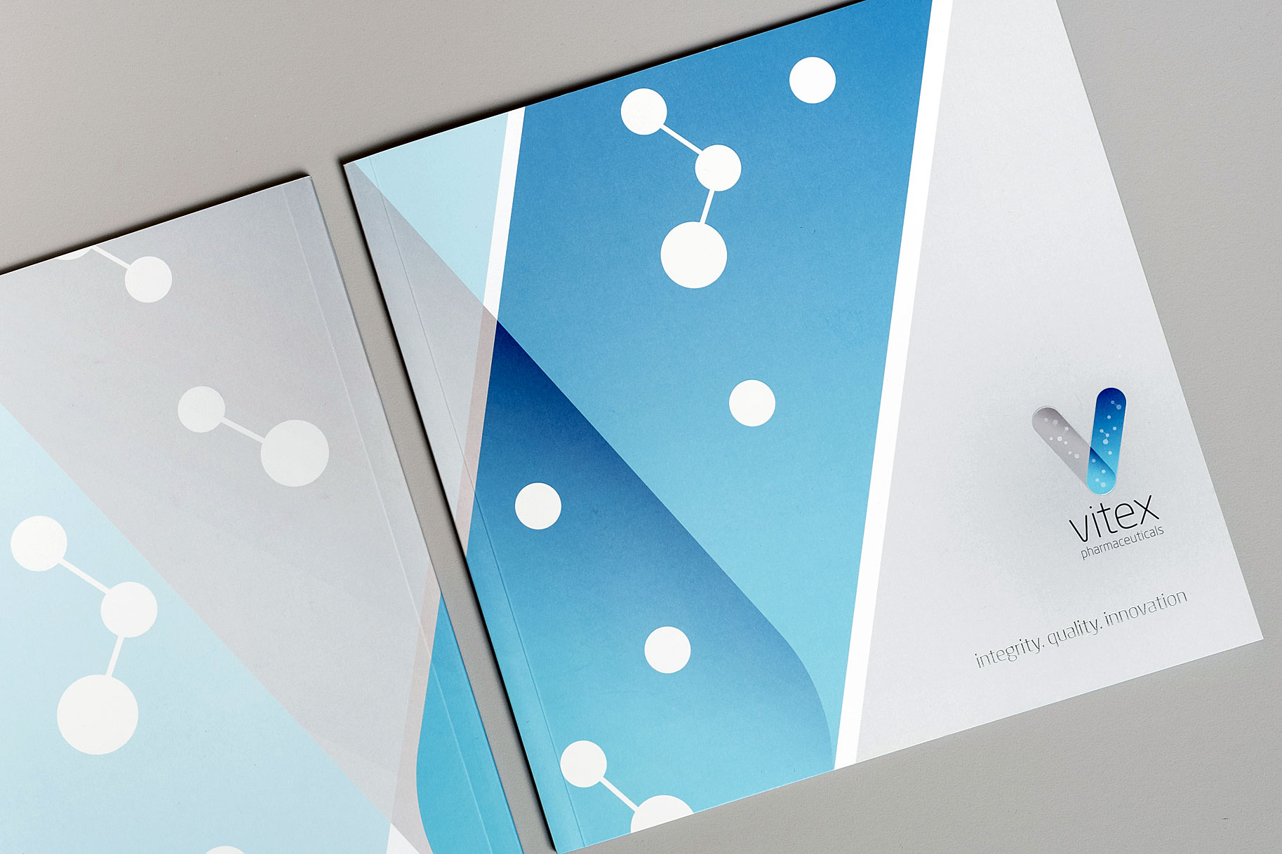
The overlapping shapes create a ‘droplet’ element. This crossover solidifies Vitex’s position as the important link between clients and regulatory authorities. The free-flowing molecule formations depict particles found within the formula of each product.
The new logo signifies a seriousness of intent and a determination to be a leading figure in the pharmaceutical industry. It can sit alongside similar pharmaceutical brands, (for example, as part of a sponsorship with multiple brand partners).
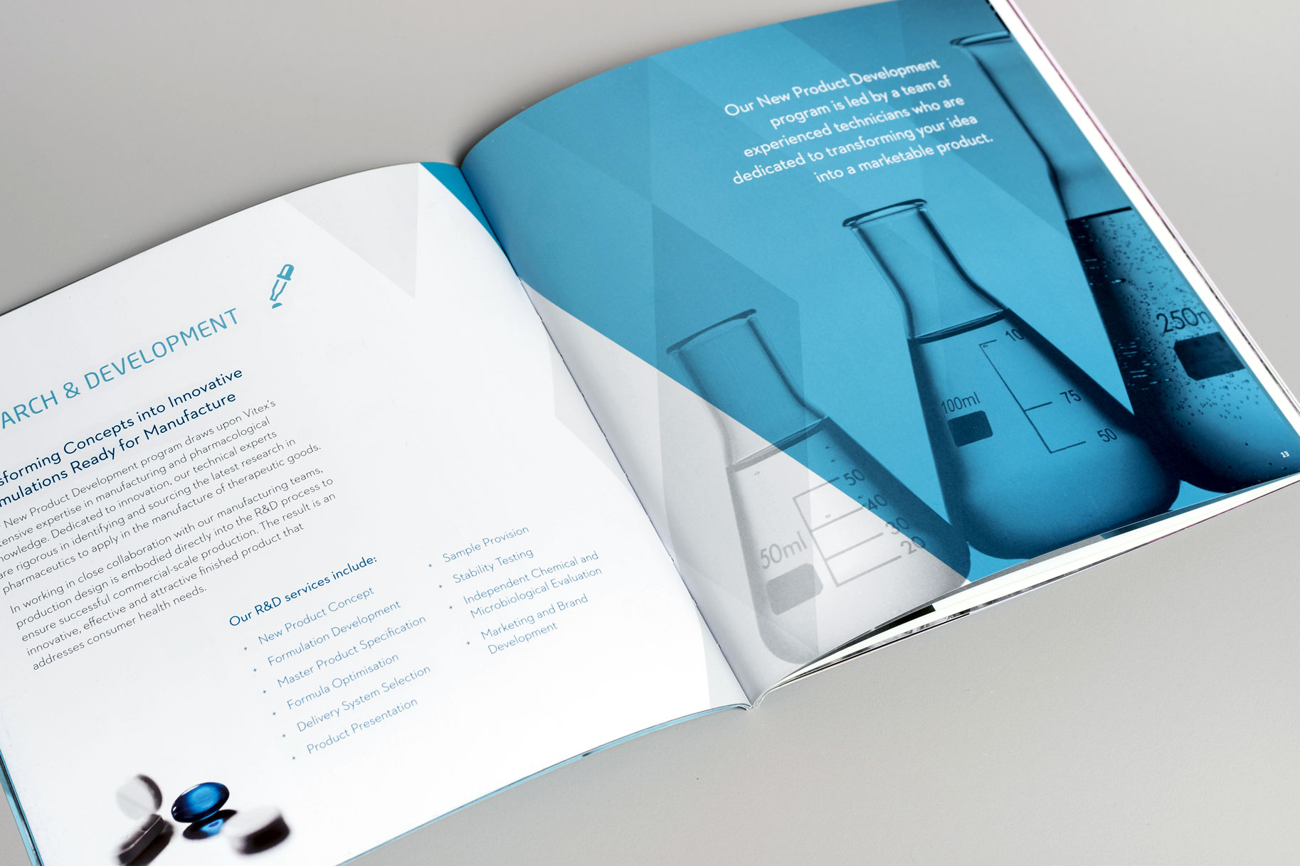
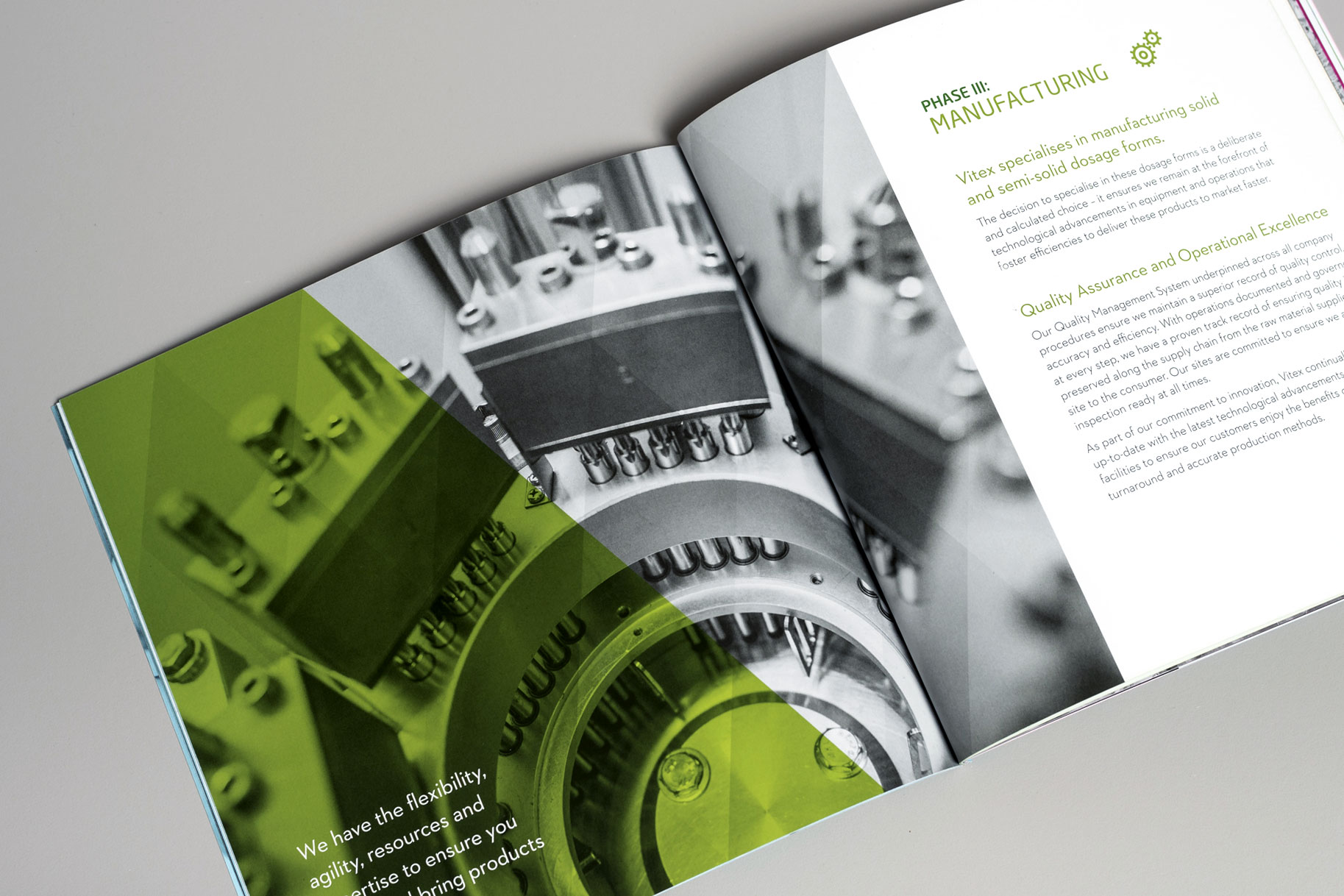
The supporting collateral brings the brand to life with sophisticated design elements combining to create a dynamic first impression of the brand’s customers and stakeholders.
“Vitex Pharmaceuticals’ brand identity required a complete overhaul.
The natural step for us for our continued expansion was to see our logo – one that we’ve had for more than 15 years – evolve into a modern day design. Given the number of stakeholders involved, Brand by Name worked tirelessly to meet and exceed high expectations to ultimately develop a sophisticated yet simple brand identity.
Fiona Brand is an incredibly gifted design professional – striking the perfect balance of creativity and corporate aesthetic to produce impressive results. From concept to the finished work, Fiona and her team spent considerable time and effort to understand our needs and provided insight throughout the design process to produce a visual identity that aligned seamlessly with our core business offering.
I would highly recommend Brand by Name for their responsiveness, creativity and business acumen – the perfect synergy that any company looks for to meet their design needs.”
Email hello@brandbyname.com.au
or call +61 3 8658 7744
105 Wellington St,
St Kilda VIC 3182
© 2025 Brand by Name™

Subscribe to our monthly newsletter — Brand News — filled with Design tips, Creativity hacks, Brand news and Design-related goodness.