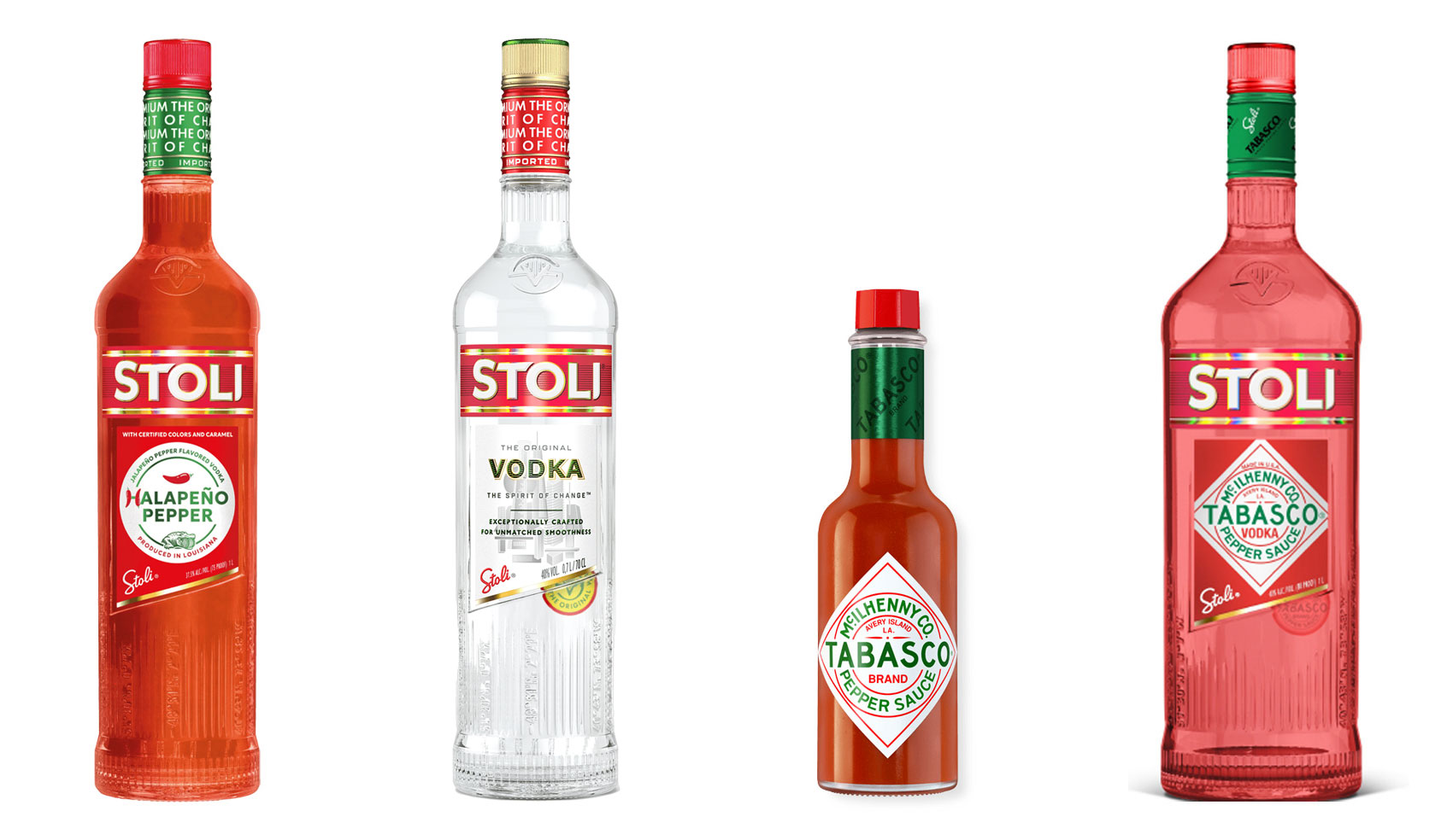
The 10% Myth
Have you ever heard ‘Change a logo by 10% and then you can legally use it’? We take a look at 2 examples involving Taylor Swift and Tabasco and explain why this is a myth.
Like most trends, flat design is coming hot off the heels of its predecessor, a style called Skeuomorphic, in which digital elements resemble real world objects.
Apple used this type of design very effectively when they launched the iphone in 2007, with its realistic looking television (YouTube), compass (Safari web browser), cogs (Settings) and camera. It helped users quickly understand what the new icons signified. Consumer comprehension was remarkably quick for such a new product.
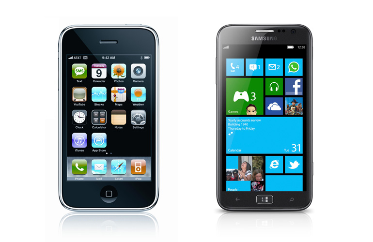
Fast forward to 2013 and we’ve seen the launch of Windows 8 (a combination of Flat + Skeuomorphic – take a look at the Office icons), a re-designed Google Search and over 42% of Australia’s population using smartphones*.
Flat design can be seen as the opposite to the Skeuomorphic approach, where three-dimensional elements are taken away from the design, such as drop shadows, bevels, textures or gradients. Designers strip back a design to the bare bones, leaving only the essence of the thing intact.
In fact, Flat design is a lot like how we used to see the graphics on computers: simple colours and design, limited by computer technology of the time. We’re going back to basics, albeit with more colours at our disposal.

– A bright colour palette. There may be a retro feel to the colours, harking back to hyper-intense colours on original instagram photos.
– Solely black, grey and white colour palettes are used sparingly, and rarely alone.
– A mid-tone colour may use darker and lighter shades to introduce an element of 3D. Both black and white type or icons will read easily when placed over it.
– Typography is important. Type will stand out clearly over a flat background, so typefaces are chosen for their personality, easy readability and being legible at small sizes. This is most important in application design and across multiple platforms. In many cases the words will be the only navigation tool, so they need to work hard. Short words and phrases are useful.
– Icons and navigation items are simplified to their most basic, stripping out unnecessary elements – as long as a user understands what they mean, they have done their job.
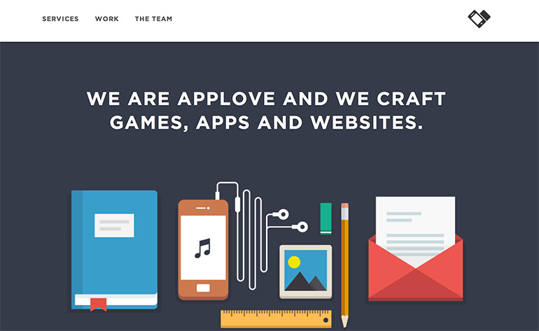
– Illustrations replacing photographic treatments.

And even the new Apple iOS7

A very real benefit (and one reason the trend has been so successful) for designers and developers is the ease of web development with flat design.
The style is particularly useful when designing for responsive websites, as images are not dependent on connecting with other elements. They can move around independently and still remain legible. When a user changes a screen or browser size, or turns their device 90 degrees, the design re-arranges to suit.
Like any trend, what goes up generally comes down.
Designing a site completely in one style will inevitably date very quickly. Therefore jumping on the bandwagon of this trend is ill-advised, unless this design style is innately suited to your product—public transport or weather applications, perhaps.
Up-and-coming ‘Modern User Interface Design’ is competing for space in the ‘What’s Hot’ category, combining some parts of Flat and Skeuomorphic design.
Either way, it’s a good thing it’s not (yet) as ubiquitous as the crossed hipster logo, a recent trend most popular in cafes and bike shops. A collection of these can be found here: http://pinterest.com/dezzig/crossed-x-hipster-logo/
* http://www.newmediatrendwatch.com/markets-by-country/11-long-haul/40-australia
Have you ever heard ‘Change a logo by 10% and then you can legally use it’? We take a look at 2 examples involving Taylor Swift and Tabasco and explain why this is a myth.
Whatever the brief is, it’s exactly the same. Every project. Every time. Every design. It‘s just one word.
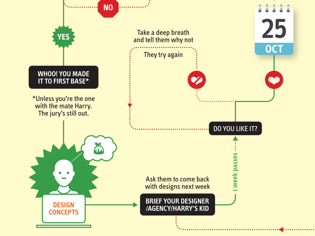
It’s that time of year when we start looking forward to the end of the working year, changes in the seasons, and celebrations over the New year…
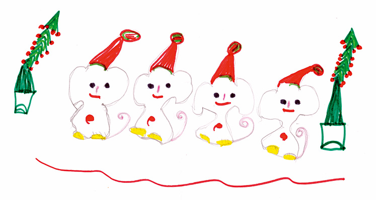
Sometimes it can be hard to think of Christmas Cards (especially when the holiday season is months away). So we present a few ideas to get your creative minds sparking…

For the 2024 President’s Dinner event at State Library Victoria, we created two visual concepts.
This is the concept that didn’t make the cut, and we share some of the additional printing and finishing details.

We have 3 rules when designing merch / swag / promotional gifts: 1. Sustainable
2. Usable
3. Quality