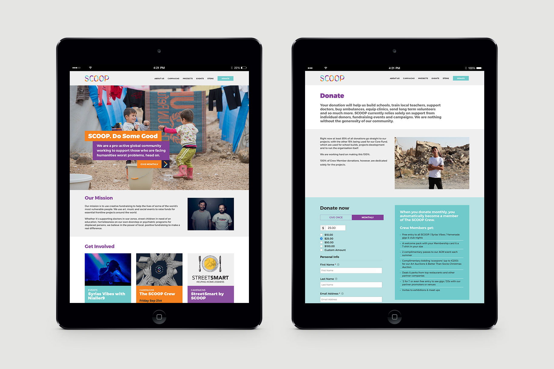
SCOOP (Supporting Children Out of Poverty) is an Irish-based not-for-profit group that fundraises for diverse programs such as schools, healthcare, equipment and infrastructure for children living in poverty in Cambodia and India.
SCOOP’s original logo was designed quickly in order to ‘get something up on the website’. It lacked visual clues to the organisation’s raison d’être, and failed the instant recognition test. Furthermore, the mission statement wasn’t well integrated with the logo mark.
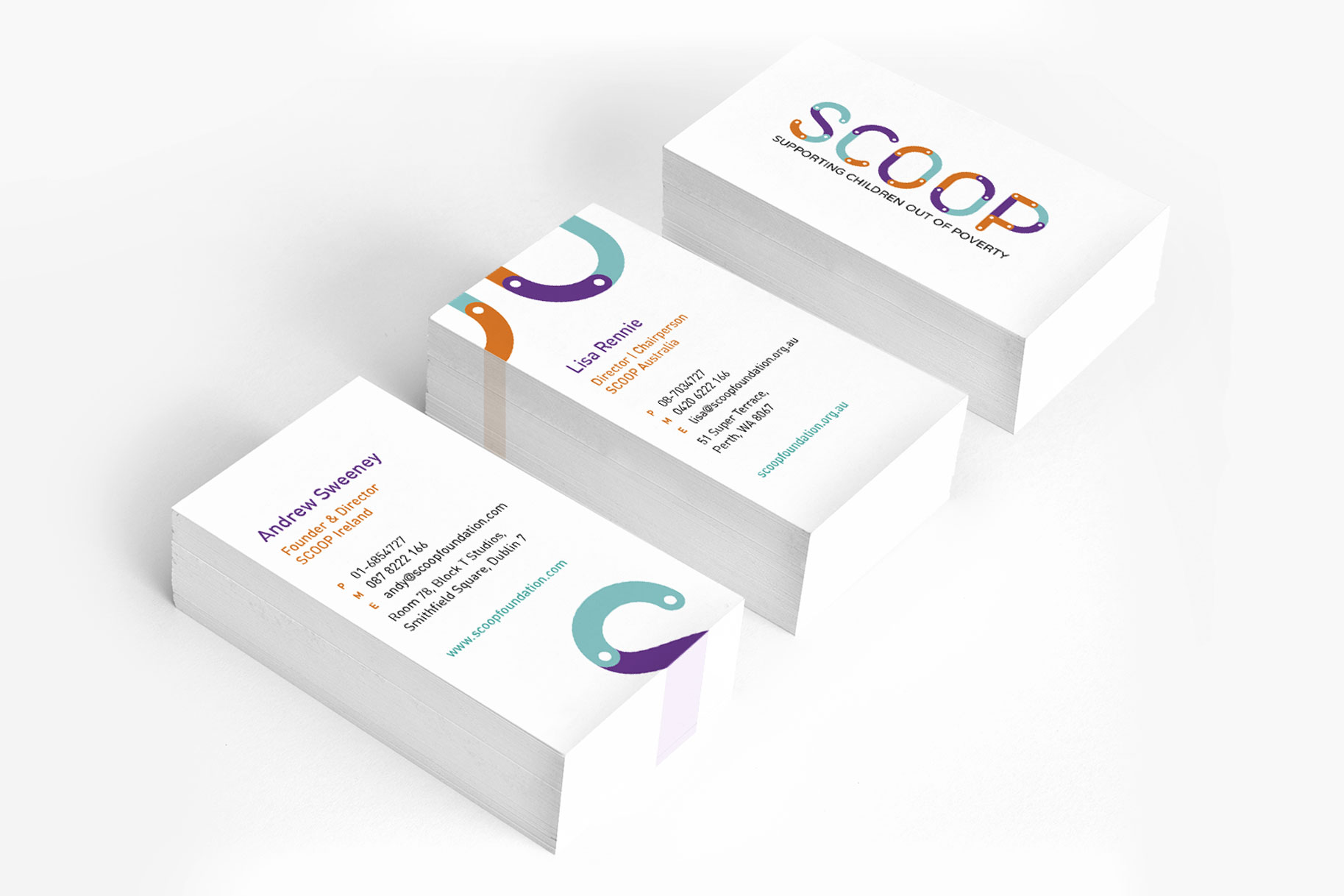
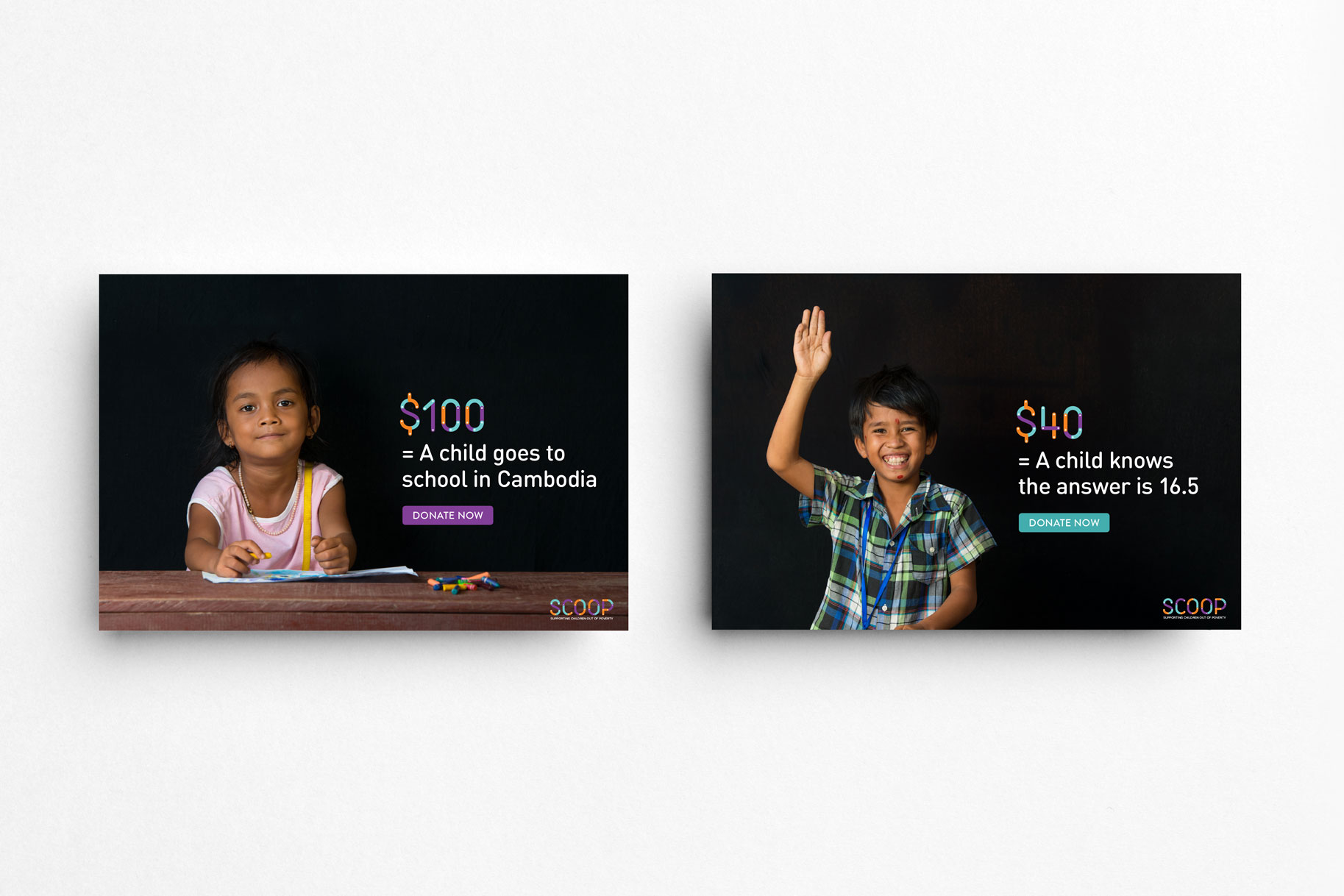
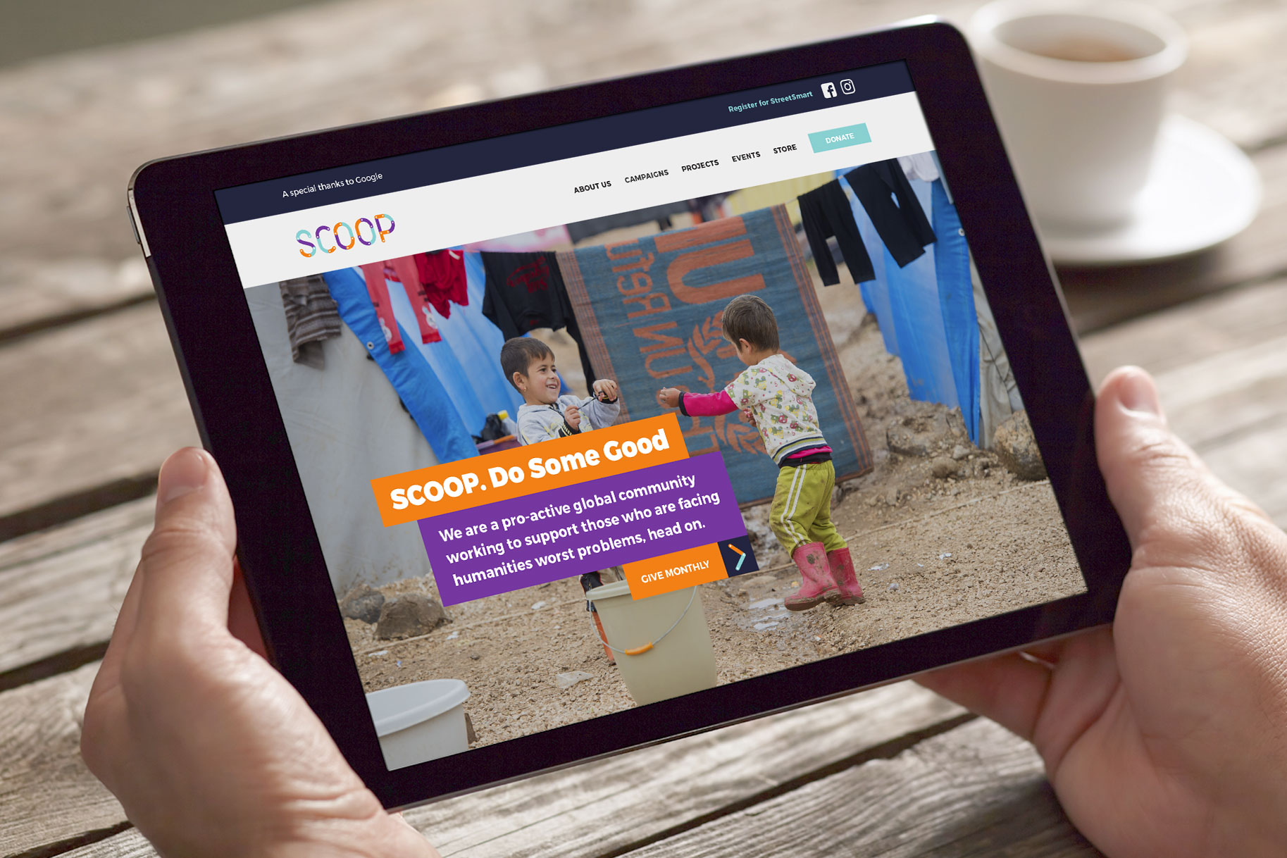
It was important that the new identity contained a visual element relating to children, without being overtly childish. Crucial to the launch of SCOOP in the Australian market was to convey a professional outlook to potential corporate sponsors and supporters and attract the attention of new volunteers and participants at fundraising events.
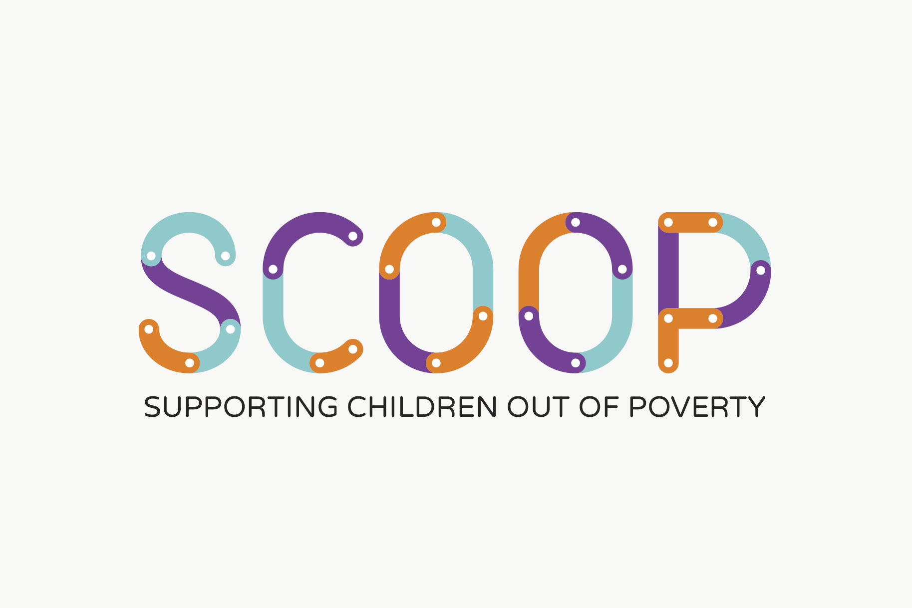
While it’s a convenient and clever acronym, SCOOP only makes sense when placed alongside the charity’s tagline. Without it, the brand could be mistaken for an ice cream label or a kitchen utensil.
As with many charities, available funds are limited. Resourcing future design work would predominantly fall on the shoulders of ad-hoc design students, in house staff and non design-savvy volunteers.
Therefore we created an identity that sits nicely alongside its tagline. It is simple to apply and flexible enough to be used across multiple mediums, whilst allowing freedom for creative interpretations.
Reflecting brand values
SCOOP’s vision statement features altruism, innovation, technology and education. Using these key values as our starting point, we designed letterforms to reflect these elements, symbolically connecting up the pieces that must come together to bring about change for children in need.
The pieces also represent the aligning of all the different groups of people—teachers, volunteers, campaigners and fundraisers who make SCOOP’s achievements possible. Reminiscent of childhood toys, the final brand features a non-primary bright colour palette and an element of fun and gameplay. It reflects the importance of children in SCOOP’s work.
Recognition
Awarded silver in the Melbourne Design Awards 2015 (Graphic Design – Corporate Identity and Branding)