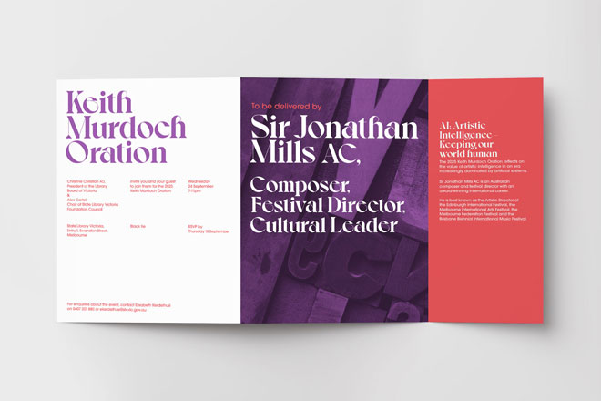
Most design projects include multiple visual concepts, especially for event branding, when the ideas we create in this phase will continue through to the final event.
For the 2024 President’s Dinner event at State Library Victoria, we created two visual concepts.
This one didn’t make the cut, and we share some of the additional printing and finishing details we had to imagine (and communicate) to the client.
After a viewing of pre-1800 Japanese Ukiyo-e Printed Books at State Library Victoria — shown as part of Melbourne Rare Book Week — we hoped to use some of these beautiful prints in the concepts for the event collateral.
Prints from the Library’s collection
When presenting a concept, there are additional printing and finishing details that add immeasurably to the final product. When all you have is the mockup above, there’s an element of imagination needed to picture the final product.
 See that little graphic in the bottom right corner of the mockup (it’s a little hard to see)? The text reads ‘President’s Dinner’ with the same floral shape as seen the cover.
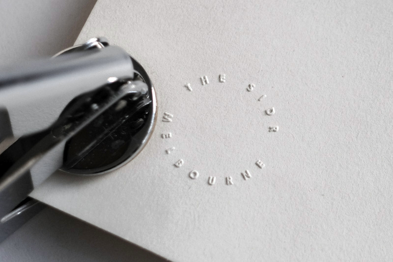
An emboss adds a little gravitas to the invitation. Embossing can be done as a finishing process (after the ink is printed, but before it’s folded). It’s an expensive process, but if you’re likely to use it again, the cost is spread out between events—just make sure you don’t include a date…
A cheaper alternative is a hand embosser.
But—it pays to remember that someone has to do the embossing, and it’s tough on your hands and wrists. The first 5 are a breeze, but once you’re at number 300…ouch…
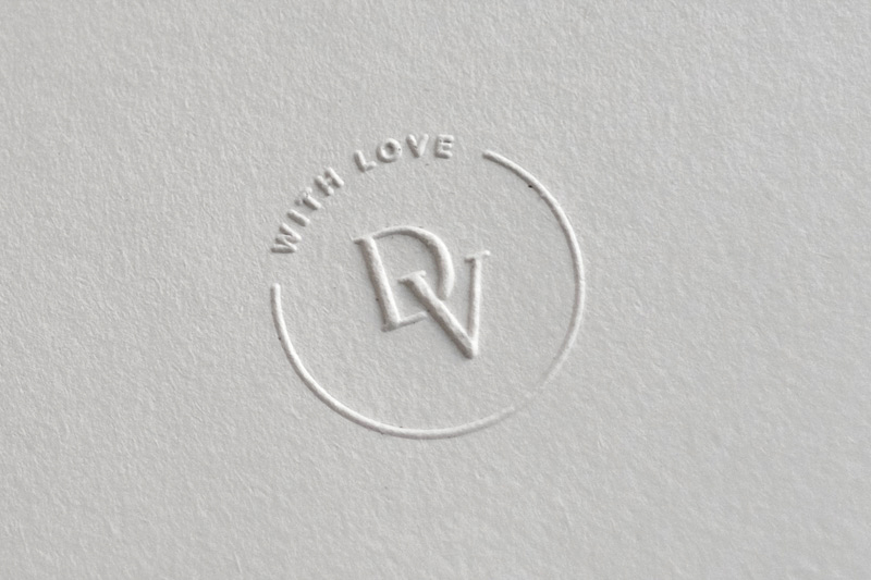
If we had a choice and the budget allowed, we’d go textural.
Either a fluffy, off-white paper stock that’s almost furry to touch. Or go modern with a bright white, patterned stock. Both stocks would be delicious to feel as you open the invitation.


Finally, we planned to pimp the final invitation by tying a bow around the invitation in a bright red or purple and adding matching envelopes.
When it comes to outstanding design, it really does pay to pay attention to the details.


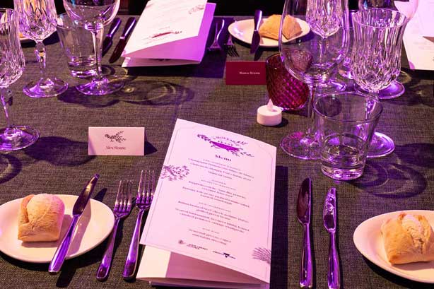

In corporate event branding, you’re often working with a company’s brand guidelines.
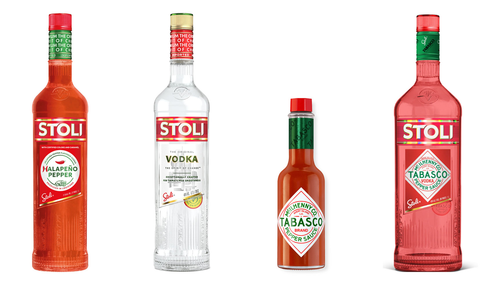
Have you ever heard ‘Change a logo by 10% and then you can legally use it’? We take a look at 2 examples involving Taylor Swift and Tabasco and explain why this is a myth.
Whatever the brief is, it’s exactly the same. Every project. Every time. Every design. It‘s just one word.
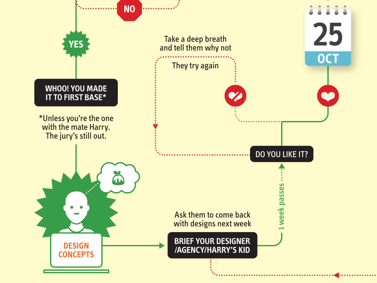
It’s that time of year when we start looking forward to the end of the working year, changes in the seasons, and celebrations over the New year…
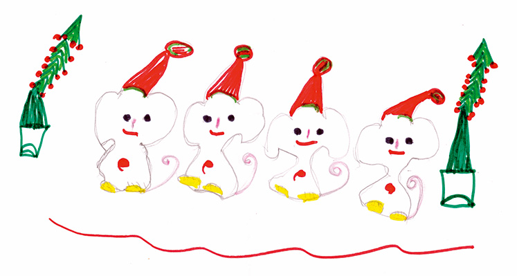
Sometimes it can be hard to think of Christmas Cards (especially when the holiday season is months away). So we present a few ideas to get your creative minds sparking…

We have 3 rules when designing merch / swag / promotional gifts: 1. Sustainable
2. Usable
3. Quality
Email hello@brandbyname.com.au
or call +61 3 8658 7744
105 Wellington St,
St Kilda VIC 3182
© 2025 Brand by Name™
Subscribe to our monthly newsletter — Brand News — filled with Design tips, Creativity hacks, Brand news and Design-related goodness.