
That’s right. When specifying black, experienced designers actually use something we call ‘Rich black’.
It changes depending on a designer’s preference, but it’s often something like 20% Cyan, 20% Magenta and 20% Yellow, plus 100% Black.
The result is a much deeper black that REALLY looks black. When compared to just 100% black, the latter looks…well, more Grey than Black.
Just one of those little details you never knew about sending artwork to a printer (and why, if you’ve ever tried to save money by doing your own artwork in Canva, you might have been surprised at the result).
* PS. you rarely do this with text, unless it’s printing super-large.


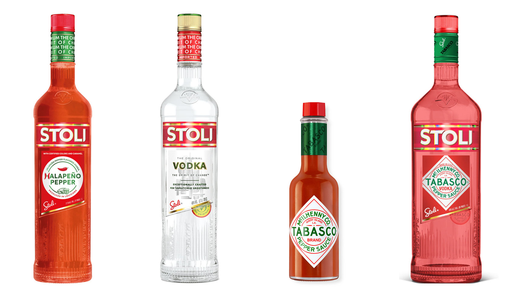
Have you ever heard ‘Change a logo by 10% and then you can legally use it’? We take a look at 2 examples involving Taylor Swift and Tabasco and explain why this is a myth.

Whatever the brief is, it’s exactly the same. Every project. Every time. Every design. It‘s just one word.

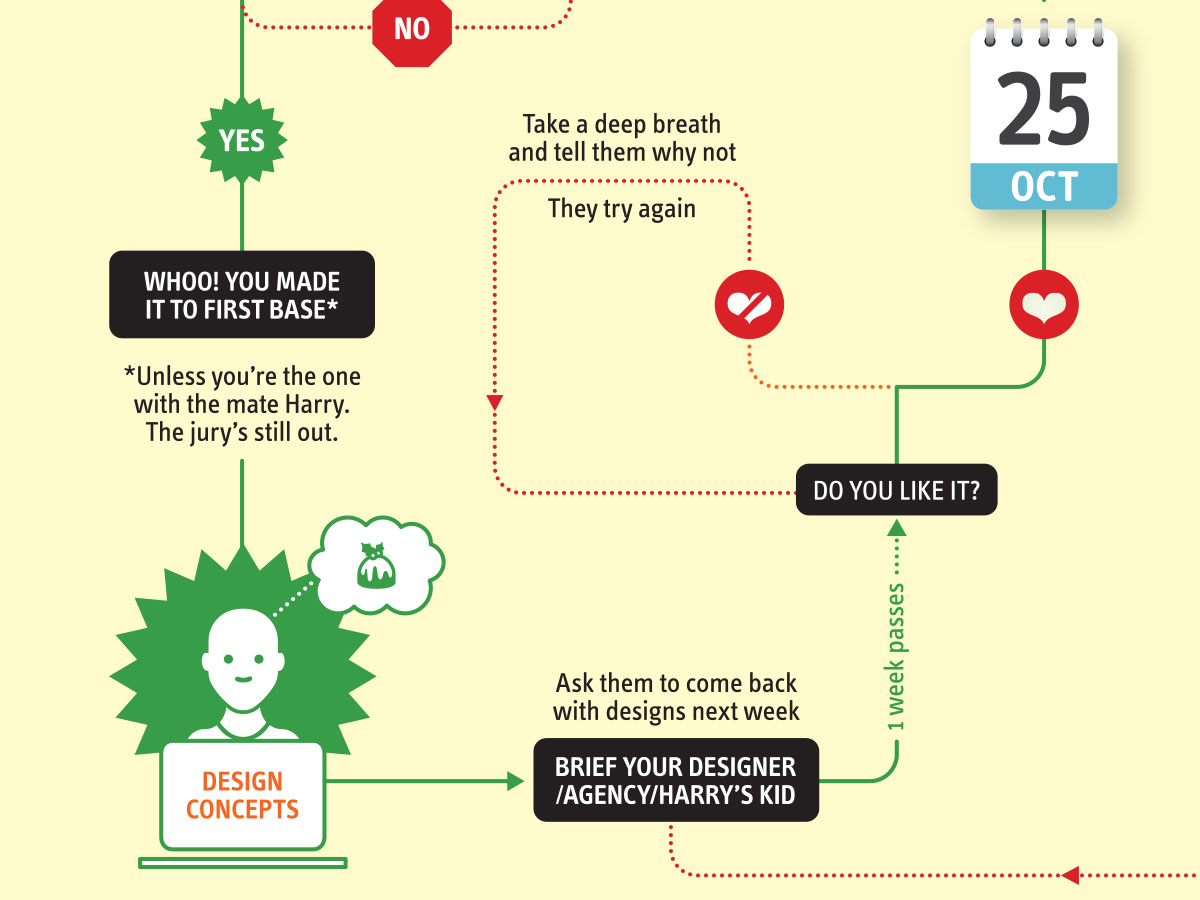
It’s that time of year when we start looking forward to the end of the working year, changes in the seasons, and celebrations over the New year…

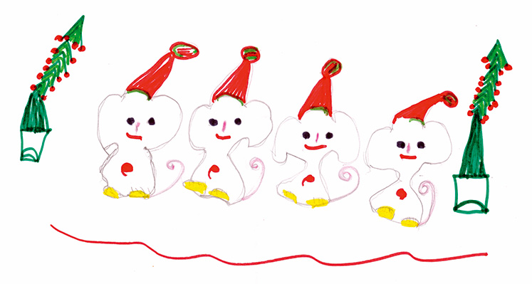
Sometimes it can be hard to think of Christmas Cards (especially when the holiday season is months away). So we present a few ideas to get your creative minds sparking…

For the 2024 President’s Dinner event at State Library Victoria, we created two visual concepts.
This is the concept that didn’t make the cut, and we share some of the additional printing and finishing details.

We have 3 rules when designing merch / swag / promotional gifts: 1. Sustainable
2. Usable
3. Quality
Email hello@brandbyname.com.au
or call +61 3 8658 7744
105 Wellington St,
St Kilda VIC 3182
© 2025 Brand by Name™

Subscribe to our monthly newsletter — Brand News — filled with Design tips, Creativity hacks, Brand news and Design-related goodness.