Colour — using the vibrant palette was key, but it could overwhelm other elements.
Imagery — brand photography, always in black and white.
Iconography — was there a way to adapt, or add to the icon suite for ongoing use?
Shapes — how to integrate these into the overall look and feel.
A key insight? There was a myriad of ways to use all the elements together – the trick would be to balance all of them and align them with each design’s end goal.
THE outcome
We designed pdf documents for Use cases, Customer stories and developed a template for the quarterly Employee Sentiment Index (ESI) report, centred on the key insight of ‘balance’ between all the different elements.
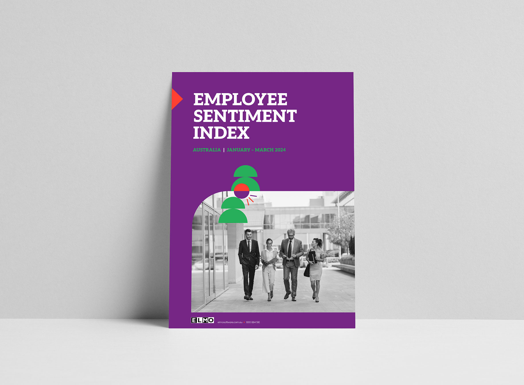
⭐ Industry use cases + Customer stories feature a single brand colour + single greyscale image on the cover.
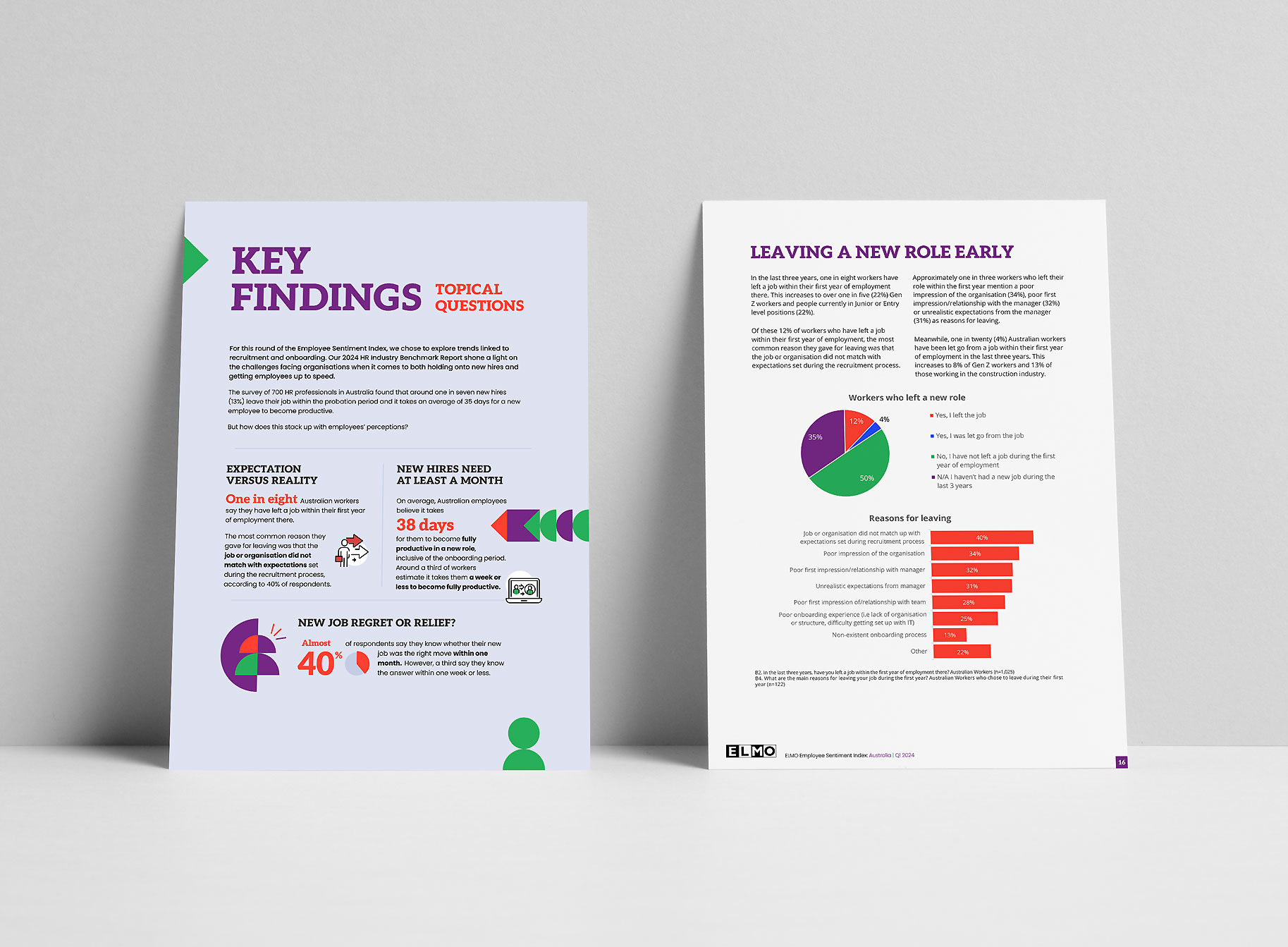
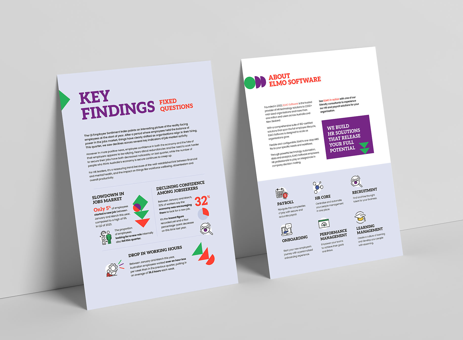
⭐ Key Findings pages and infographics introduce the ESI reports, including brand shapes and icons throughout.
⭐ The annual Benchmark report combines all four elements: the vibrant colour palette, layering of photography, brand icons and shapes that guide the reader’s eye.
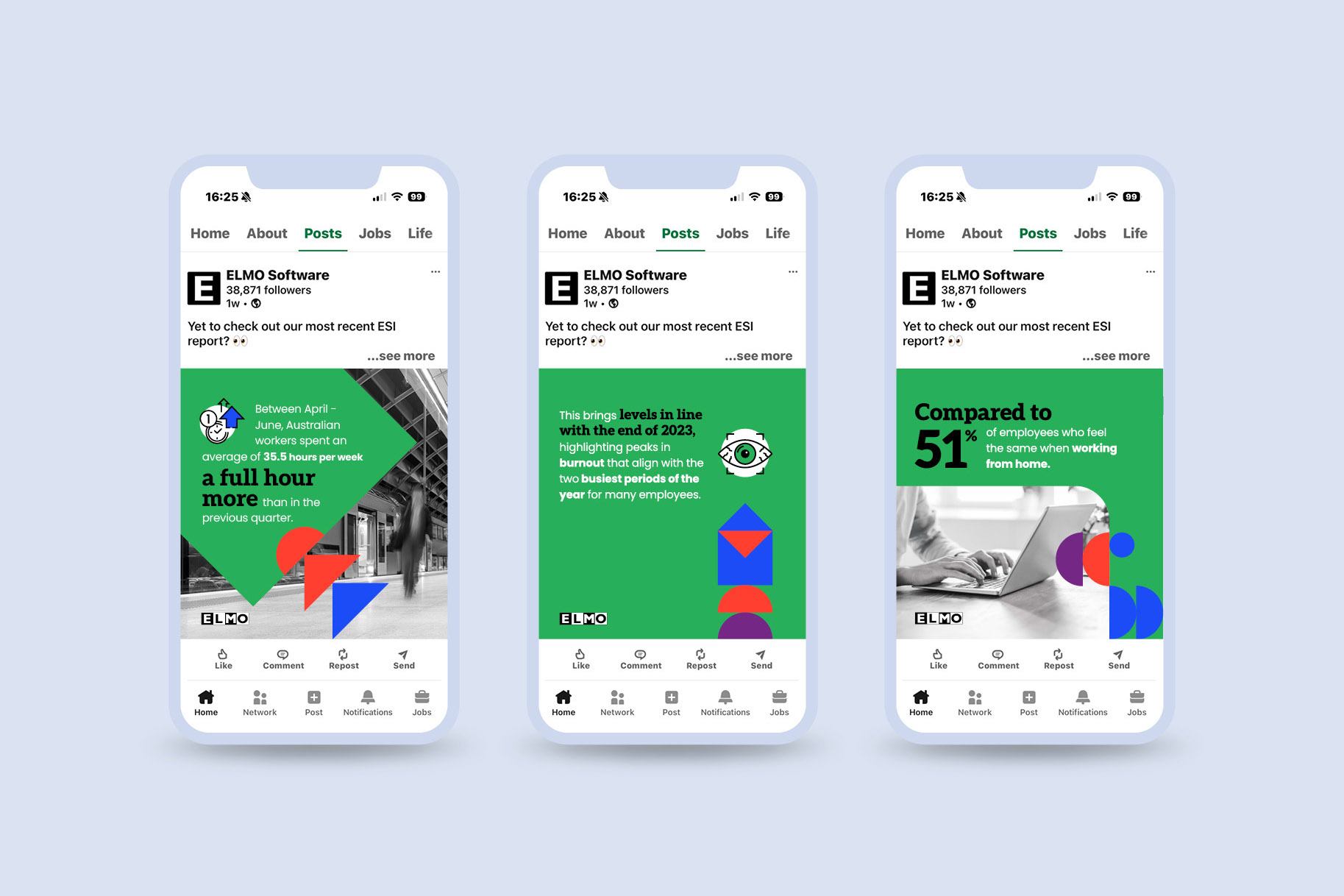
⭐ Supporting social media graphics layer photography, and brand shapes with a dominant duo of colours.
Brand rollout projects like this are our sweet spot at Brand By Name.
There’s scope to do something different and develop creative work that a client can get excited about. Here’s what they said about us:
Just wanted to drop you a quick note to say thank you for all your work on the Benchmark report. It was beautifully done and totally exceeded my expectations. And of course, working with you was super easy as always!