We work with people at an exciting stage in their business—they’re either going for it with a startup or taking an existing business in a certain strategic direction. Either way it’s an exciting time, and we get to play a small part in creating the brand identity.
Jodie from The Detail Department is a perfect example. Jodie is the guru of all things systems and technology, consulting and advising clients on customer relationship management, document, accounting and business systems.
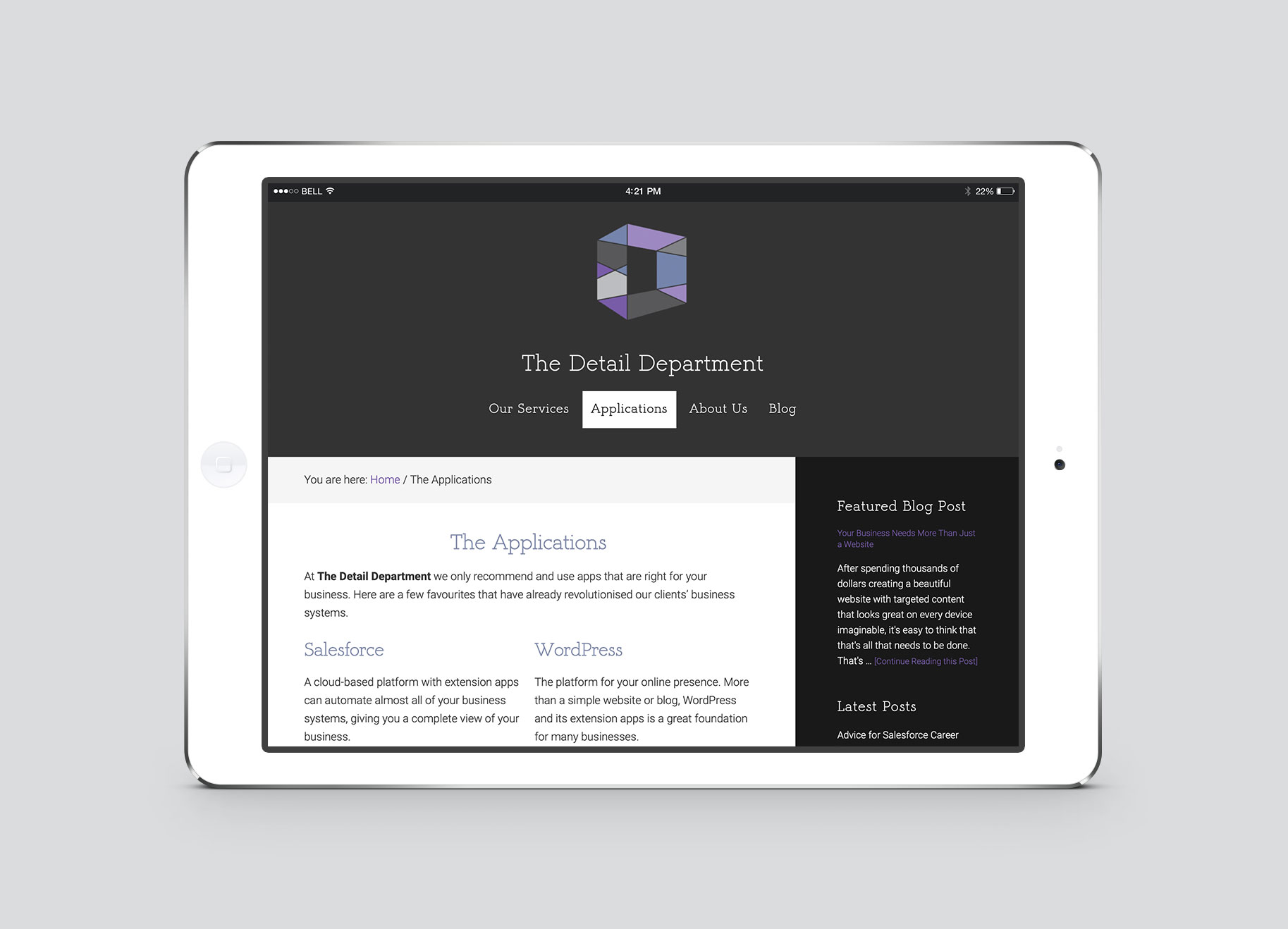
Our brief was to highlight The Detail Department’s commitment to innovation, technology solutions and professionalism.
Also required – some printed stationery which would stand out from the usual, creating a brilliant first impression when at a networking event or meeting potential clients.
The Solution
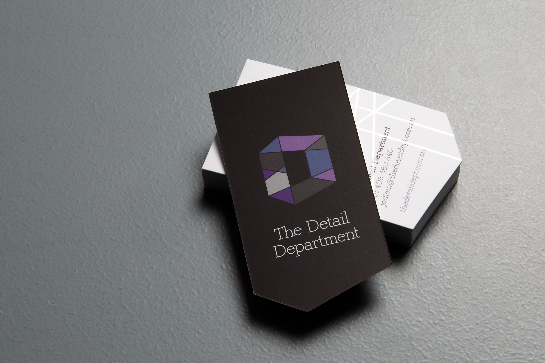
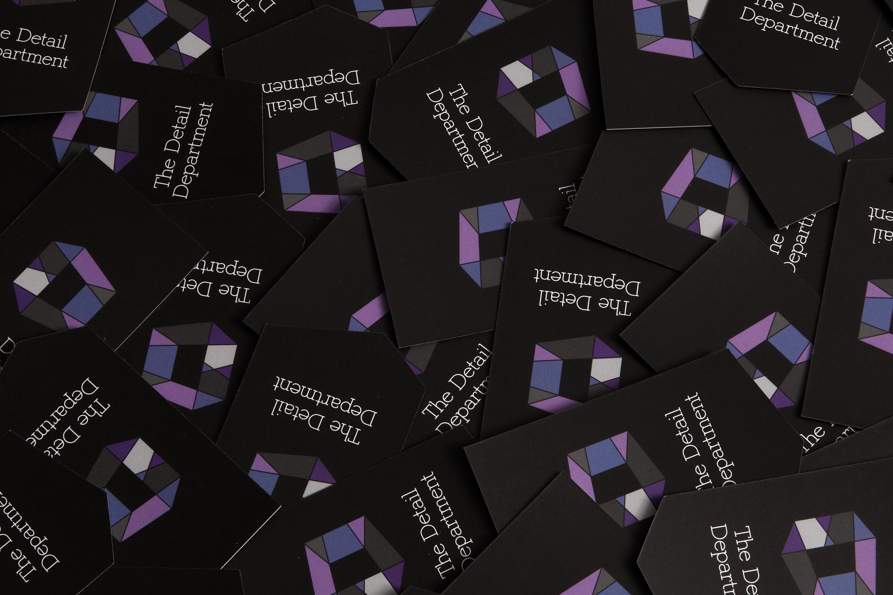
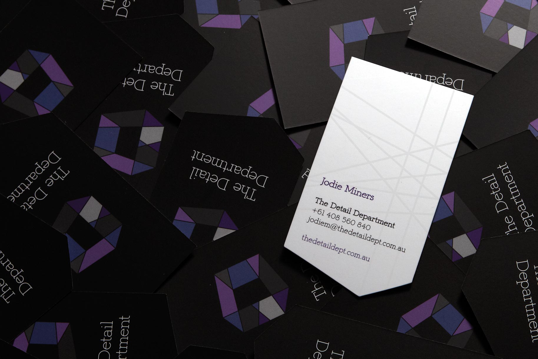
We created an optical illusion that can be viewed from several angles yet remains streamlined and elegant. It conveys the many elements that form technology solutions suited to each client, whist the colour palette signifies authority, balance and reliability.
Jodie wasn’t afraid to spend a bit more on the production of the business cards. Utilising the logo wireframe drawings, we including a gloss detail on one side, and really made the cards stand out from the pack with a diecut based on the logo shape.
In Jodie’s words
“Despite the complex nature of our business Brand by Name understood our needs and created a wonderful brand identity that conveys what we’re about and takes our business to the next level.”