Designers hear this a lot: “Now that I think about it… I don’t like blue/serif fonts/circles.” It’s much better to consider what you like (and dislike) in advance and tell your designer in a written brief. Imagine you went to the airport and said ‘put me on a flight to somewhere amazing’. The travel agent sends you to Antarctica. You really meant ‘send me somewhere amazing … and warm’.
Think about where you’d like to end up and you’ll get there much easier.
If you love the look of the handwritten font on your estate agent’s flyer or the funky label of your craft beer, show your designer (or in the case of the beer, buy them a beer). Don’t worry, they won’t copy it—just understand what you’re looking for. Design is everywhere; spend time looking at websites, advertising or magazines to find what you like. You don’t even need the actual item – a simple snap from your phone will usually suffice.
That’s just too vague. You must be specific in your feedback. Show the designer an example of what you mean and tell them how you feel the draft falls short. Remember the phrase ‘a picture says a thousand words’? Use visual examples to help you explain what you’re trying to say.
You hired a designer for their design skills—so let them have fun and try out something you don’t expect. When you first see a design, take the time to consider it for a day or two (at the very least a few hours)—often your first response is based on a personal gut feel, and may not be the right one for that particular project. We had one client who initially hated the colour on her website but it grew on her—and it’s still there. She trusted in our expertise to choose the right colour scheme, even though it wasn’t her personal preference.
Don’t dictate the solution. For example, let’s say your design is too contemporary for your conservative audience. So you say to your designer–change the typeface. If you don’t the explain the real reason for your request, your designer may make the changes you need, but they won’t understand the problem. We designers are a creative lot, we might have an even better solution—if you give us a chance to think about it.
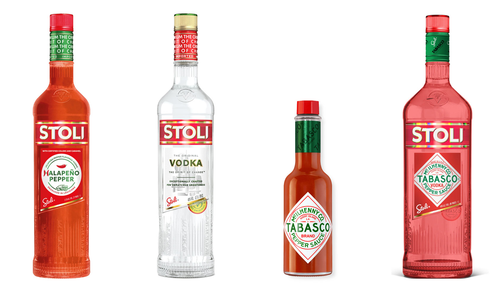
Have you ever heard ‘Change a logo by 10% and then you can legally use it’? We take a look at 2 examples involving Taylor Swift and Tabasco and explain why this is a myth.

Whatever the brief is, it’s exactly the same. Every project. Every time. Every design. It‘s just one word.
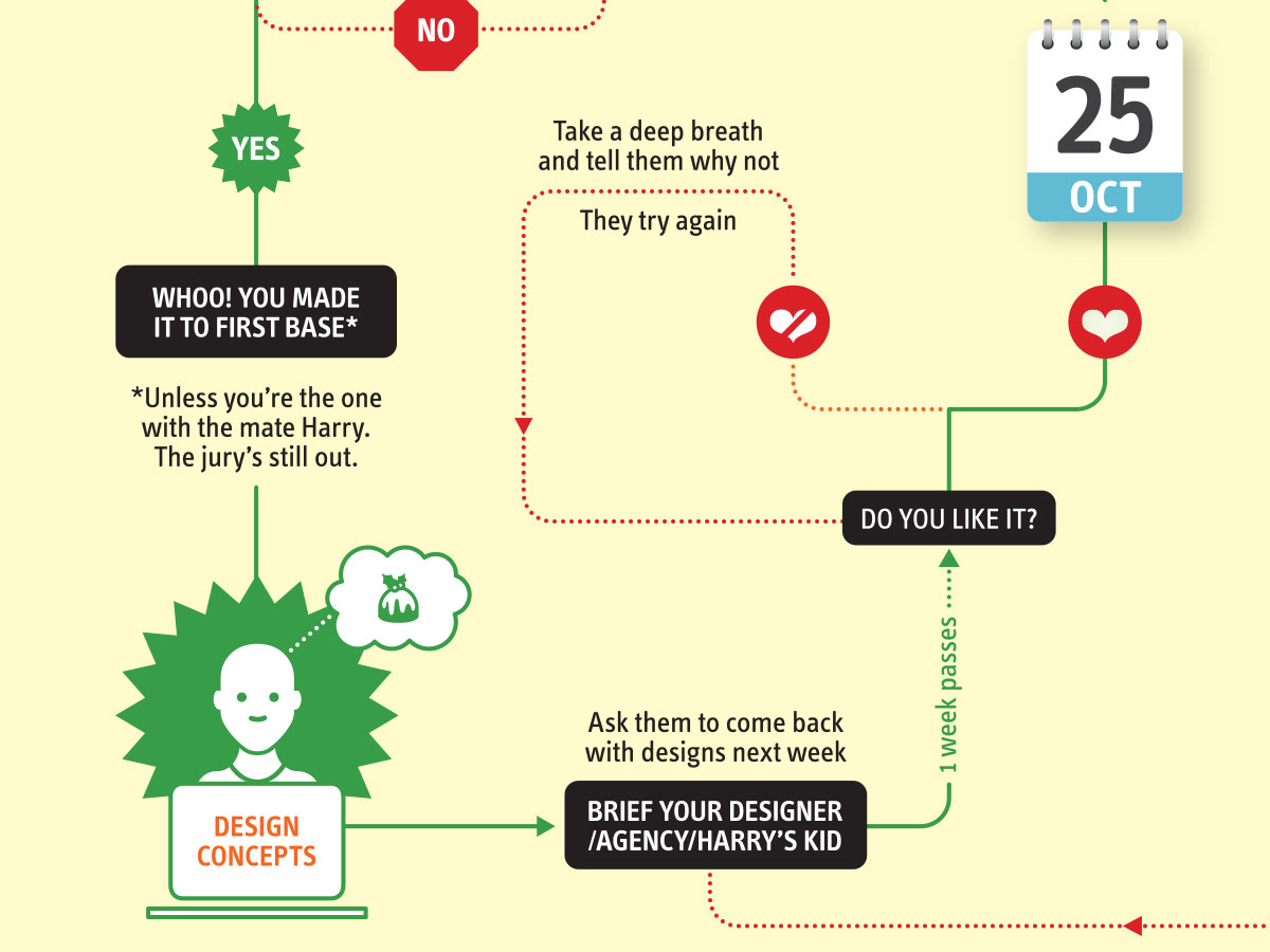
It’s that time of year when we start looking forward to the end of the working year, changes in the seasons, and celebrations over the New year…
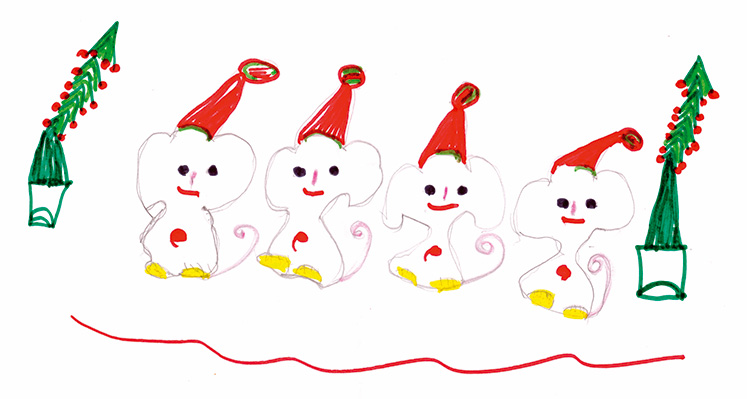
Sometimes it can be hard to think of Christmas Cards (especially when the holiday season is months away). So we present a few ideas to get your creative minds sparking…

For the 2024 President’s Dinner event at State Library Victoria, we created two visual concepts.
This is the concept that didn’t make the cut, and we share some of the additional printing and finishing details.

We have 3 rules when designing merch / swag / promotional gifts: 1. Sustainable
2. Usable
3. Quality
Email hello@brandbyname.com.au
or call +61 3 8658 7744
105 Wellington St,
St Kilda VIC 3182
© 2025 Brand by Name™
Subscribe to our monthly newsletter — Brand News — filled with Design tips, Creativity hacks, Brand news and Design-related goodness.