
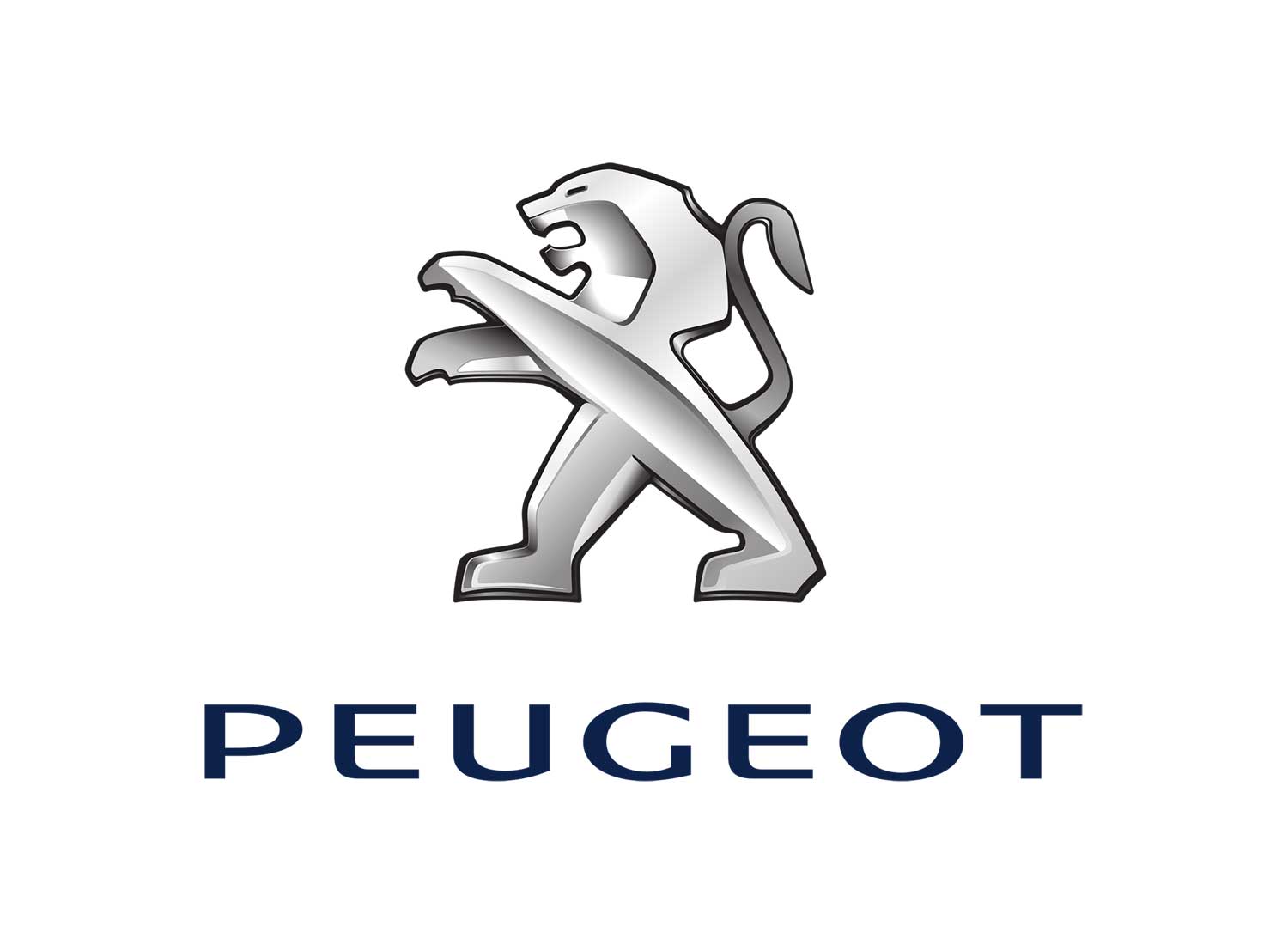

The previous identity looked a little like a bitmapped computer game character picking up take-away coffee. No longer. That lion looks sleek, sexy, tough and about to eat you alive.
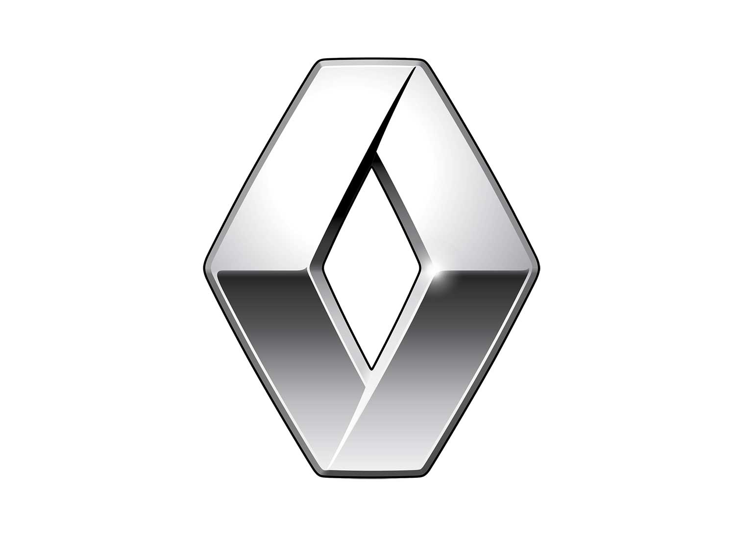
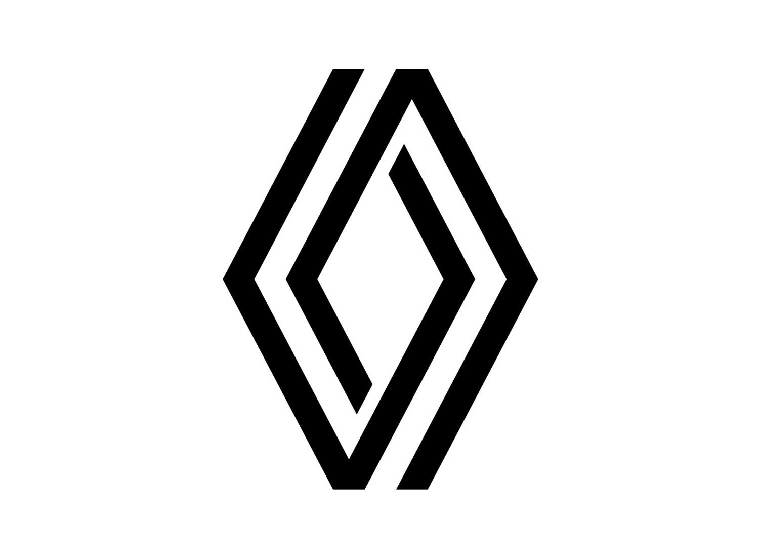
We don’t totally love this. Whilst we understand they’ve retained the diamond shape symbolising ‘Renault’, it feels a little lacklustre. Where is the sense of style for a French car brand?

At first glance, you might think they just changed the letters. But look closer. They’ve symbolised the move towards electric cars within the negative space in the letter ‘m’. Clever.
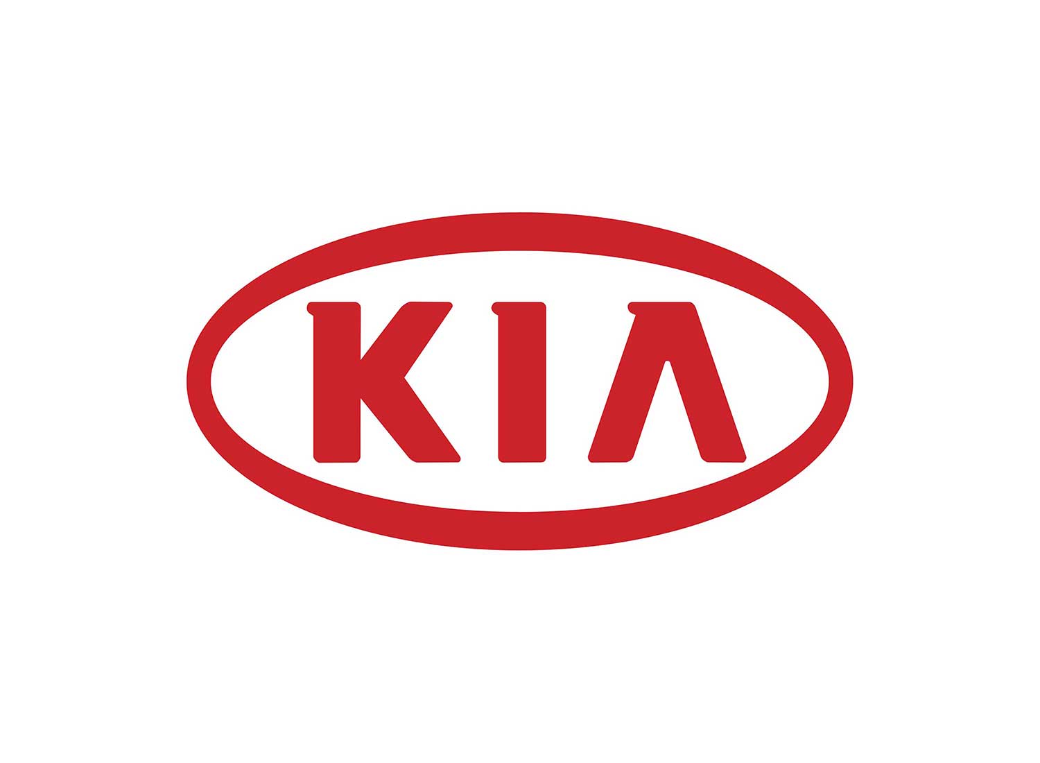
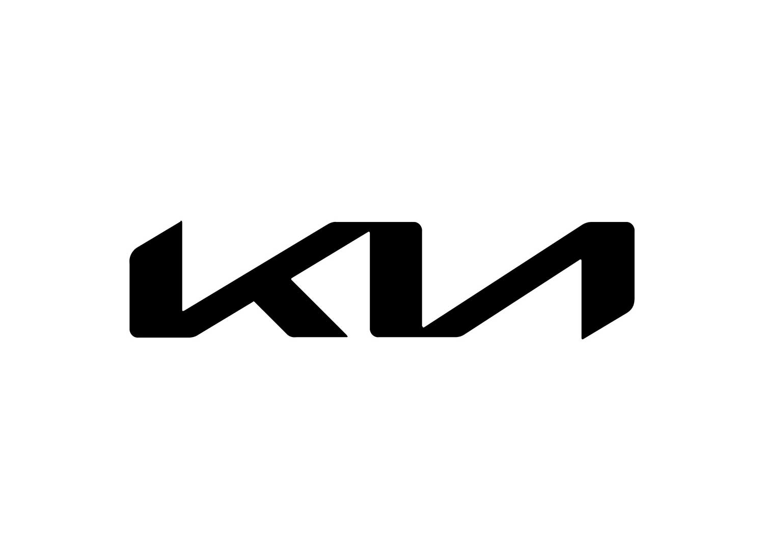
Initial thoughts — ‘Whoah, what logo is that, it’s unreadable’. That said, once you’ve seen it once, you won’t mistake it. Clearly a brand wanting to transform its reputation, it’s sharp, edgy and uncompromisingly now.
On a side note, Google searches for “KN car” have risen since the rebrand, as approximately 30,000 people a month are misreading the new logo as “KN” instead of “KIA”.

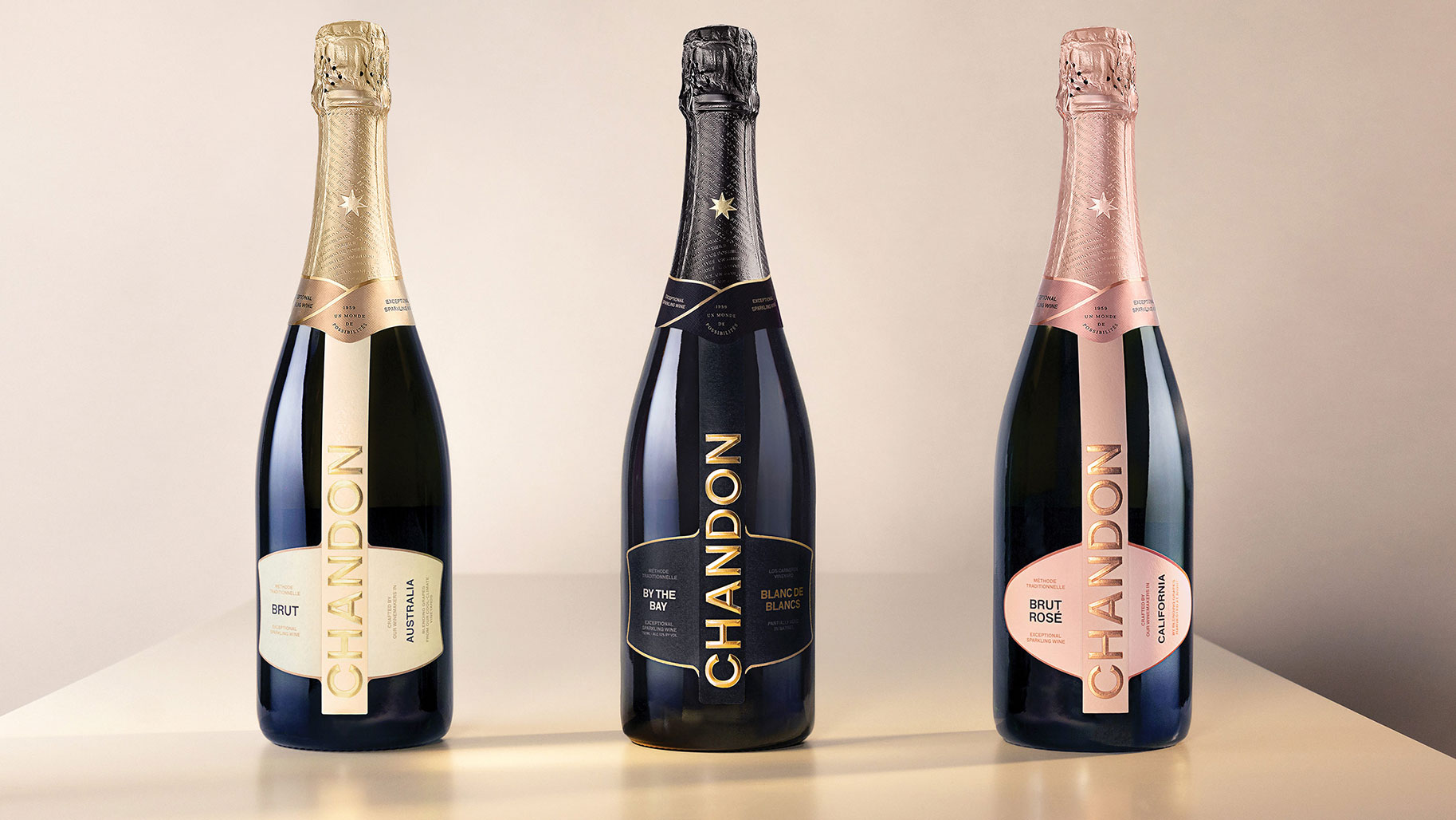
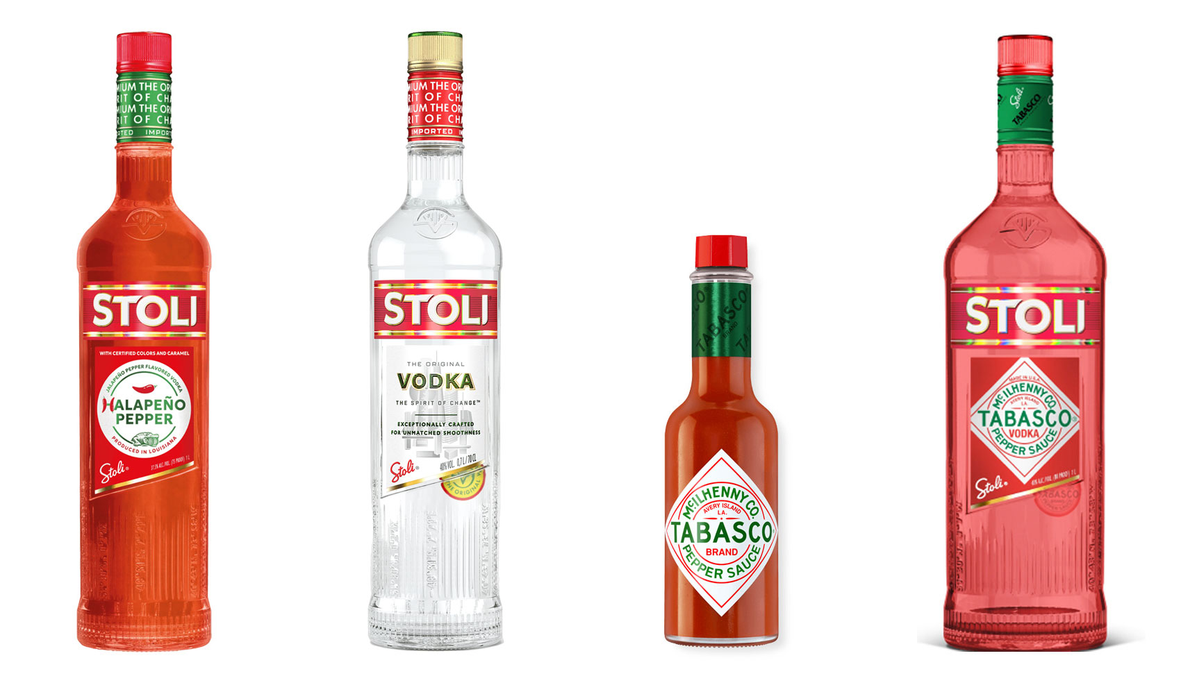
Have you ever heard ‘Change a logo by 10% and then you can legally use it’? We take a look at 2 examples involving Taylor Swift and Tabasco and explain why this is a myth.
Whatever the brief is, it’s exactly the same. Every project. Every time. Every design. It‘s just one word.
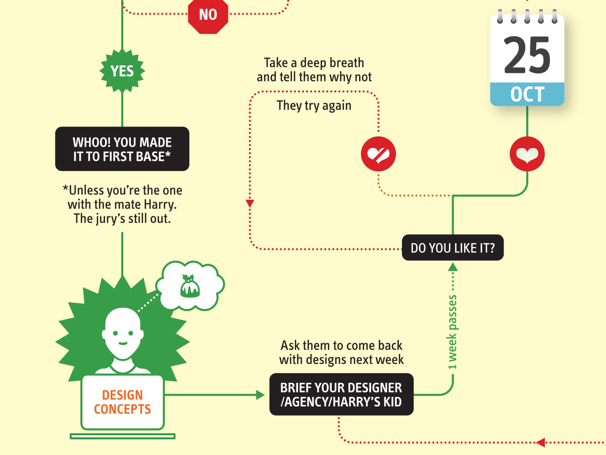
It’s that time of year when we start looking forward to the end of the working year, changes in the seasons, and celebrations over the New year…
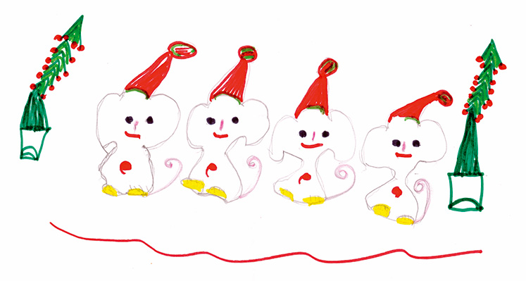
Sometimes it can be hard to think of Christmas Cards (especially when the holiday season is months away). So we present a few ideas to get your creative minds sparking…

For the 2024 President’s Dinner event at State Library Victoria, we created two visual concepts.
This is the concept that didn’t make the cut, and we share some of the additional printing and finishing details.

We have 3 rules when designing merch / swag / promotional gifts: 1. Sustainable
2. Usable
3. Quality
Email hello@brandbyname.com.au
or call +61 3 8658 7744
105 Wellington St,
St Kilda VIC 3182
© 2025 Brand by Name™
Subscribe to our monthly newsletter — Brand News — filled with Design tips, Creativity hacks, Brand news and Design-related goodness.