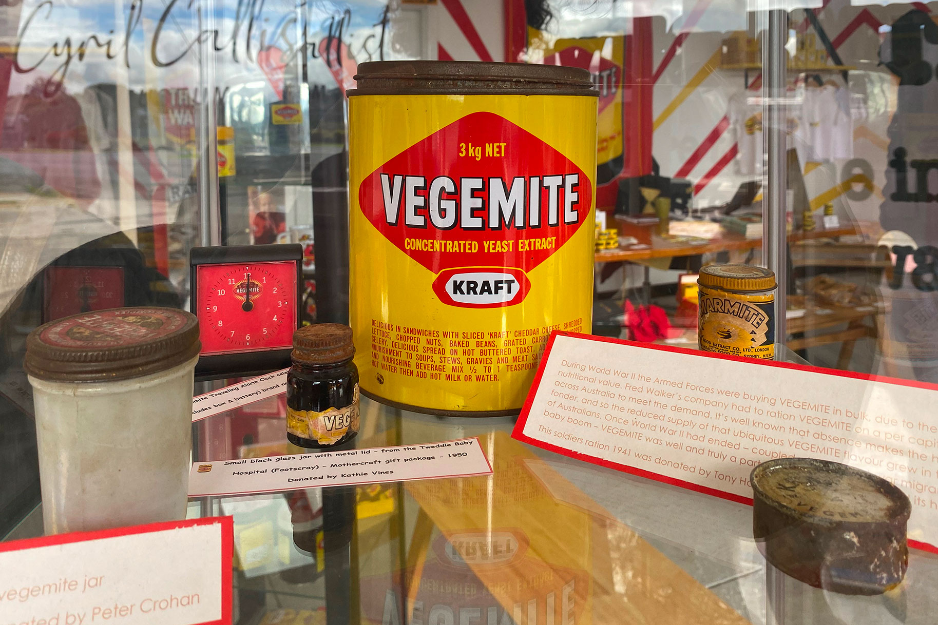
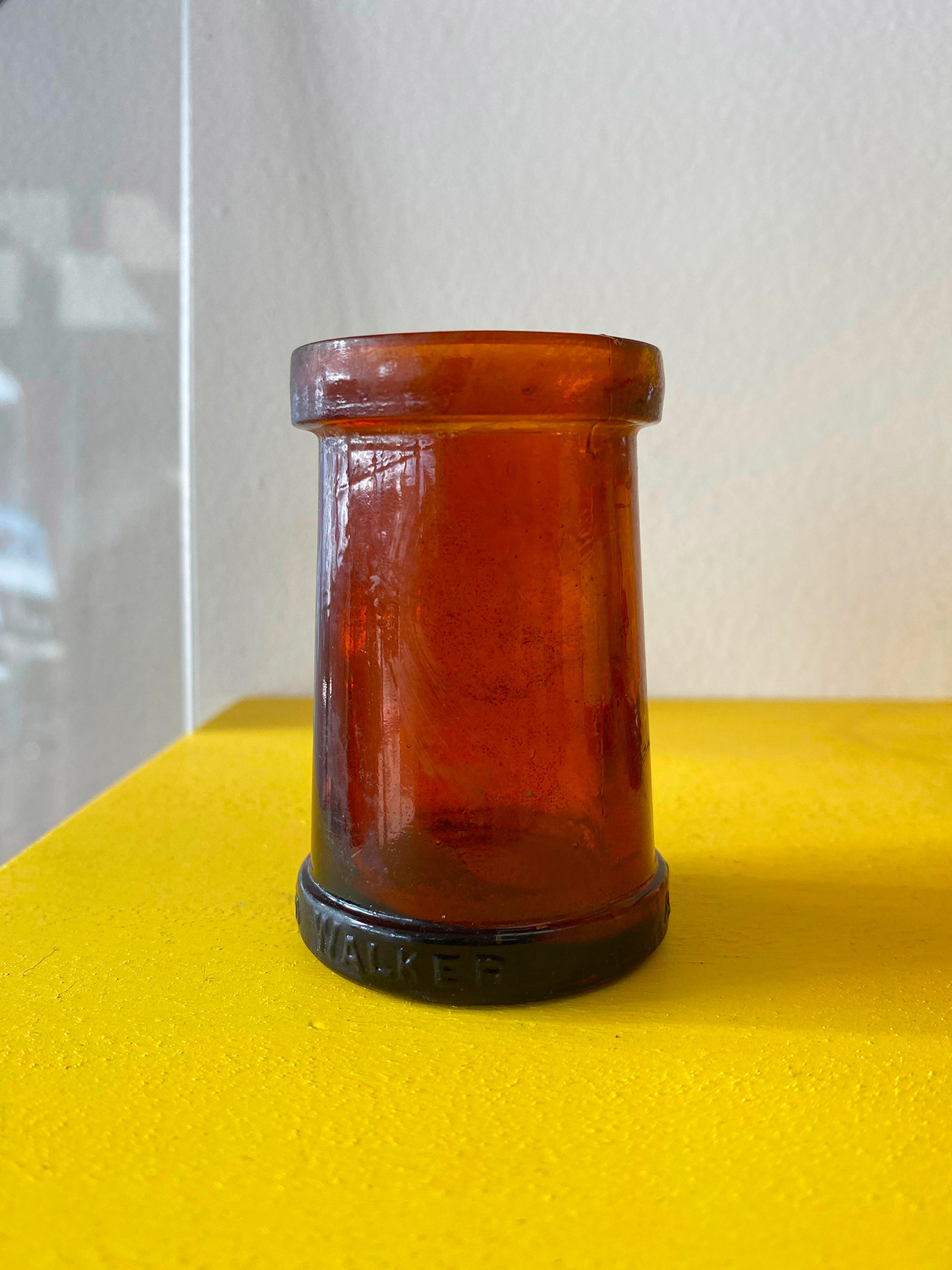
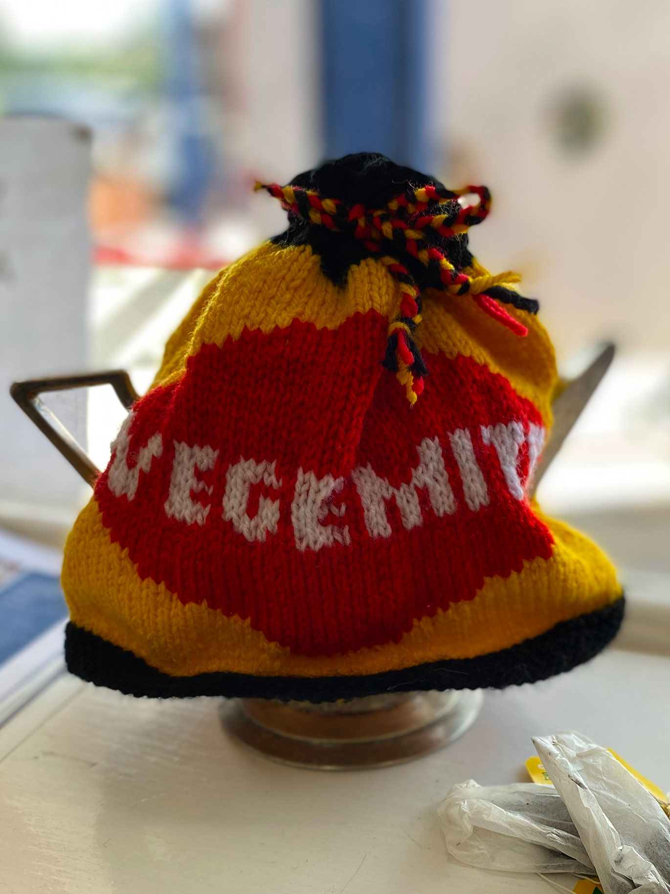
In ‘Symbols of Australia’ by Mimmo Cozzolino and Fysh Rutherford, an advertisement features the dark amber-coloured jar used to package Vegemite in 1923 or 1924. It includes a diamond-shape on its label.
The museum has a small 1950s-era jar which originally contained Vegemite — given to new mothers at the Tweddle Hospital for Babies in Footscray. The label is ripped and faded, but but that familiar shape is still there.
How many other Australian Brands have retained the same elements for 100 years?
Let’s say Happy Birthday to an iconic black spread—Vegemite! 


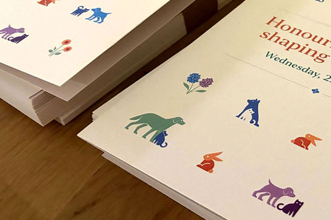
Lort Smith is the busiest animal hospital in Australia, seeing more than 25,000 animals each year for services ranging from vaccinations to orthopaedic surgery.
In corporate event branding, you’re often working with a company’s brand guidelines.
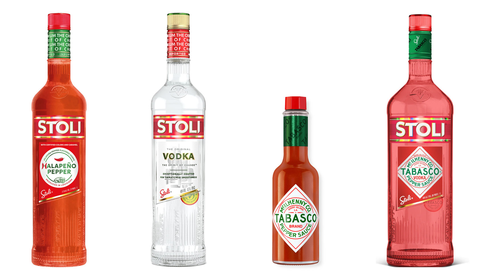
Have you ever heard ‘Change a logo by 10% and then you can legally use it’? We take a look at 2 examples involving Taylor Swift and Tabasco and explain why this is a myth.
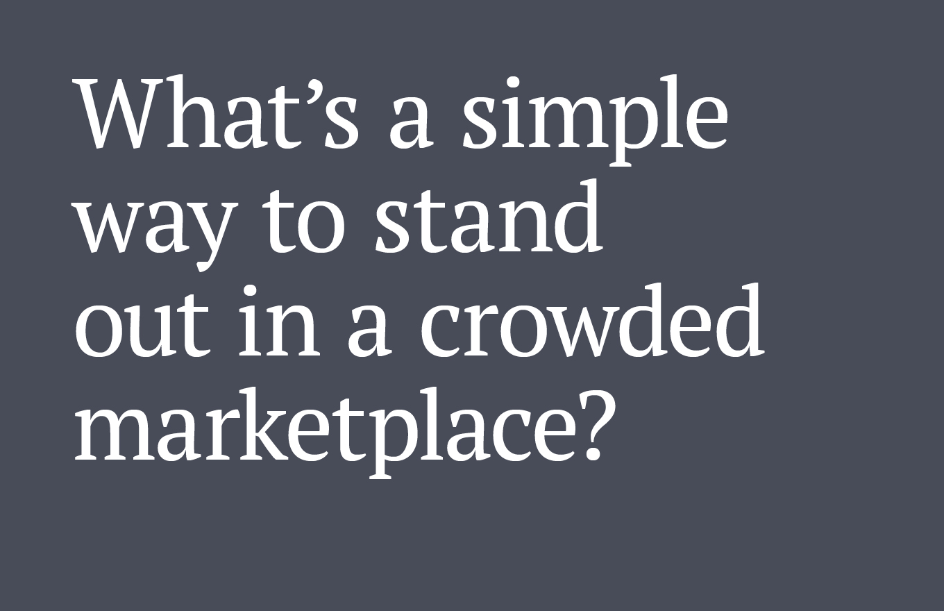
Whatever the brief is, it’s exactly the same. Every project. Every time. Every design. It‘s just one word.
It’s that time of year when we start looking forward to the end of the working year, changes in the seasons, and celebrations over the New year…
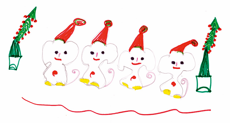
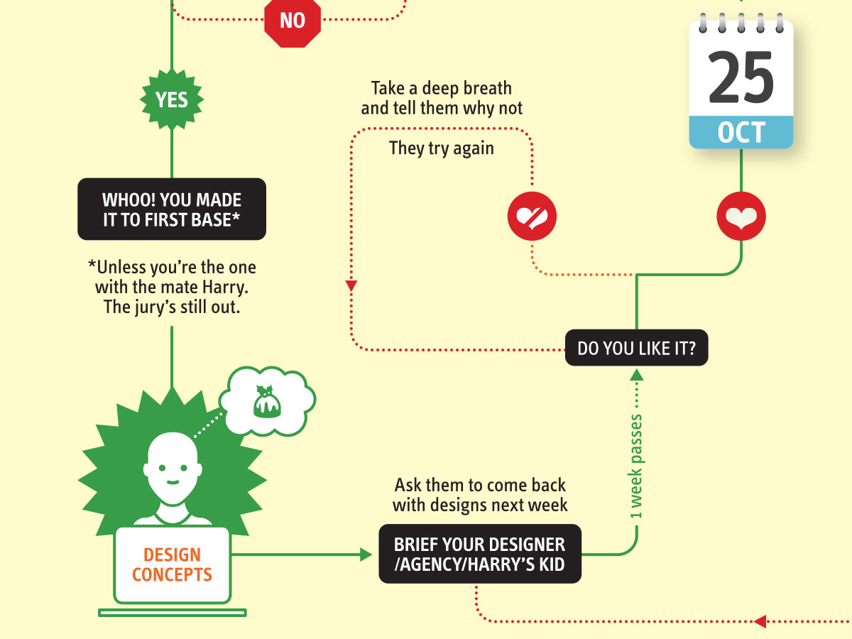
Sometimes it can be hard to think of Christmas Cards (especially when the holiday season is months away). So we present a few ideas to get your creative minds sparking…


