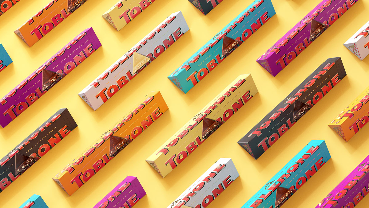
Don’t panic – their signature mountain/hidden bear hasn’t disappeared.
– a rejuvenated and quirky wordmark, inspired by the original Toblerone lettering (drooling over the gorgeous ‘O’ and ‘R’).
– a piece of the iconic triangular chocolate front and centre (neatly showcasing the ingredients…yumm).
– the wordmark split across panels.
– a streamlined mountain illustration that still features the not-so-secret bear.
– the colour palette, especially the red and purple colour combo!
– the Tobler script is particularly lovely – cleverly echoing the founder Theodor Tobler’s signature.
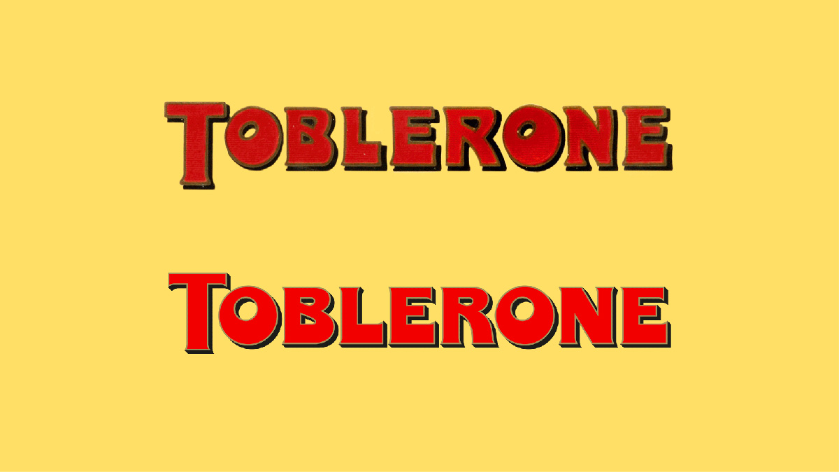
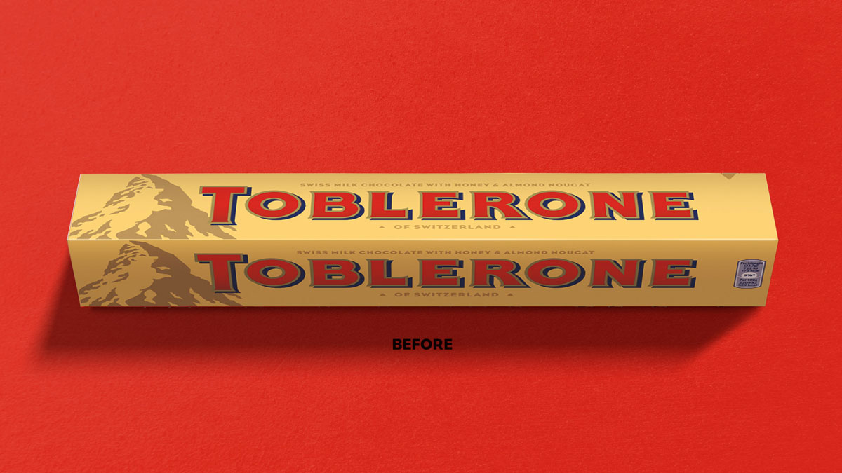
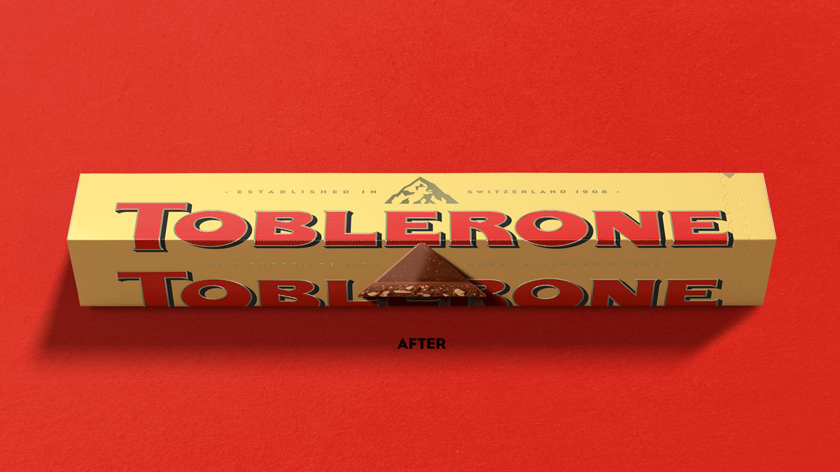

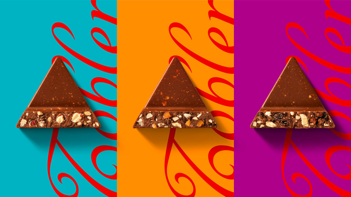
This is a brilliant example of a well-known retail brand both modernising its brand and packaging, whilst referencing its heritage and company history. Kudos to UK-based agency Bulletproof.
The new brand is being rolled out globally in the coming months (it’s already in our local supermarkets).
Images courtesy of Bulletproof.


In corporate event branding, you’re often working with a company’s brand guidelines.
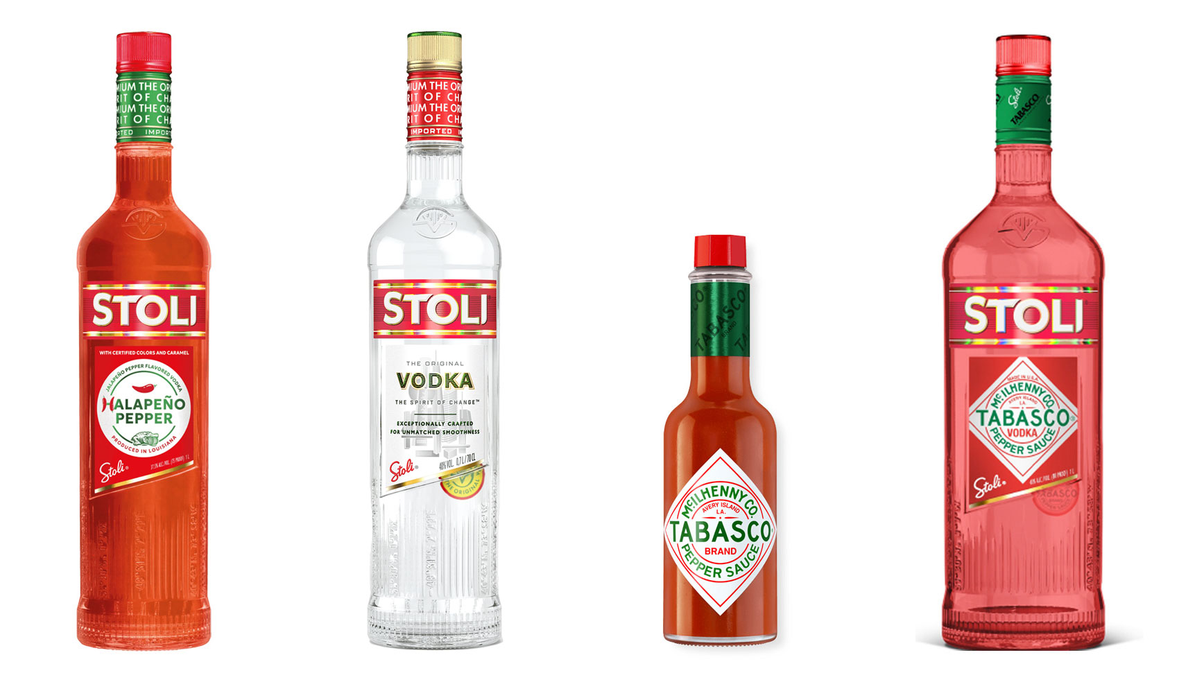
Have you ever heard ‘Change a logo by 10% and then you can legally use it’? We take a look at 2 examples involving Taylor Swift and Tabasco and explain why this is a myth.
Whatever the brief is, it’s exactly the same. Every project. Every time. Every design. It‘s just one word.
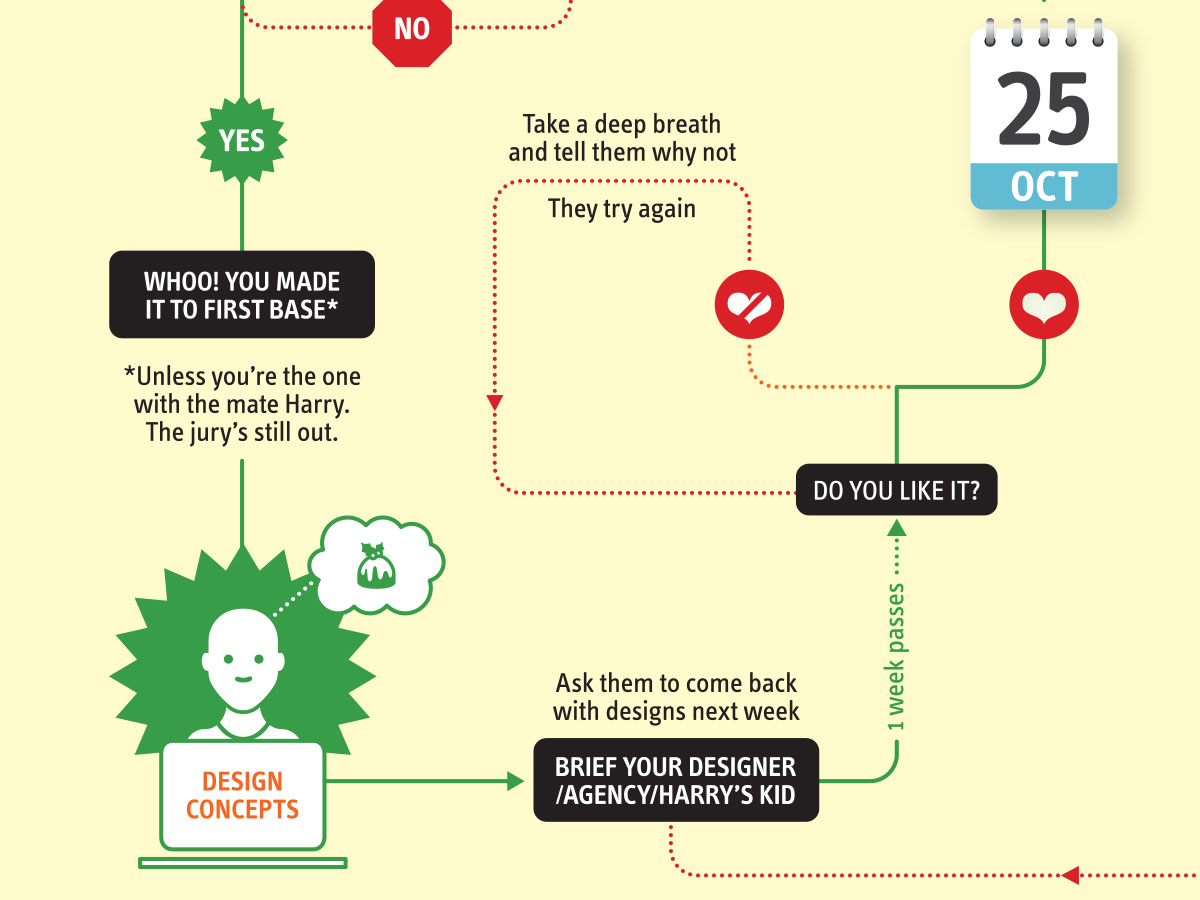
It’s that time of year when we start looking forward to the end of the working year, changes in the seasons, and celebrations over the New year…
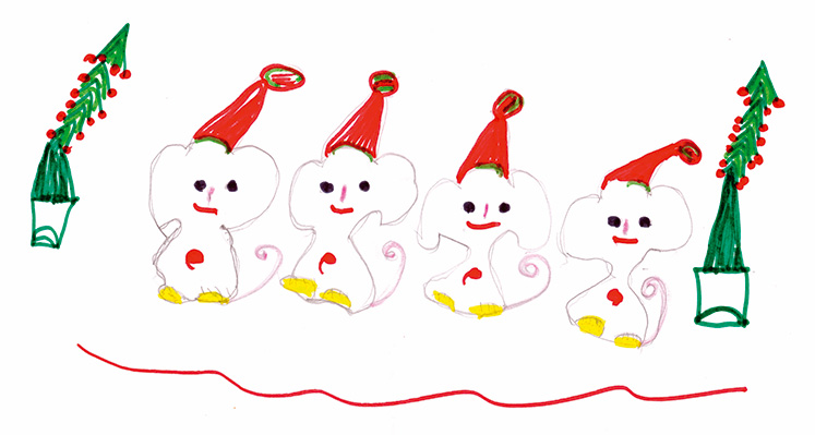
Sometimes it can be hard to think of Christmas Cards (especially when the holiday season is months away). So we present a few ideas to get your creative minds sparking…

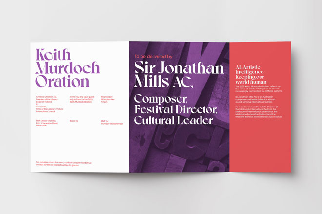
For the 2024 President’s Dinner event at State Library Victoria, we created two visual concepts.
This is the concept that didn’t make the cut, and we share some of the additional printing and finishing details.
Email hello@brandbyname.com.au
or call +61 3 8658 7744
105 Wellington St,
St Kilda VIC 3182
© 2025 Brand by Name™

Subscribe to our monthly newsletter — Brand News — filled with Design tips, Creativity hacks, Brand news and Design-related goodness.