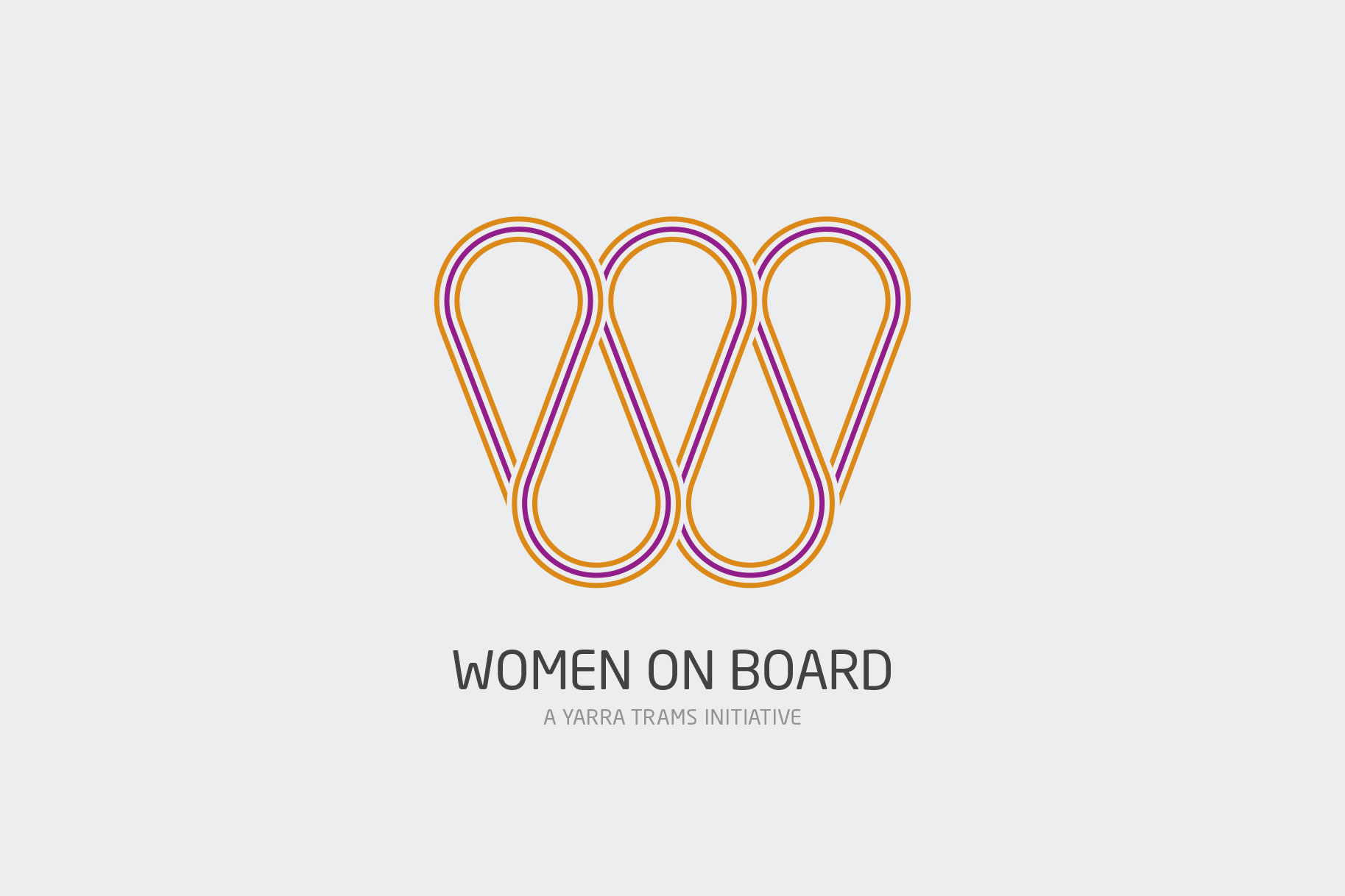
‘Women on Board’ is an internal communication initiative of Yarra Trams.
Traditionally a male-dominated workplace, the company wanted to support female workers with a range of initiatives to improve their day-to-day working environment.
Brand By Name created a brand identity that would include all female employees, whether at head office or in customer service, operations staff or tram drivers.


Yarra Trams
– Brand Identity
– Event Branding
– Print Design
– Print Management
We were intrigued by the concept of ‘connection’ and the dual ways in which Yarra Trams offers this connection, in both delivering customers to their destinations and the connection between women that the company was looking to foster.
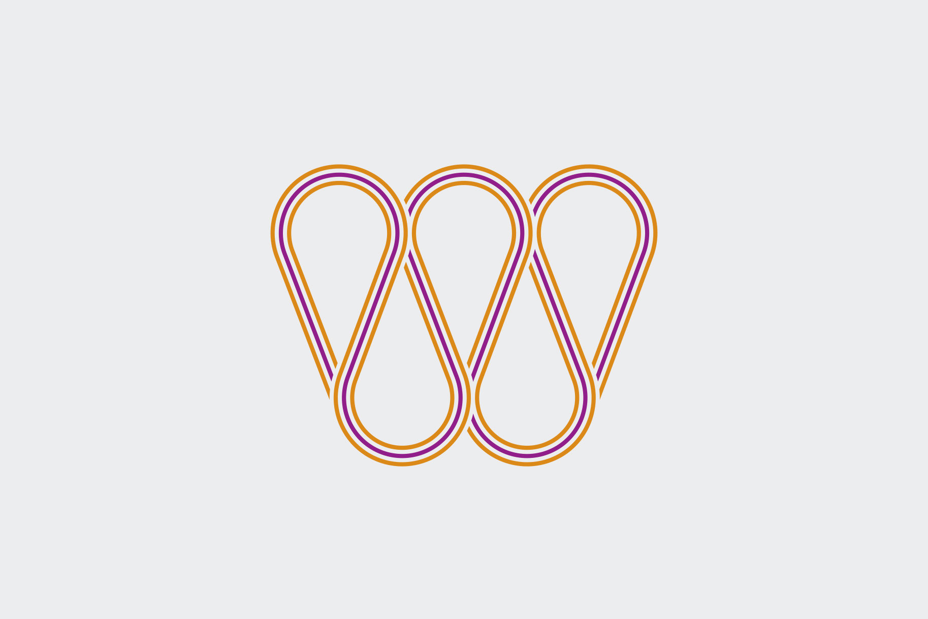
The starting visual was the tram network map, with its bright colours stretching all over Melbourne. We developed the idea further by creating a ‘W’ mark from sinuous lines folding in and over each other, representing strength and flexibility.
As for colour, inspiration came from a two totally unrelated sources.
The orange was inspired by the similarly coloured tram routes which stretch over the network: North West—City (#57), East—West (#48) and North—South (#1). And the purple was chosen because it’s one of the traditional feminist colours. As a bonus, it was the colour of our client’s favourite brand of macarons’ gift box.


Email hello@brandbyname.com.au
or call +61 3 8658 7744
105 Wellington St,
St Kilda VIC 3182
© 2025 Brand by Name™

Subscribe to our monthly newsletter — Brand News — filled with Design tips, Creativity hacks, Brand news and Design-related goodness.