Why do many great logos look oh-so-simple?

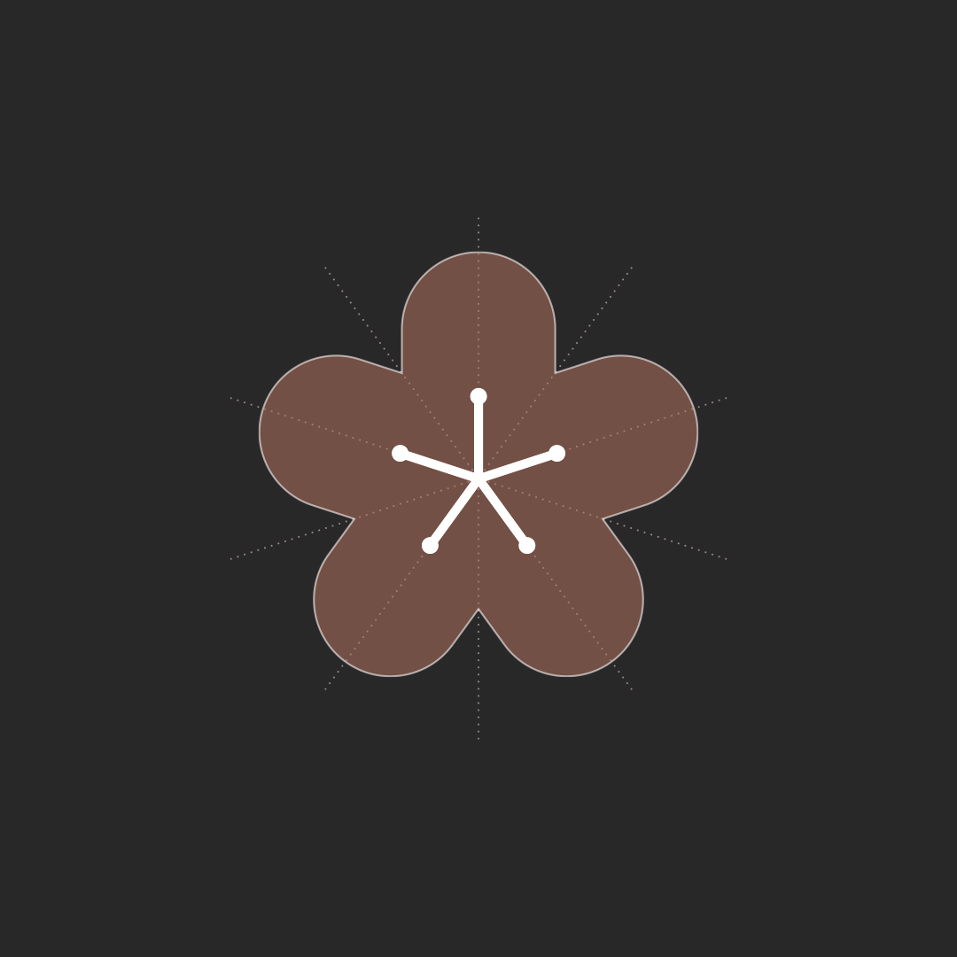
Take this logomark for an aged care brand.

The outer shape encloses a 5-pointed star from the original brand identity. The inner shape represents the importance of the individual within the larger organisation.

This concept didn’t make the final cut, but the images are a good example of the craft that underpins a logomark (similar to an architect’s building plans).

Starting with the star, lozenge shapes were drawn around the points, then sliced and diced to create the final shape. Then a 5-pointed inner shape was created, and tiny dots were added to soften the sharp lines.

Next time you say ‘that’s so simple, I could have done that in 5 minutes’ … think about the time it took you to read this post, let alone how long the designer took to ensure the shapes, line work and dots were EXACTLY the right size, the lozenges were JUST the right width.

And don’t get us started about coming up with idea in the first place. That’s an entirely different (and much longer) post!

Recent posts

When Brand By Name made branding irons

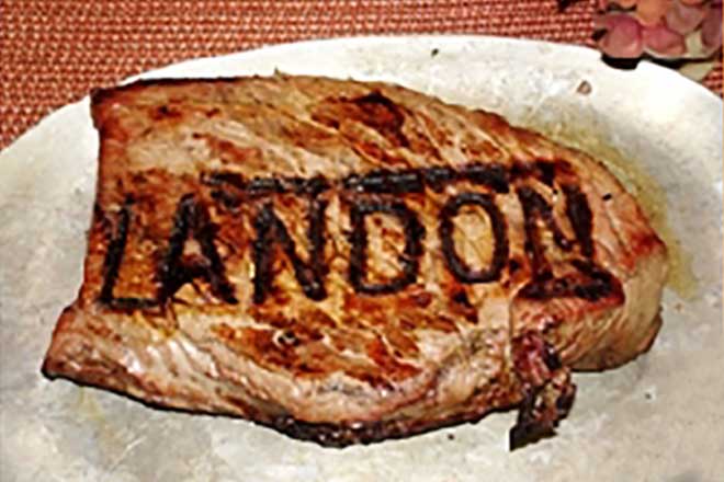
Way back in 2010, Brand By Name made branding irons. In Oregon USA, a (different) Brand By Name sold personalised irons for your favourite barbecued meal.
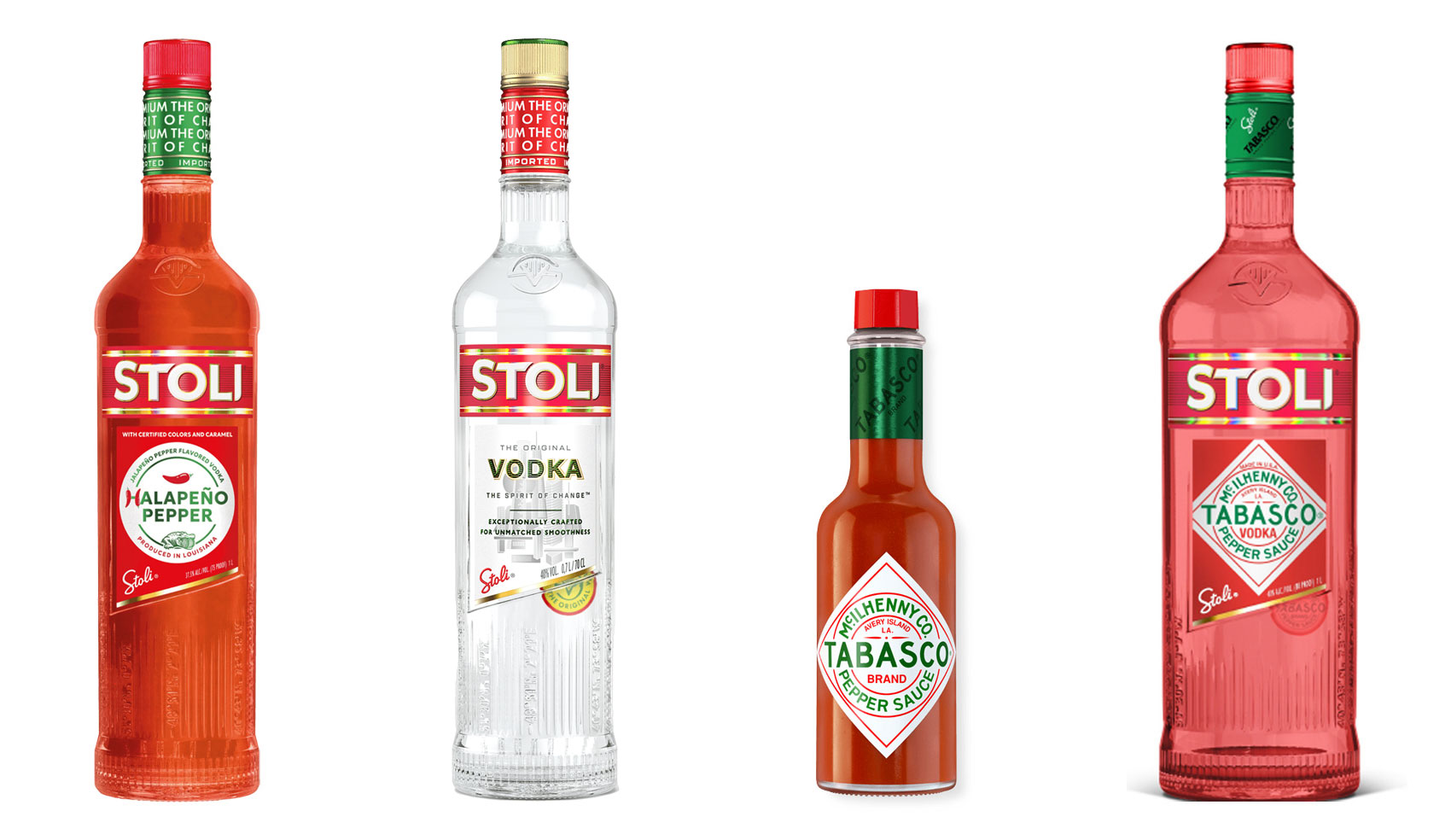
Halapeno Vodka from Stoli, standard Stoli bottle, Tabasco sauce bottle, mockup of a collaboration between Tabasco and Stoli

The 10% Myth

Have you ever heard ‘Change a logo by 10% and then you can legally use it’? We take a look at 2 examples involving Taylor Swift and Tabasco and explain why this is a myth.
Christmas Card Preparation Flow Chart

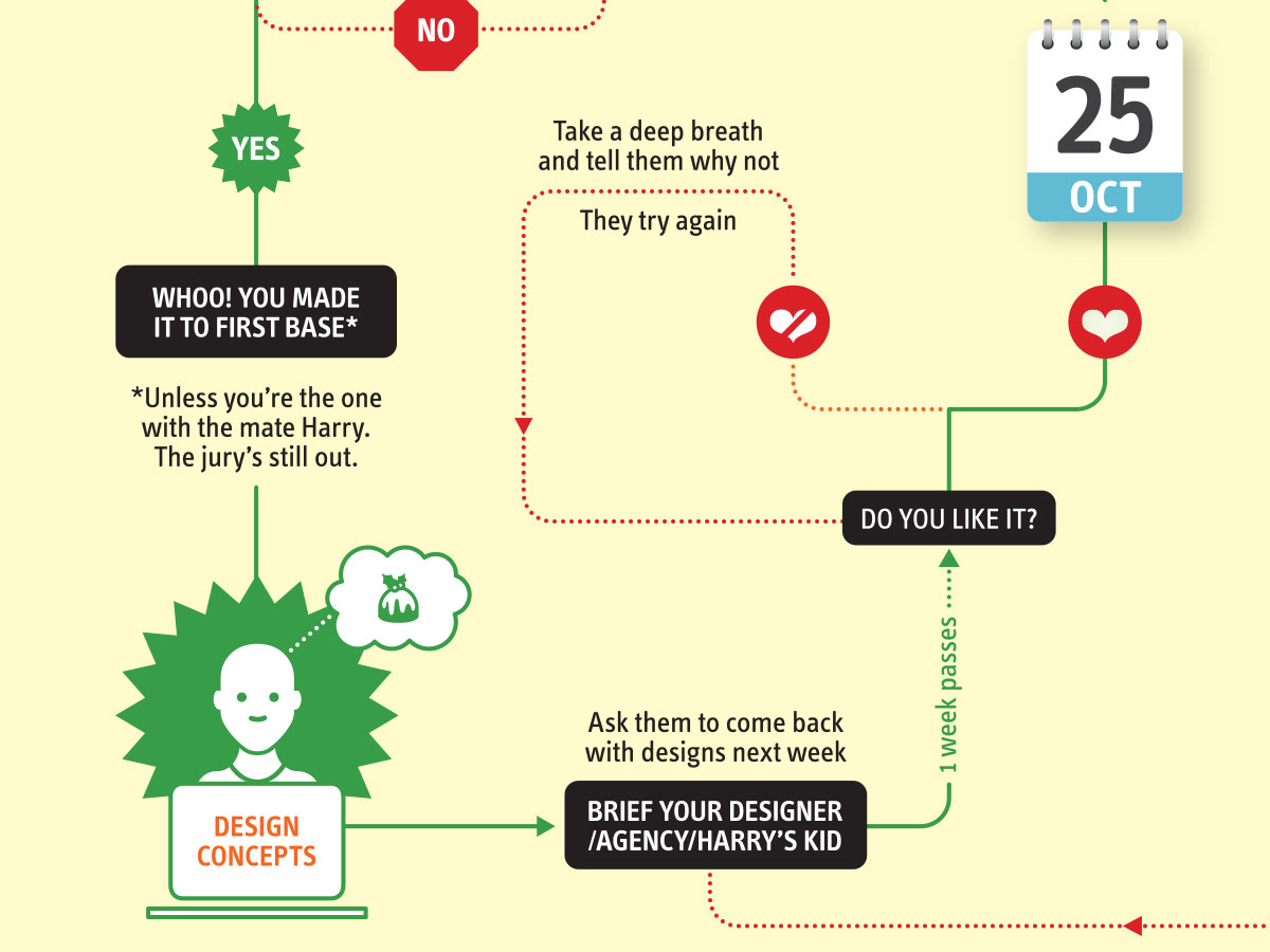
It’s that time of year when we start looking forward to the end of the working year, changes in the seasons, and celebrations over the New year…

Follow on Instagram

Connect on LinkedIn

Sign up to our newsletter

Subscribe!

Subscribe to our monthly newsletter — Brand News — filled with Design tips, Creativity hacks, Brand news and Design-related goodness.