
A brand experience needs more than good design. It is a commitment to reducing every friction point between customer and client.
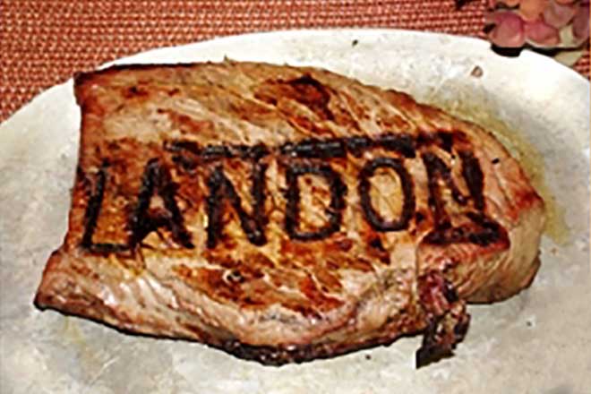
Way back in 2010, Brand By Name made branding irons. In Oregon USA, a (different) Brand By Name sold personalised irons for your favourite barbecued meal.
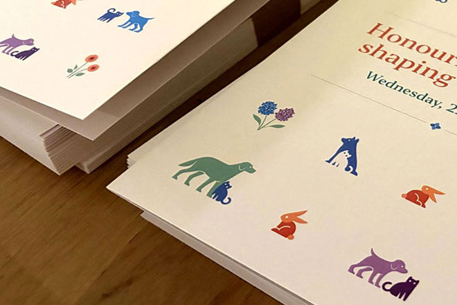
Lort Smith is the busiest animal hospital in Australia, seeing more than 25,000 animals each year for services ranging from vaccinations to orthopaedic surgery.
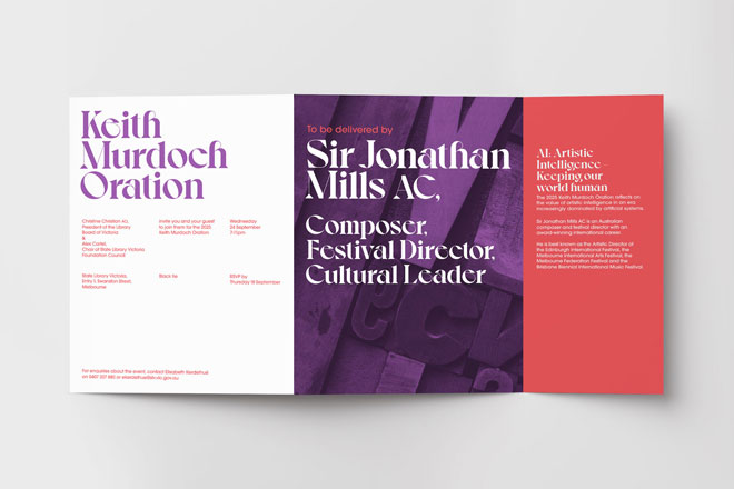
In corporate event branding, you’re often working with a company’s brand guidelines.
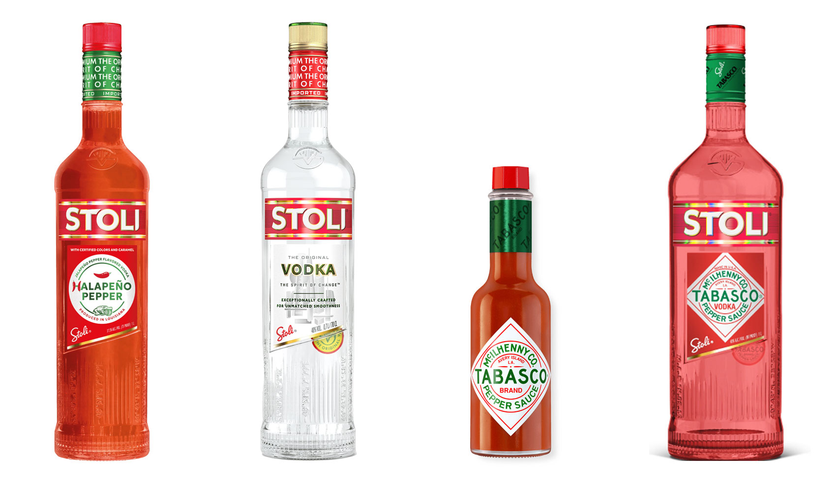
Have you ever heard ‘Change a logo by 10% and then you can legally use it’? We take a look at 2 examples involving Taylor Swift and Tabasco and explain why this is a myth.
Whatever the brief is, it’s exactly the same. Every project. Every time. Every design. It‘s just one word.