












Here’s something new – a book review.

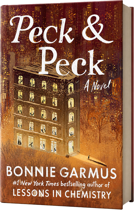
Book cover of the US edition of ‘Peck & Peck’
US Edition cover
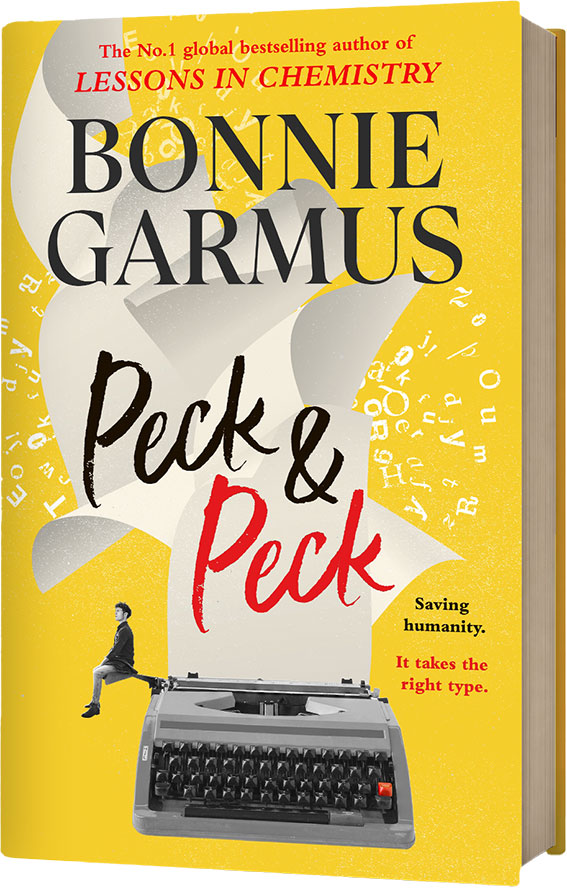
Book cover of the UK edition of ‘Peck & Peck’
UK Edition cover

The book in question is Peck & Peck, by Bonnie Garmus—her previous book was Lessons in Chemistry. You might have heard of it.


Why review this book?

Because of one simple thing:
The main protagonist’s mother—Rainey—is a Typeface Designer.

Have you ever read a book before that features a Typeface Designer? We can’t recall a single one.

Were we excited to read it? Hell to the yes.

Did it disappoint? Nope.

Because Rainey is FUNNY. Her dialogue inevitably features typeface comments or criticism, which we adored.


Here’s some examples (no spoilers):

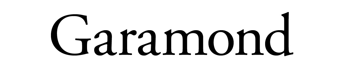
‘Publish that in Garamond and you basically look like a slobbering idiot.’

‘Is it the one with the incredibly uninspired use of Caslon, or the one that substituted Baskerville for Sabon?’


It’s a 10/10 for the type talk alone.

For anyone not overly interested in typeface nerdiness, it (currently) has 4.14 stars on Goodreads and 4.1 on The StoryGraph.  


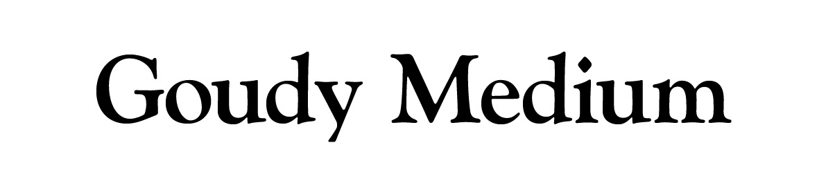
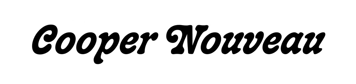
The typefaces

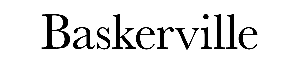
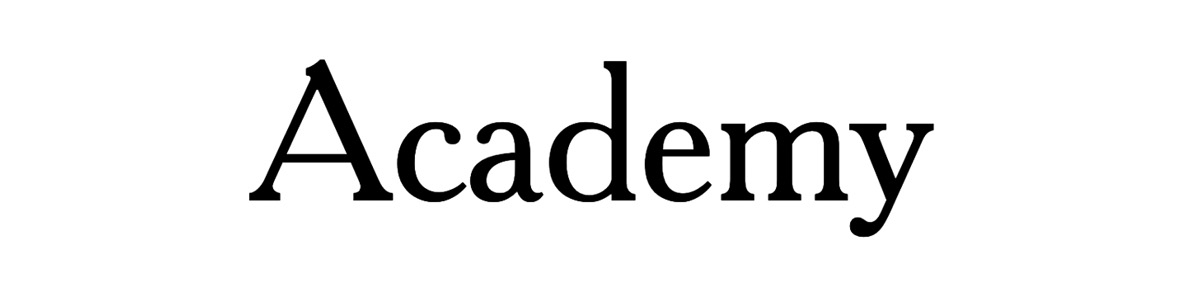
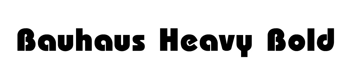
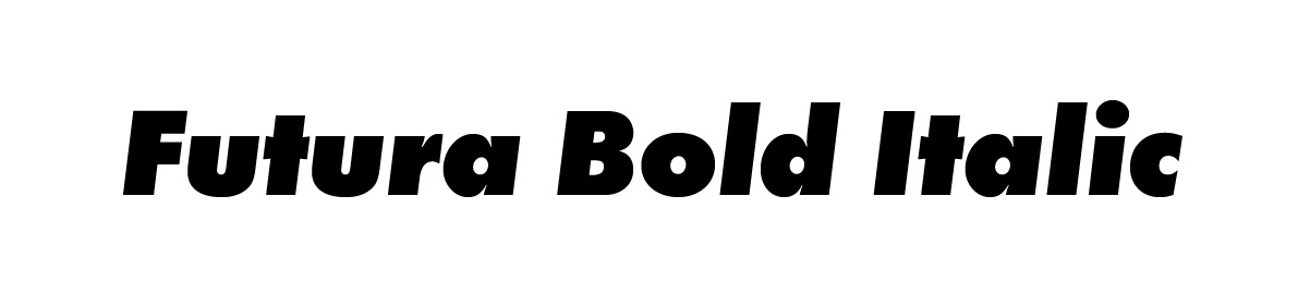
You shouldn’t be surprised we noted every single typeface in the book. Here they are, in order of appearance:


Want to talk type? Let’s chat.

Recent posts

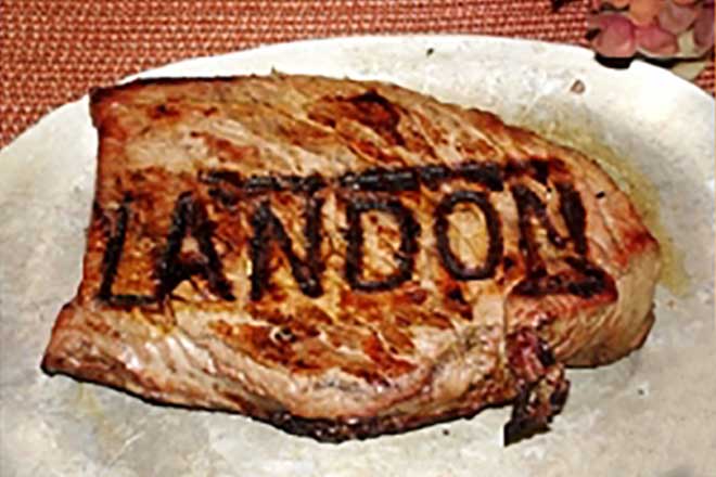
When Brand By Name made branding irons

Way back in 2010, Brand By Name made branding irons. In Oregon USA, a (different) Brand By Name sold personalised irons for your favourite barbecued meal.
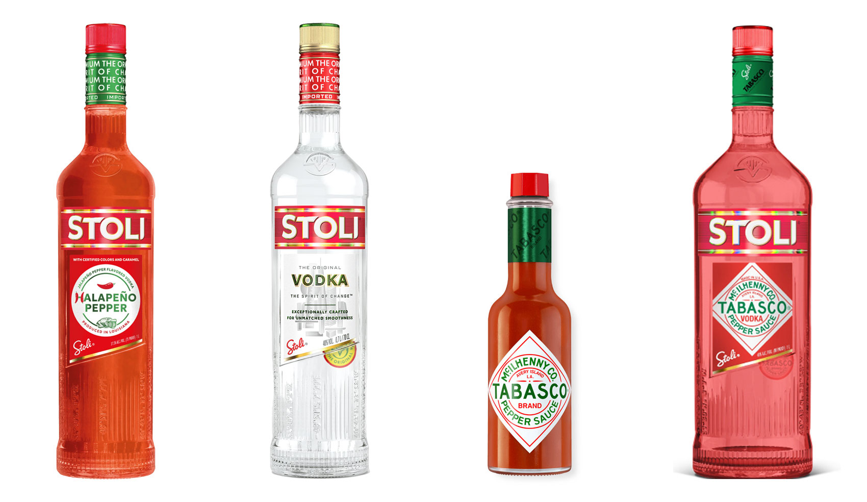
Halapeno Vodka from Stoli, standard Stoli bottle, Tabasco sauce bottle, mockup of a collaboration between Tabasco and Stoli

The 10% Myth

Have you ever heard ‘Change a logo by 10% and then you can legally use it’? We take a look at 2 examples involving Taylor Swift and Tabasco and explain why this is a myth.
Follow on Instagram

Connect on LinkedIn

Sign up to our newsletter

Subscribe!

Subscribe to our monthly newsletter — Brand News — filled with Design tips, Creativity hacks, Brand news and Design-related goodness.