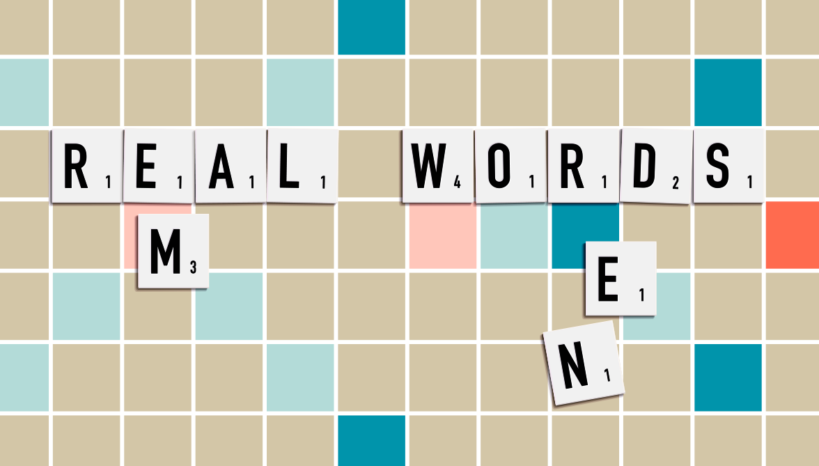
If you were a printer using the moveable type system developed by Johannes Gutenburg, a letter was referred as a ‘sort’. If you were ‘out of sorts’ you had run out of a letter you needed.
One of the most hated jobs was to distribute, or dis, the type, back into the case. The job was often given to an apprentice compositor.
Historically, blocks of type had to be set upside down and backwards. So a typesetter had to be careful to use the right letter, or receive a nasty surprise when the (at the time, very expensive) paper had to be thrown out because an incorrect letter had been selected.
So next time you have a few too many letter ‘E’s, remember those ems and ens.
An em is the width of an uppercase letter M, an en is the width of the capitol letter N.

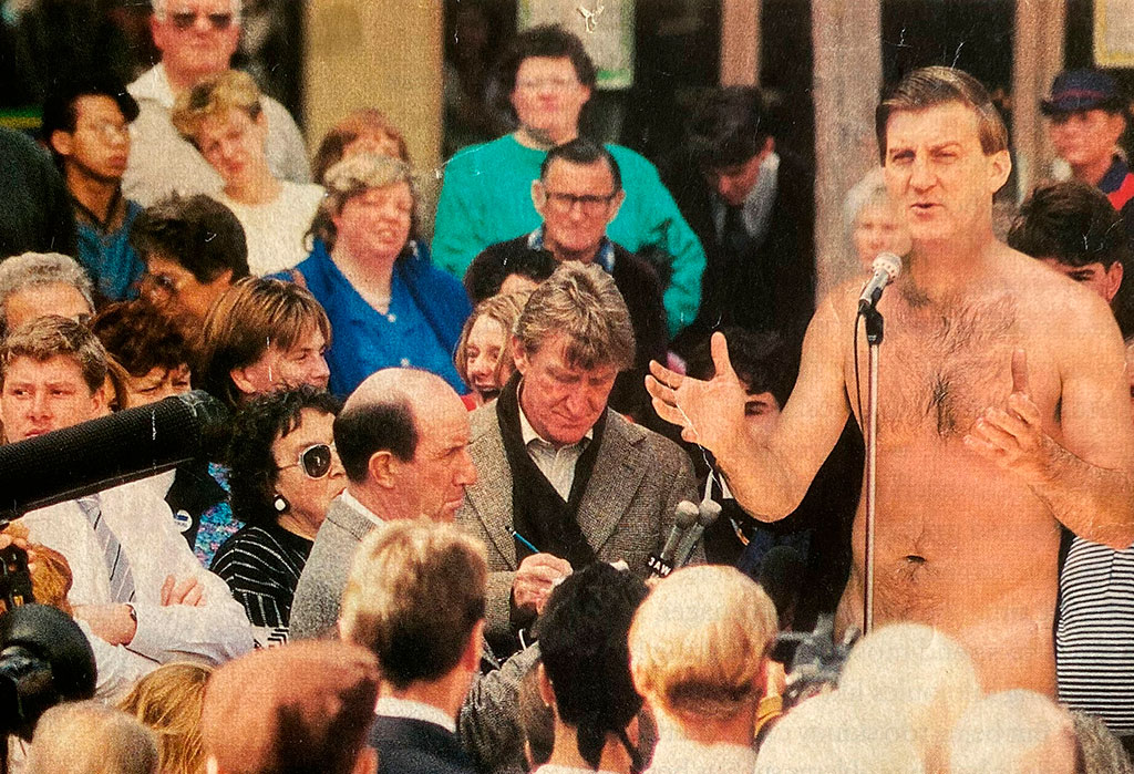
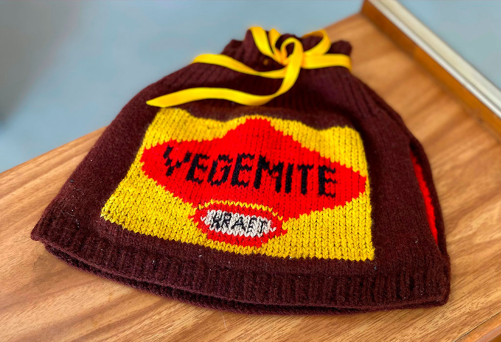
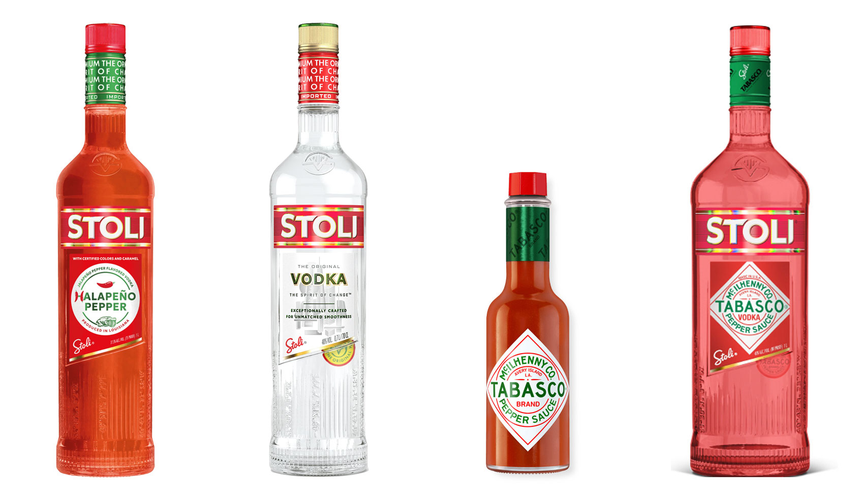
Have you ever heard ‘Change a logo by 10% and then you can legally use it’? We take a look at 2 examples involving Taylor Swift and Tabasco and explain why this is a myth.
Whatever the brief is, it’s exactly the same. Every project. Every time. Every design. It‘s just one word.
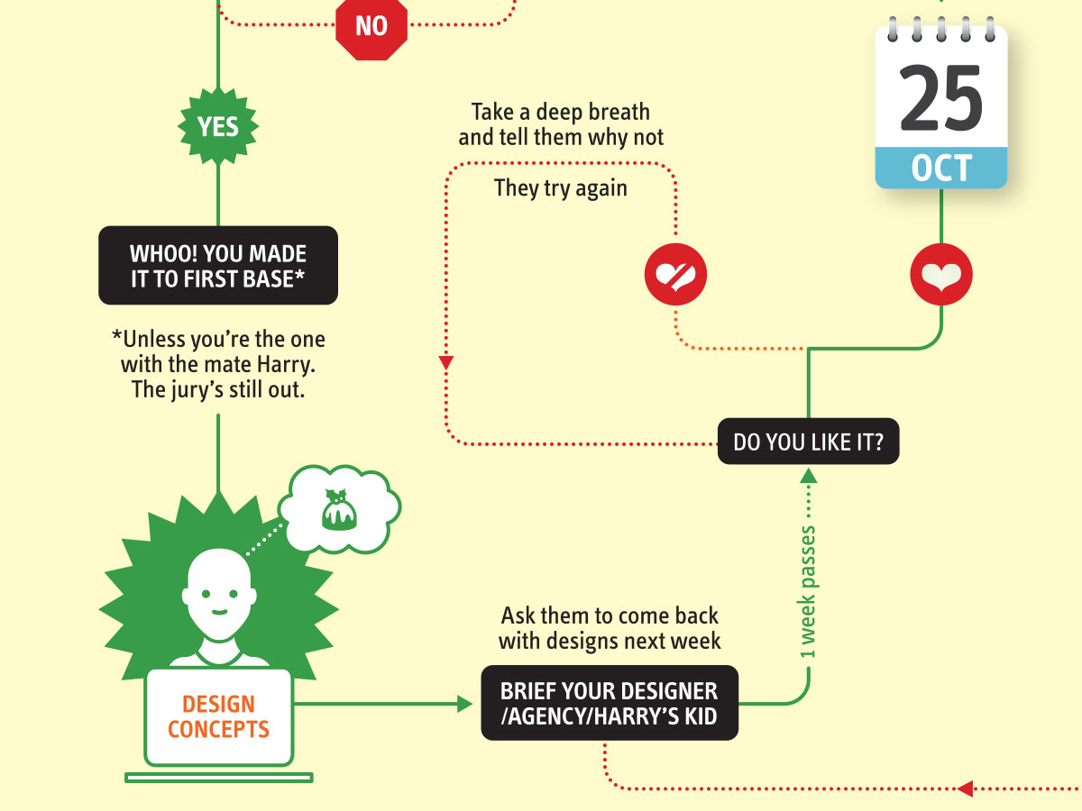
It’s that time of year when we start looking forward to the end of the working year, changes in the seasons, and celebrations over the New year…
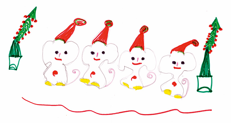
Sometimes it can be hard to think of Christmas Cards (especially when the holiday season is months away). So we present a few ideas to get your creative minds sparking…

For the 2024 President’s Dinner event at State Library Victoria, we created two visual concepts.
This is the concept that didn’t make the cut, and we share some of the additional printing and finishing details.

We have 3 rules when designing merch / swag / promotional gifts: 1. Sustainable
2. Usable
3. Quality
Email hello@brandbyname.com.au
or call +61 3 8658 7744
105 Wellington St,
St Kilda VIC 3182
© 2025 Brand by Name™
Subscribe to our monthly newsletter — Brand News — filled with Design tips, Creativity hacks, Brand news and Design-related goodness.