Typically when we undertake a brand identity project, we start with a multitude of sketches and narrow them down to two or three solutions we feel best answer the brief. After a presentation to our client, we usually agree on one idea to develop further.
The answer is… nothing really. They take a back seat and soon become a distant memory in our design archives. So we thought we would show you a few of these from a recent identity project we completed for Yarra Trams – ‘Women on Board’ brand identity.
This concept used the shape of the W with silhouettes to convey Yarra Trams’ inclusive, welcoming environment. There wasn’t anything particularly wrong with this concept that contributed to its rejection— the client just liked the winning idea better.


This concept was the ‘riskier’ or more ‘out-there’ idea, and was never a real contender. The design applications of the identity were exciting – our client loved the badges, and how different heads could be used on print collateral. But the illustrations of only women’s heads within the mark might be seen to be promoting exclusivity, and this concept was duly canned.
![]()
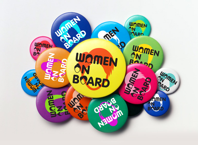


So which concept won the race? You can see the winner here.
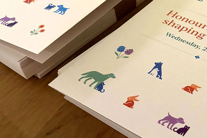
Lort Smith is the busiest animal hospital in Australia, seeing more than 25,000 animals each year for services ranging from vaccinations to orthopaedic surgery.
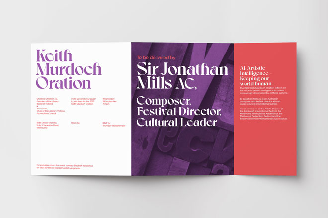
In corporate event branding, you’re often working with a company’s brand guidelines.
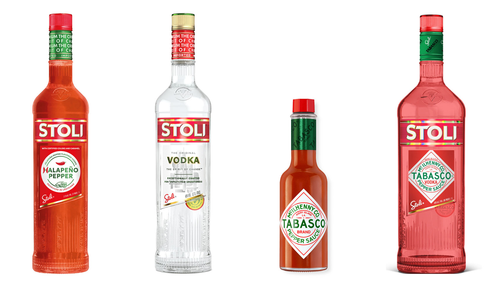
Have you ever heard ‘Change a logo by 10% and then you can legally use it’? We take a look at 2 examples involving Taylor Swift and Tabasco and explain why this is a myth.
Whatever the brief is, it’s exactly the same. Every project. Every time. Every design. It‘s just one word.
It’s that time of year when we start looking forward to the end of the working year, changes in the seasons, and celebrations over the New year…
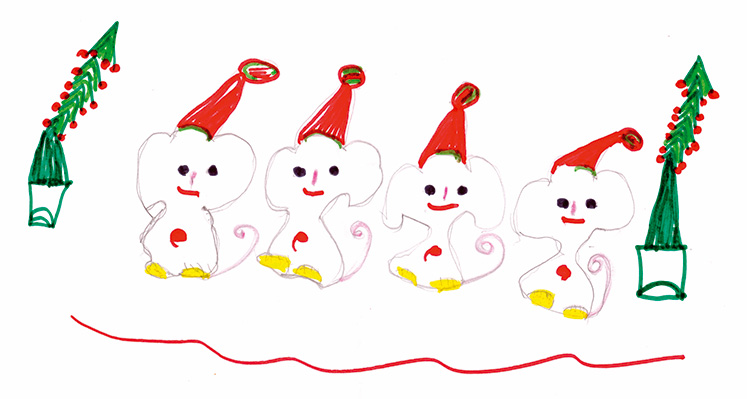
Sometimes it can be hard to think of Christmas Cards (especially when the holiday season is months away). So we present a few ideas to get your creative minds sparking…