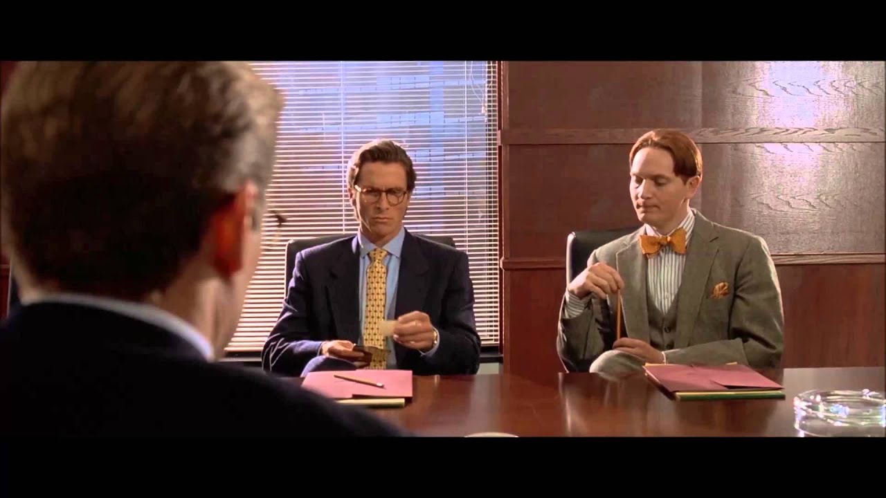

Investment banker Patrick Bateman and his equally narcissistic colleagues sit at a boardroom table comparing business cards.
But the cards themselves? They‘re downright awful.
Let’s talk about Graphic Designers working in the film industry for a second. They read behind the lines of the script, creating multiple versions of ephemera. If a character has to rip something, they’ll produce enough for the actor to shoot the scene multiple times.
Plus, they need to be good spellers.
Take the pink Mendl boxes in the film The Grand Budapest Hotel. There’s a spelling mistake in all of them. They printed 3,000 boxes with ‘pâtisserie’ spelt incorrectly (fixed in post-production).
But we digress. Let’s review the business cards in American Psycho:
• There’s too much space at the top and not enough at the base
• The margins aren’t equal
• There’s the same spelling mistake in all the cards (Acquisitions should have a ‘c’)
• The typefaces are bland and the kerning (spacing between letters) is abominable
• The centred text isn’t really centred
• Patrick’s card has an additional mistake – there’s a missing space between the ampersand and the Mergers text
Business cards are physically small. But size doesn’t mean you should ignore their potential.
They say a great deal about you, and are often the only reminder of your business after you’ve meet a potential client, supplier or contact.
As the saying goes, there’s only one chance for a first impression.
Make it count.


Have you ever heard ‘Change a logo by 10% and then you can legally use it’? We take a look at 2 examples involving Taylor Swift and Tabasco and explain why this is a myth.

Whatever the brief is, it’s exactly the same. Every project. Every time. Every design. It‘s just one word.

It’s that time of year when we start looking forward to the end of the working year, changes in the seasons, and celebrations over the New year…

Sometimes it can be hard to think of Christmas Cards (especially when the holiday season is months away). So we present a few ideas to get your creative minds sparking…

For the 2024 President’s Dinner event at State Library Victoria, we created two visual concepts.
This is the concept that didn’t make the cut, and we share some of the additional printing and finishing details.

We have 3 rules when designing merch / swag / promotional gifts: 1. Sustainable
2. Usable
3. Quality
Email hello@brandbyname.com.au
or call +61 3 8658 7744
105 Wellington St,
St Kilda VIC 3182
© 2025 Brand by Name™

Subscribe to our monthly newsletter — Brand News — filled with Design tips, Creativity hacks, Brand news and Design-related goodness.