Are you a marketer looking to persuade audiences to decide, donate, share, contribute or purchase? Here’s three great reasons to choose infographics:
1. They are visually appealing
— Humans are visual by nature, and infographics take data and make it easily understood.
2. They are logical
— Data driven infographics provide the solid facts that appeal to the logical side of our brains.
3. They are evergreen
— You can create an infographic that can be regularly shared, linked to and circulated for months, even years after launch.
Client
Australian Beverages Council
Services
– Infographics
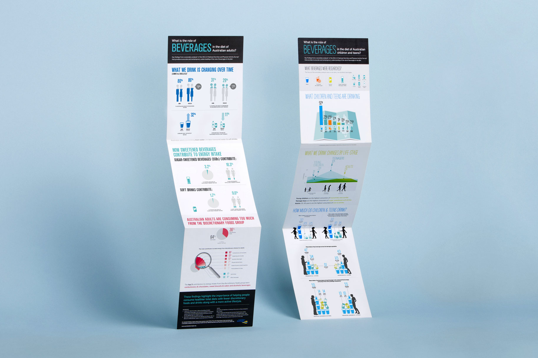
What Australians are drinking
The Australian Beverages Council conducted extensive research into the changing drinking habits of Australians. We created an infographic for numerous stakeholders, including media, members, MPs, doctors, nutritionists, dieticians and other wellbeing experts.
It also helped position the Australian Beverage Council as a leading source of research into changing trends in non-alcoholic beverage consumption.
Silhouettes and shades of colour
The use of well-placed graphic elements directed the reader’s eye to the most important aspects of the research. The colour palette allocated one colour to each research subject, thus visually signalling a new point of research with each change of colour.
Within each data subset, the use of faded and darker colours aptly indicated corresponding increases or decreases in consumption.
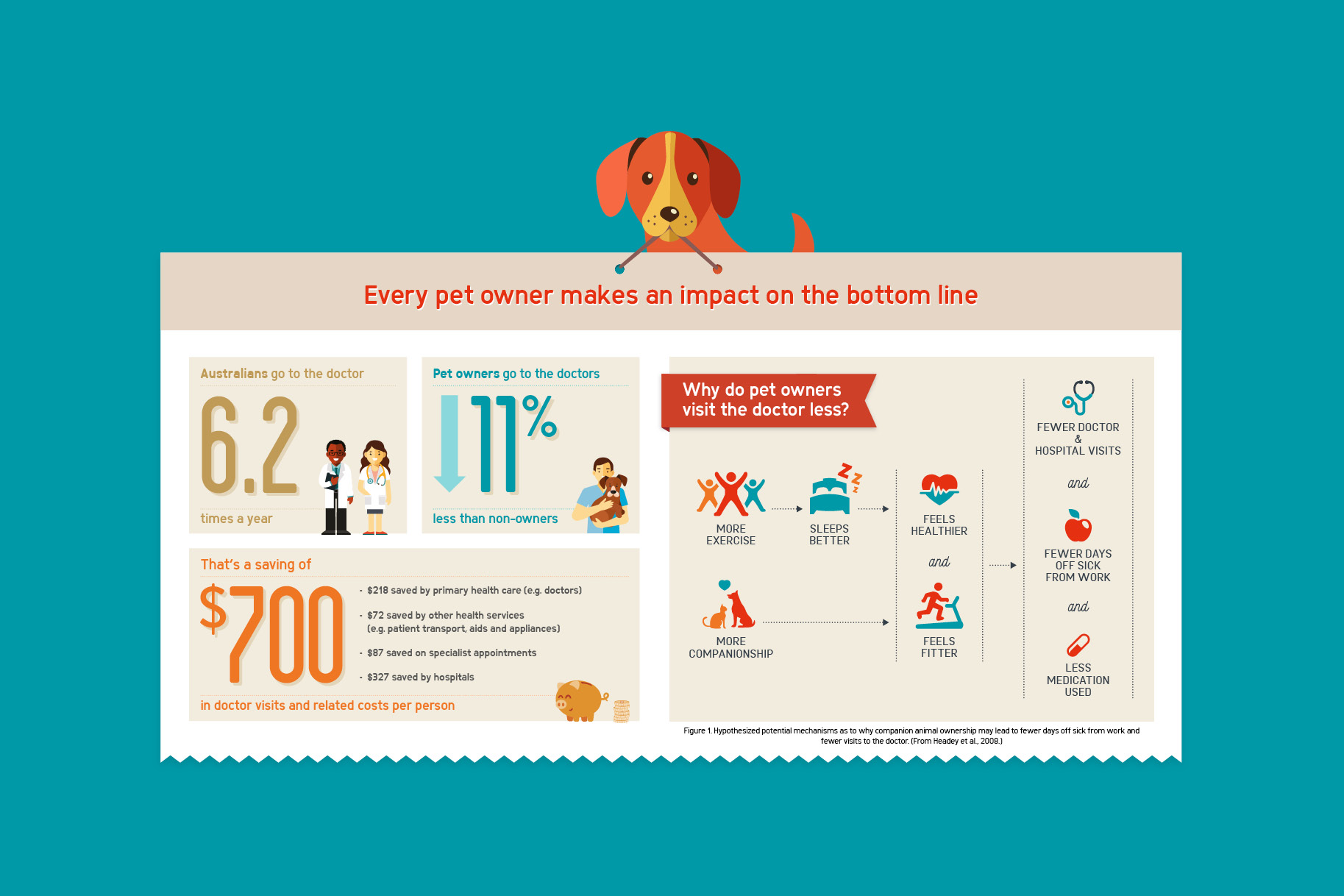
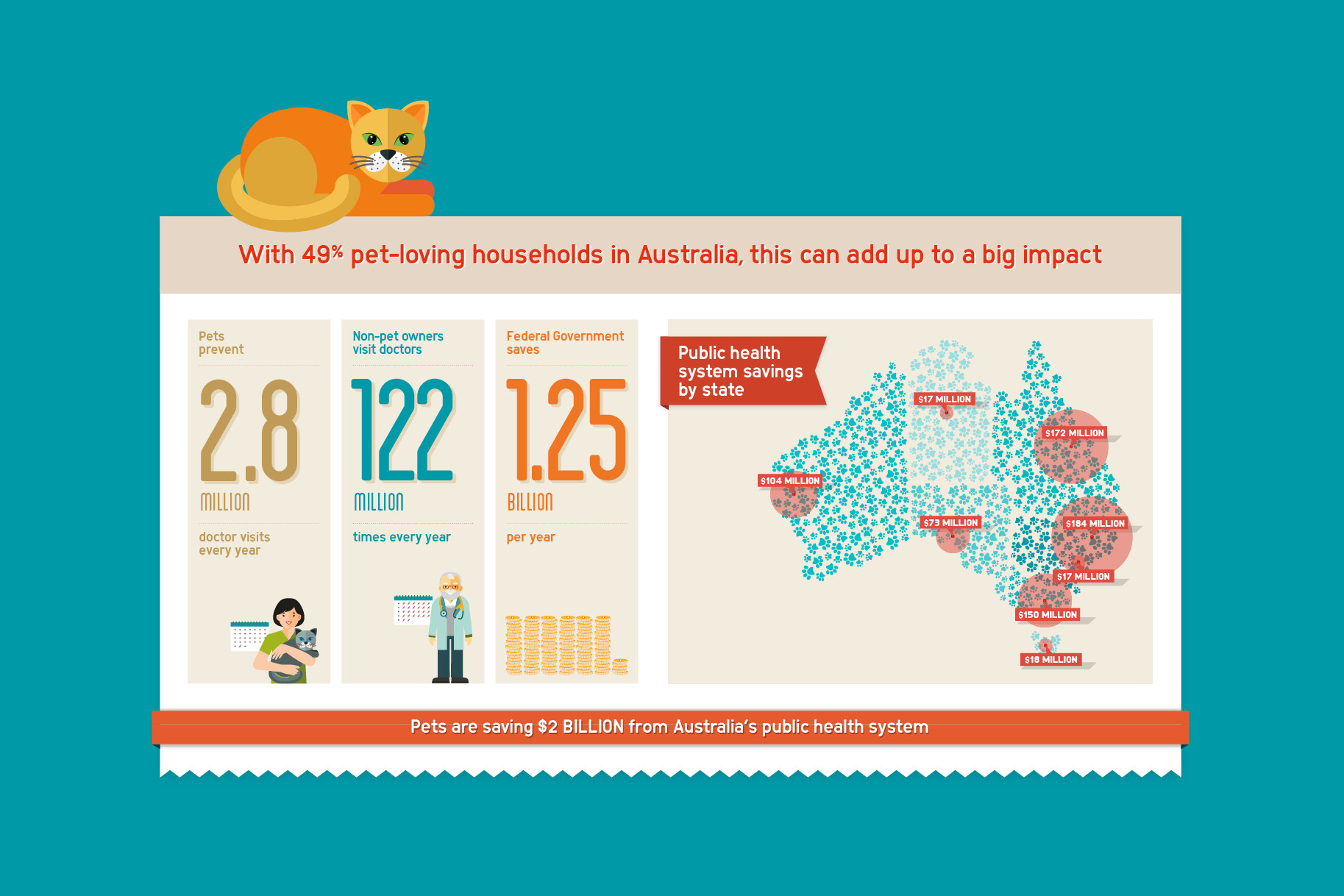
Mars Petcare is all about a better world for pets. We were commissioned to demonstrate the numerous ways in which pets improve our health and wellbeing.
Research indicated that pets contribute significantly to the health of their owners, improving their fitness with walks and mental wellbeing with companionship. Who doesn’t feel better after playing fetch with happy dog or cuddling a purring cat?
Bright and bold
The pets are the star characters, alongside simple diagrams to show the health and economic benefits of pet ownership. We took care to avoid stereotypes by showing a range of skin colours and ages of the pet owners and medical professionals.
Quirky touches like pawprints in the map, and a piggy bank helped keep it fun and fresh. The brand’s colour tones of teal and orange created impact, as did strong headlines to drive home the benefits of our furry friends.
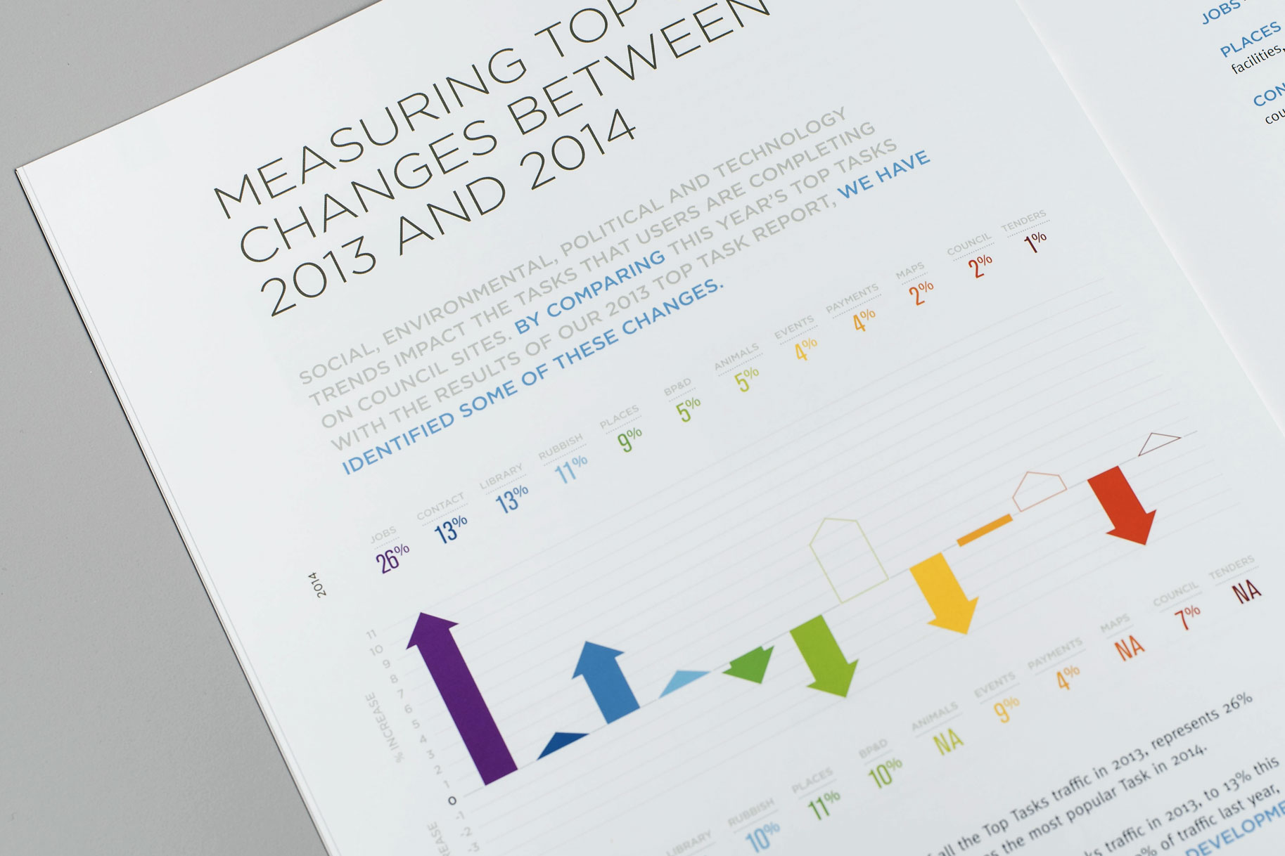
A digital and CRM agency specialising in local government, Seamless CMS empowers its clients to deliver better digital services.
A cornerstone of its marketing efforts is its comprehensive annual research. Each year the agency investigates how a council’s digital assets can impact its perceived leadership, quality of service, reliability and professionalism.
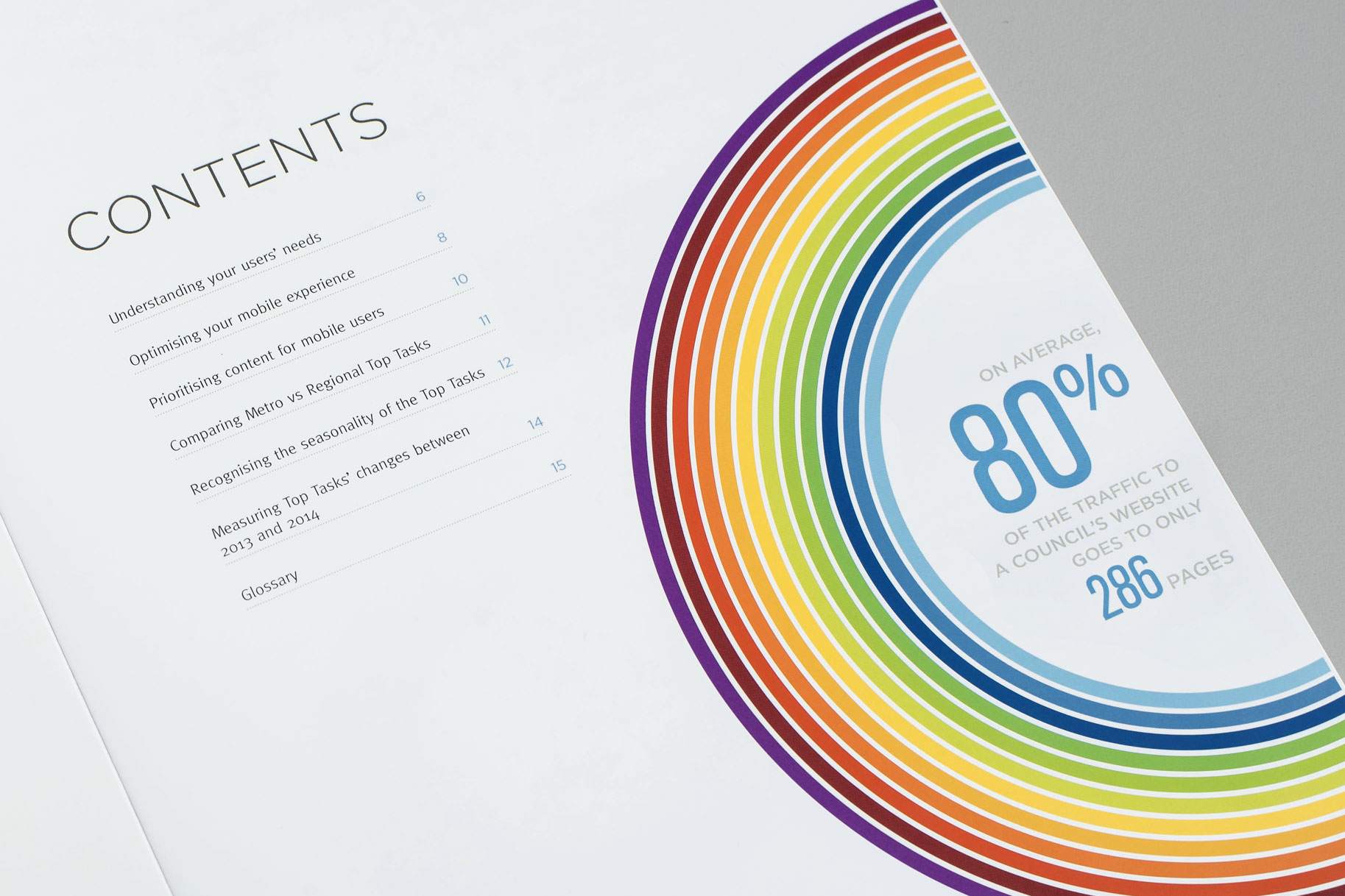
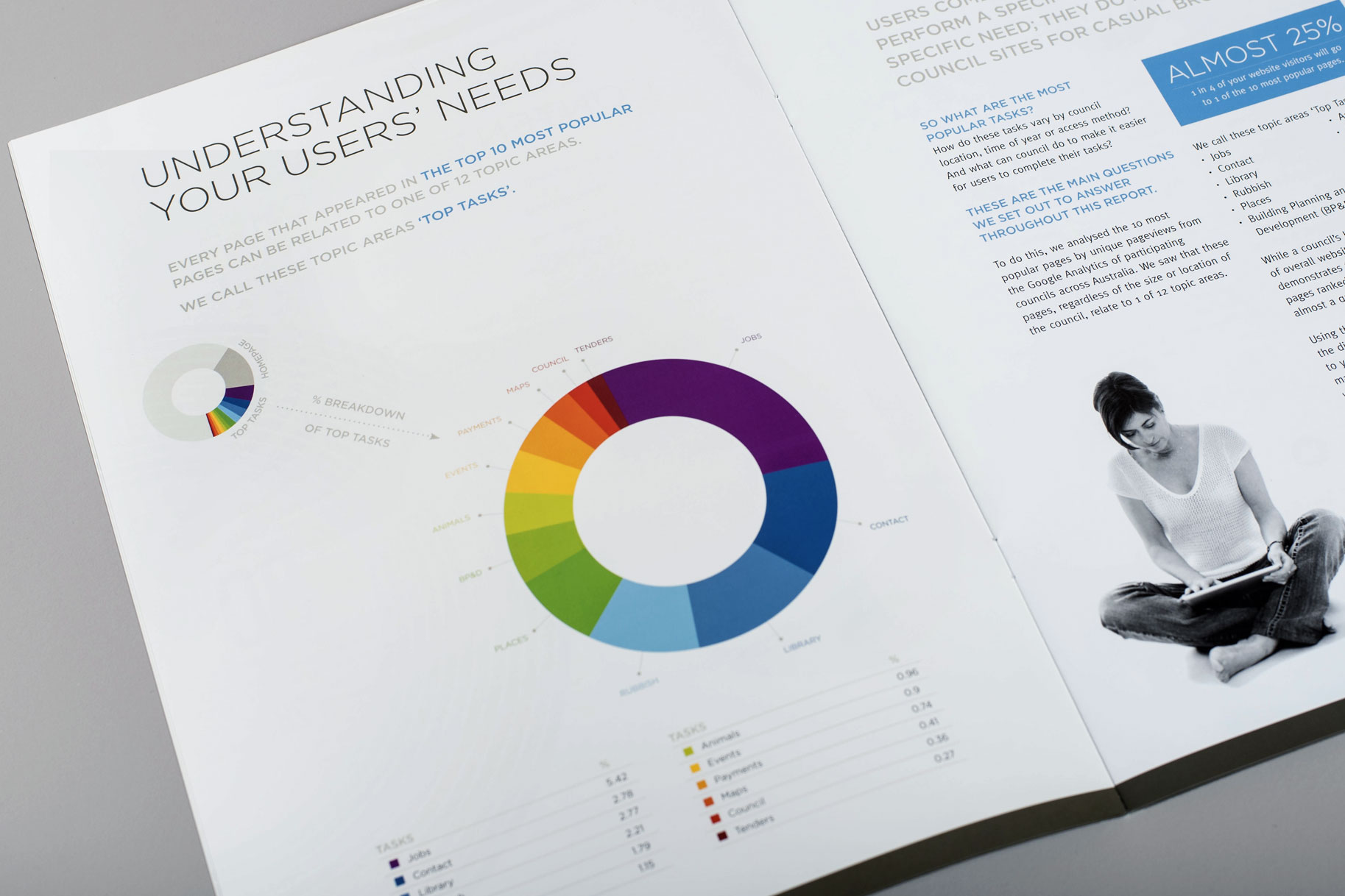
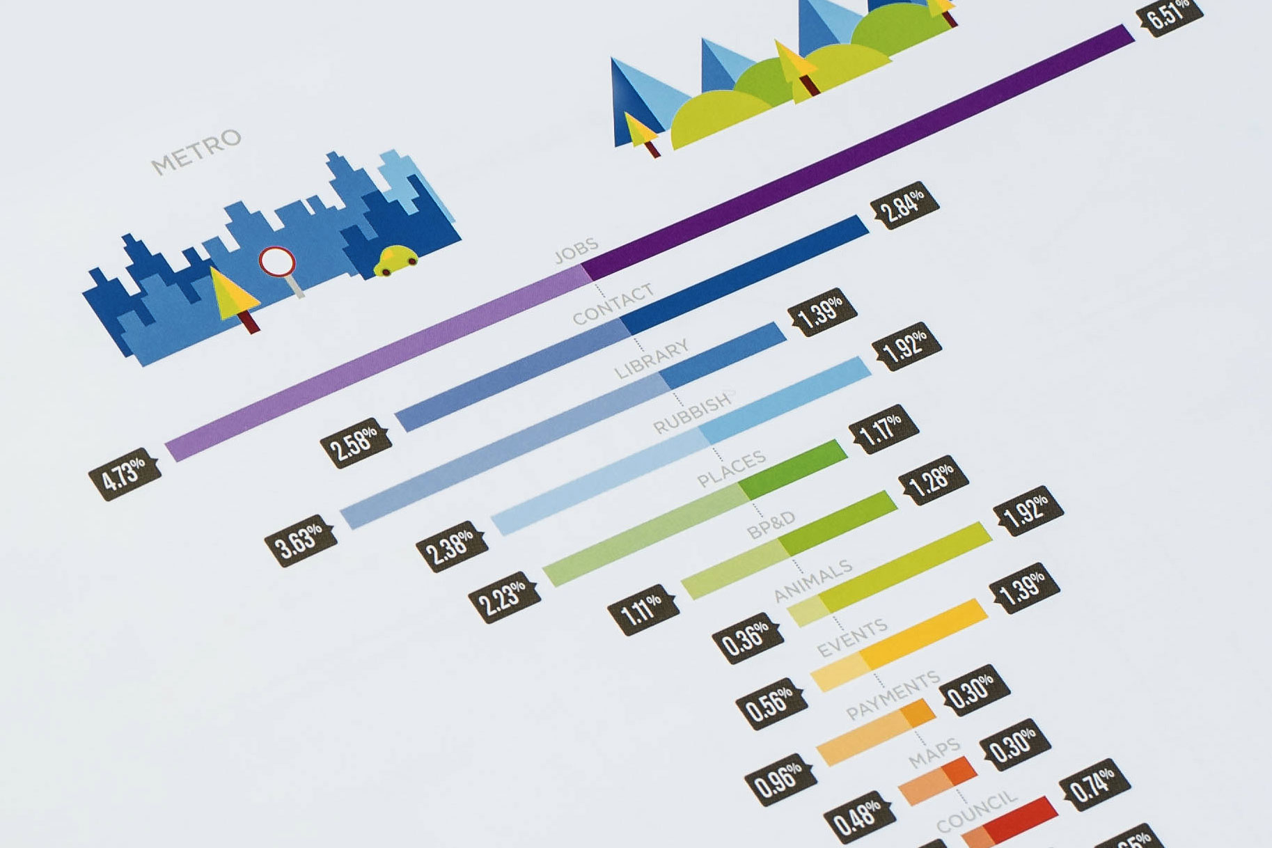
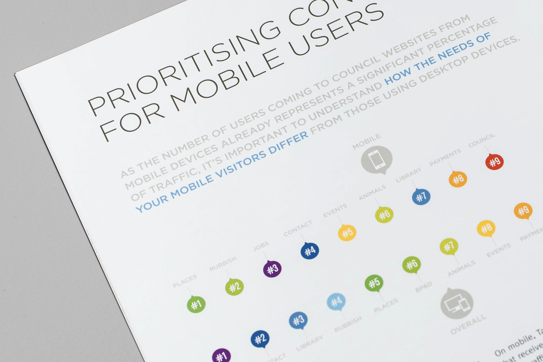
Data packs a visual punch
We began with the raw numbers and selected the most powerful statistics to present to the audience of local council digital marketing managers.
The vibrant colour scheme enabled each shade to represent a specific council service. This made the 16 page report more readable and ensured that the most important points were highlighted by scan-readers.
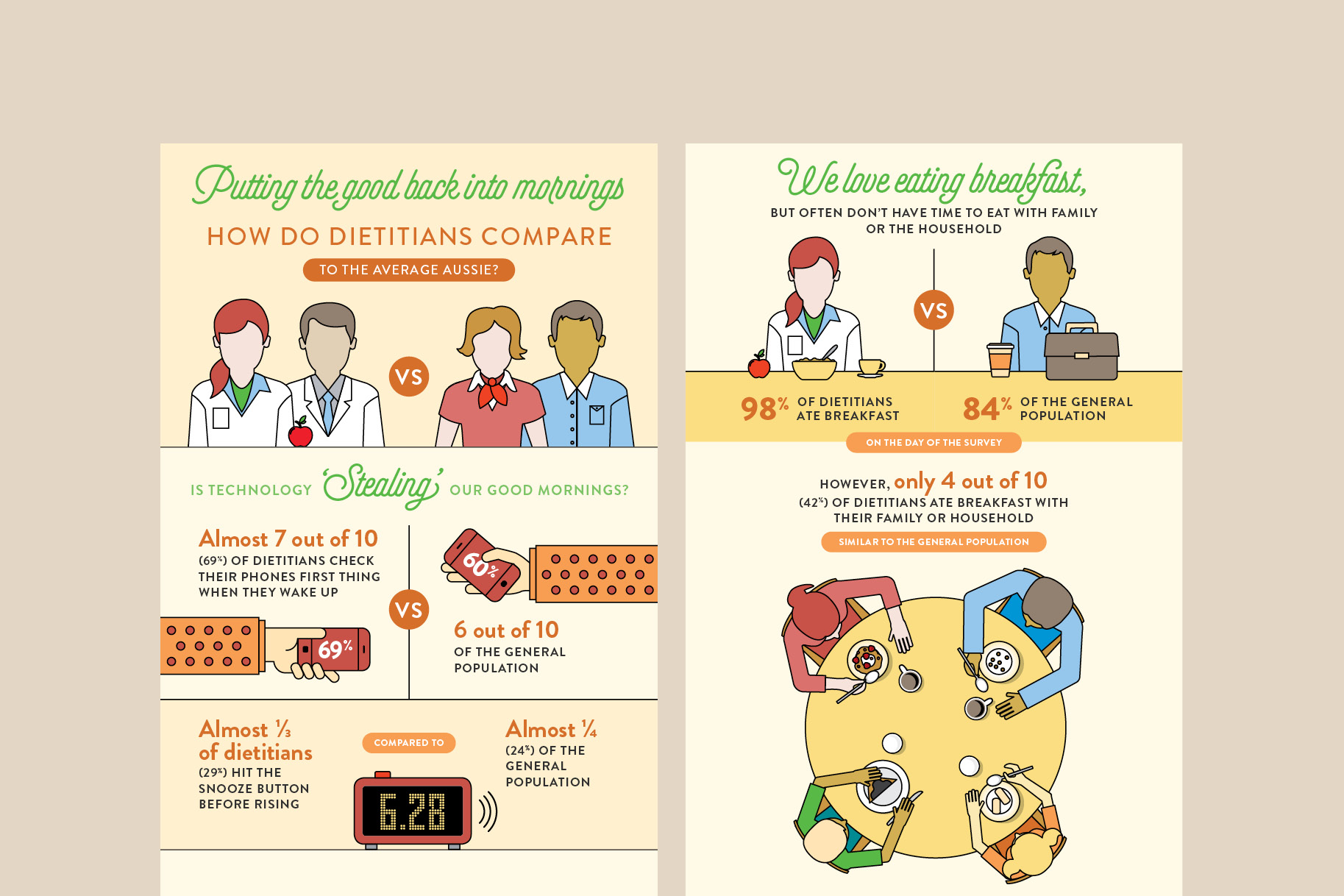
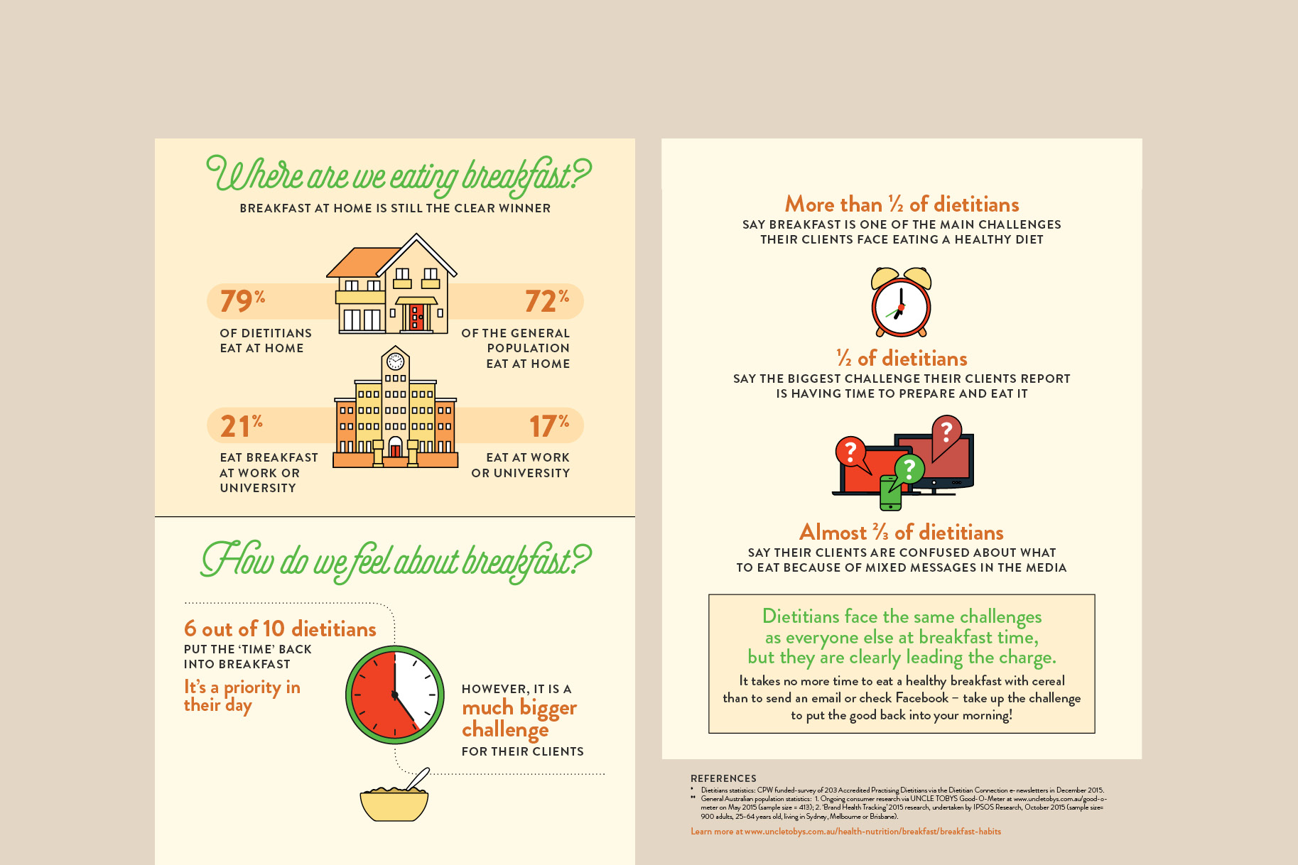
We created customer personas that represented the Dietitian compared to the ‘average Aussie’ and how those habits differed at breakfast time.
The information helped busy health professionals identify the key barriers to eating breakfast and the facts to address when talking to their patients.
Information to share
A warm colour scheme set the tone, using a muted colour palette to create an empathetic voice.
We developed a monoline illustration style, with strong call-outs to the percentage figures. Comparison numbers are prioritised – they give context to the significant differences between the two groups.