

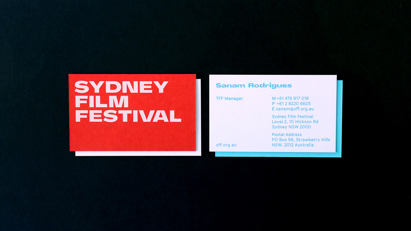
Initially it might appear there isn’t much to the rebrand, especially the logo, apart from a quirk-filled sans-serif typeface (check out those lowercase letters!).
But stay tuned – it’s in the application where things really get going.
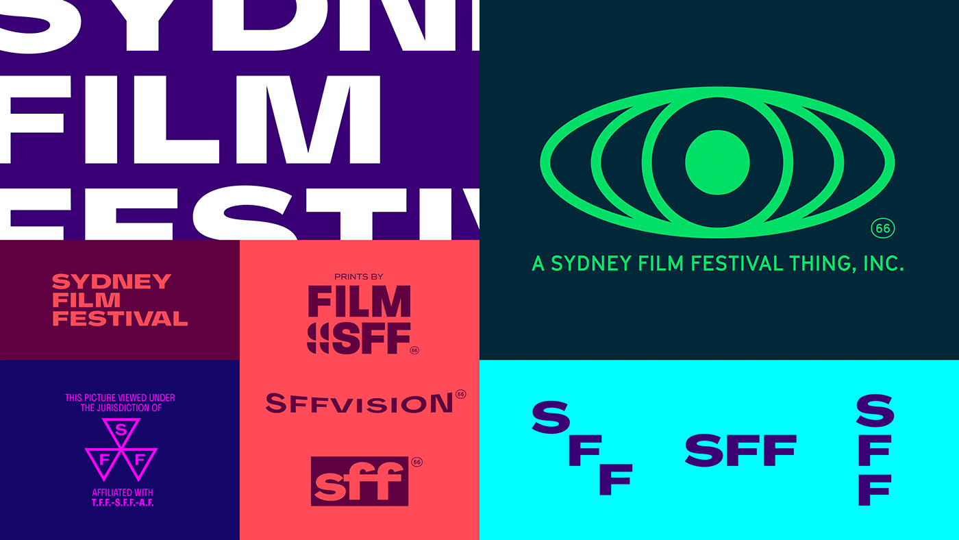
A myriad of secondary logos reference old film and television – if you’re old enough, you might recall them from VHS/Betamax tapes. It’s unclear how many of these will actually see the light of day, but they none-the-less work brilliantly to create an entire film-related universe.
Things we love:
– The colour palette. Stunning.
– The copy writing. We particularly adore the transport posters. That negative space!
– The typeface (Agrandir, or something like it). Bold enough to easily use across everything from brochures to billboards. With enough individuality to create a real sense of fun.
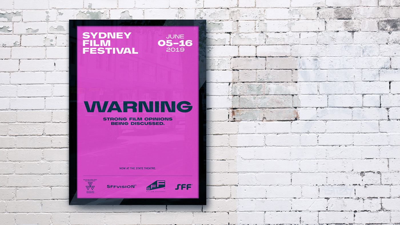
We go to the cinema to be entertained, to be informed, and to see things we miss in our daily lives. It’s common sense that a film festival’s identity reflects the magnificent diversity of the genre. Well done, Sydney Film festival!


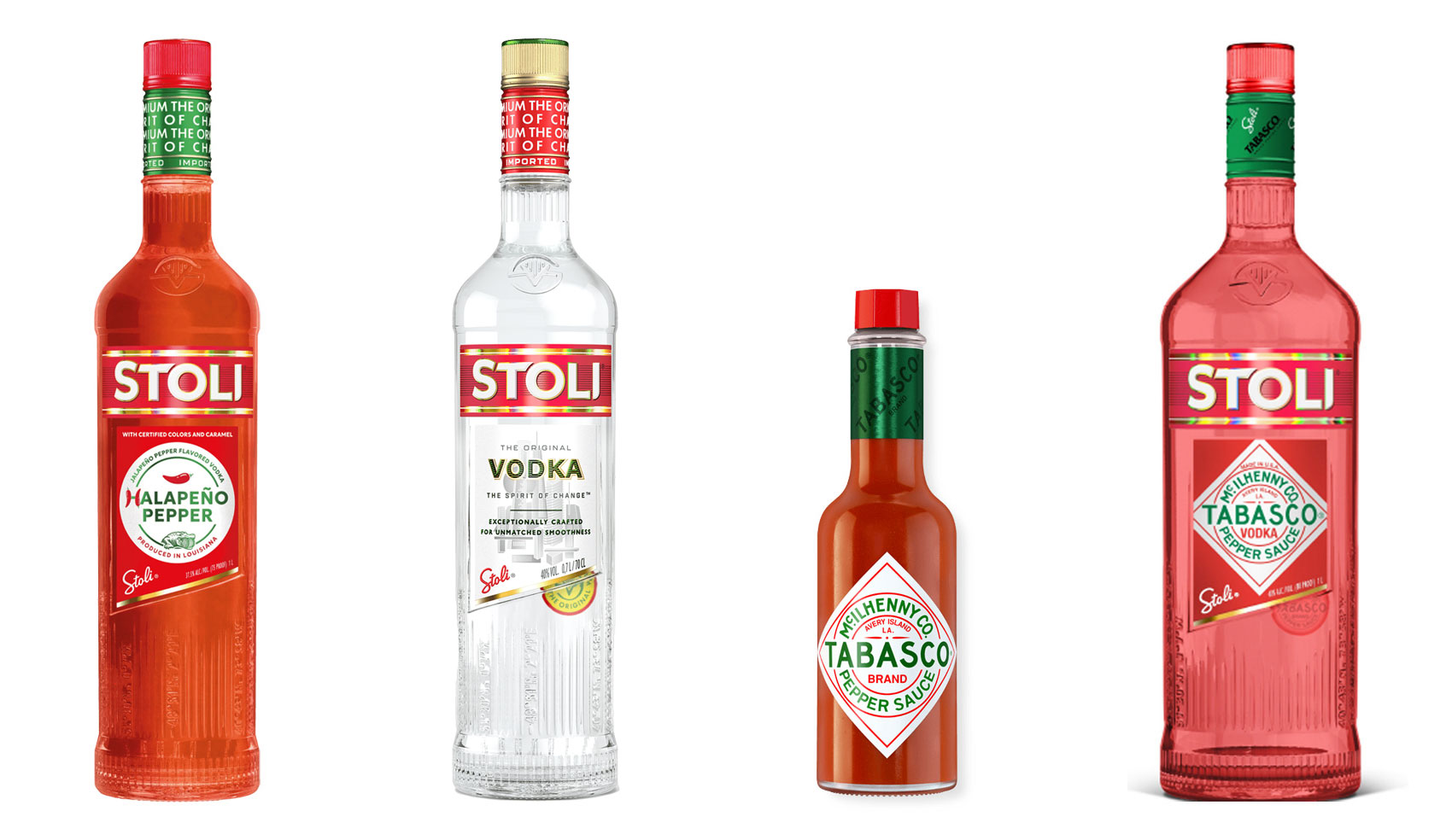
Have you ever heard ‘Change a logo by 10% and then you can legally use it’? We take a look at 2 examples involving Taylor Swift and Tabasco and explain why this is a myth.
Whatever the brief is, it’s exactly the same. Every project. Every time. Every design. It‘s just one word.
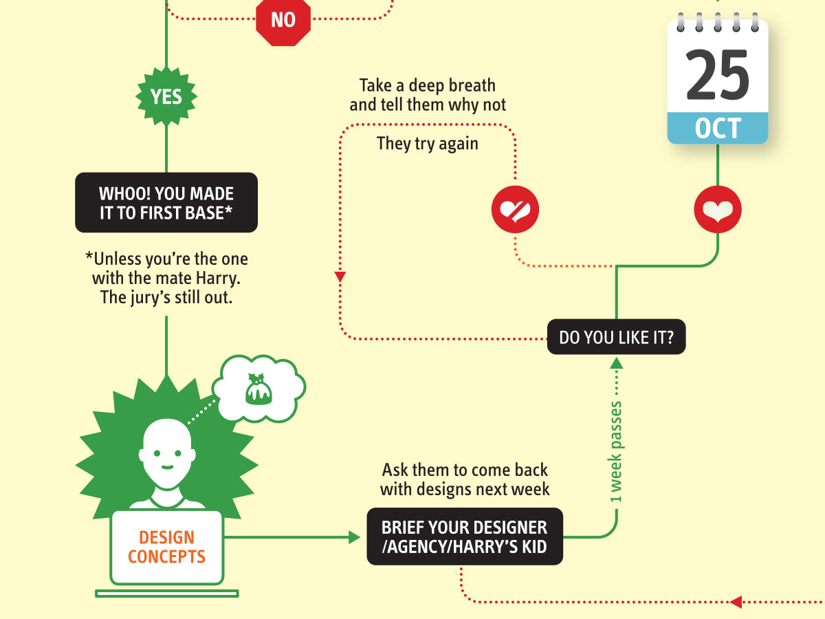
It’s that time of year when we start looking forward to the end of the working year, changes in the seasons, and celebrations over the New year…
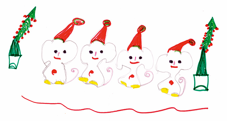
Sometimes it can be hard to think of Christmas Cards (especially when the holiday season is months away). So we present a few ideas to get your creative minds sparking…

For the 2024 President’s Dinner event at State Library Victoria, we created two visual concepts.
This is the concept that didn’t make the cut, and we share some of the additional printing and finishing details.

We have 3 rules when designing merch / swag / promotional gifts: 1. Sustainable
2. Usable
3. Quality
Email hello@brandbyname.com.au
or call +61 3 8658 7744
105 Wellington St,
St Kilda VIC 3182
© 2025 Brand by Name™

Subscribe to our monthly newsletter — Brand News — filled with Design tips, Creativity hacks, Brand news and Design-related goodness.