SETO is the over-arching body for the student educational travel community in Australia. Historically closely joined with industry body CATO, the two organisations were no longer as intertwined, bringing with it a need for a brand uplift.
SETO required a new core identity to support its growth and renewed presence, and to support the launch of its own quality standards into the travel market.
Client
SETO
Services
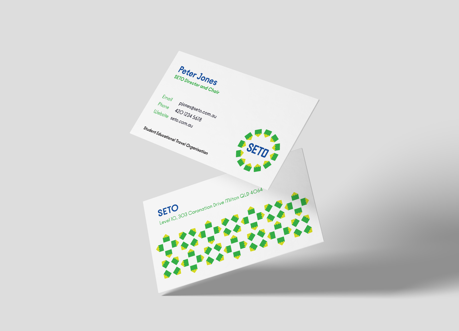
– Branding – Print design
CHALLENGE
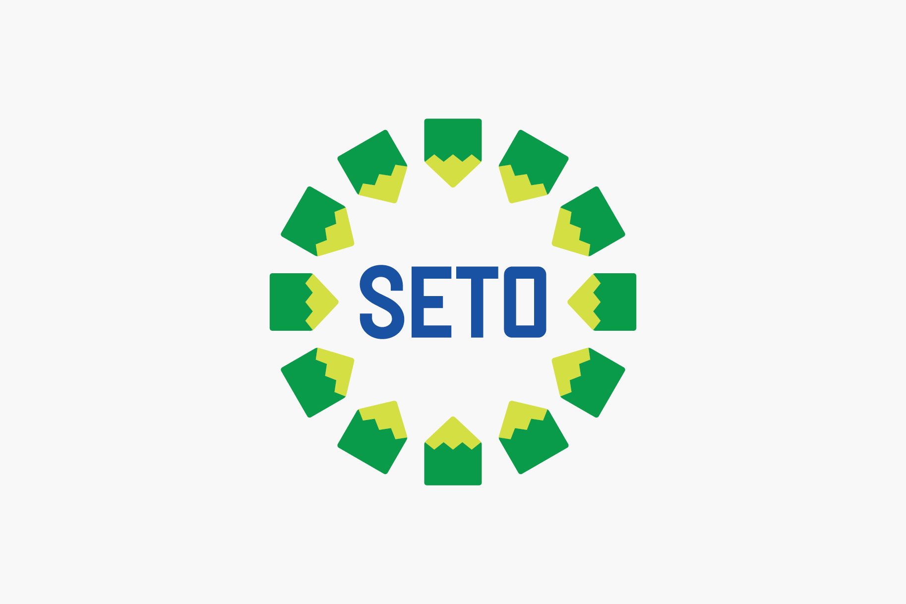
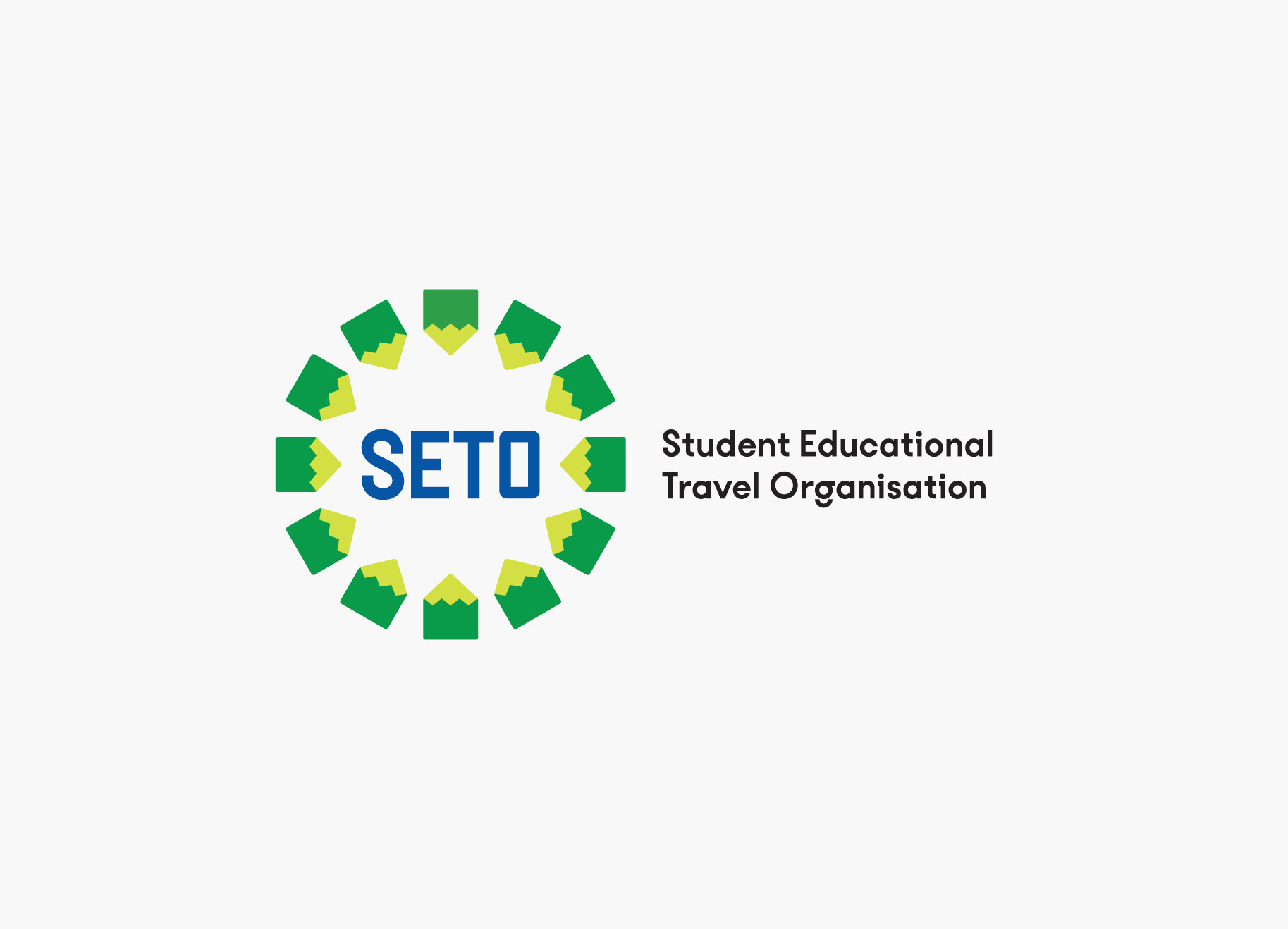
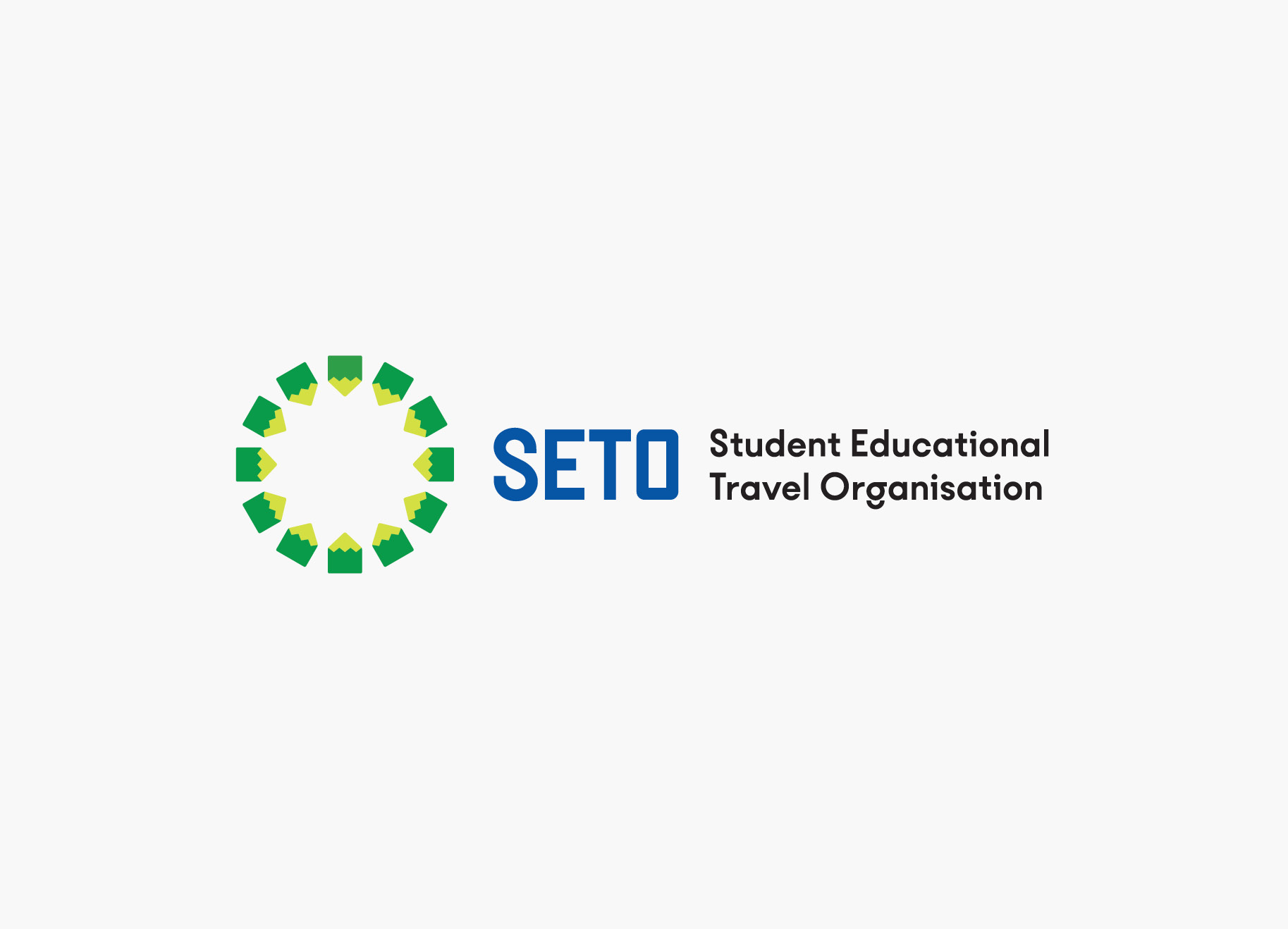
How to symbolise a student-focused travel organisation?
SETO’s aims: – Fresh, modern, trustworthy, agile and world-leading. – Stand out against similar global organisations. – Emphasis on travel and students, but without any cliched motifs.
SOLUTION
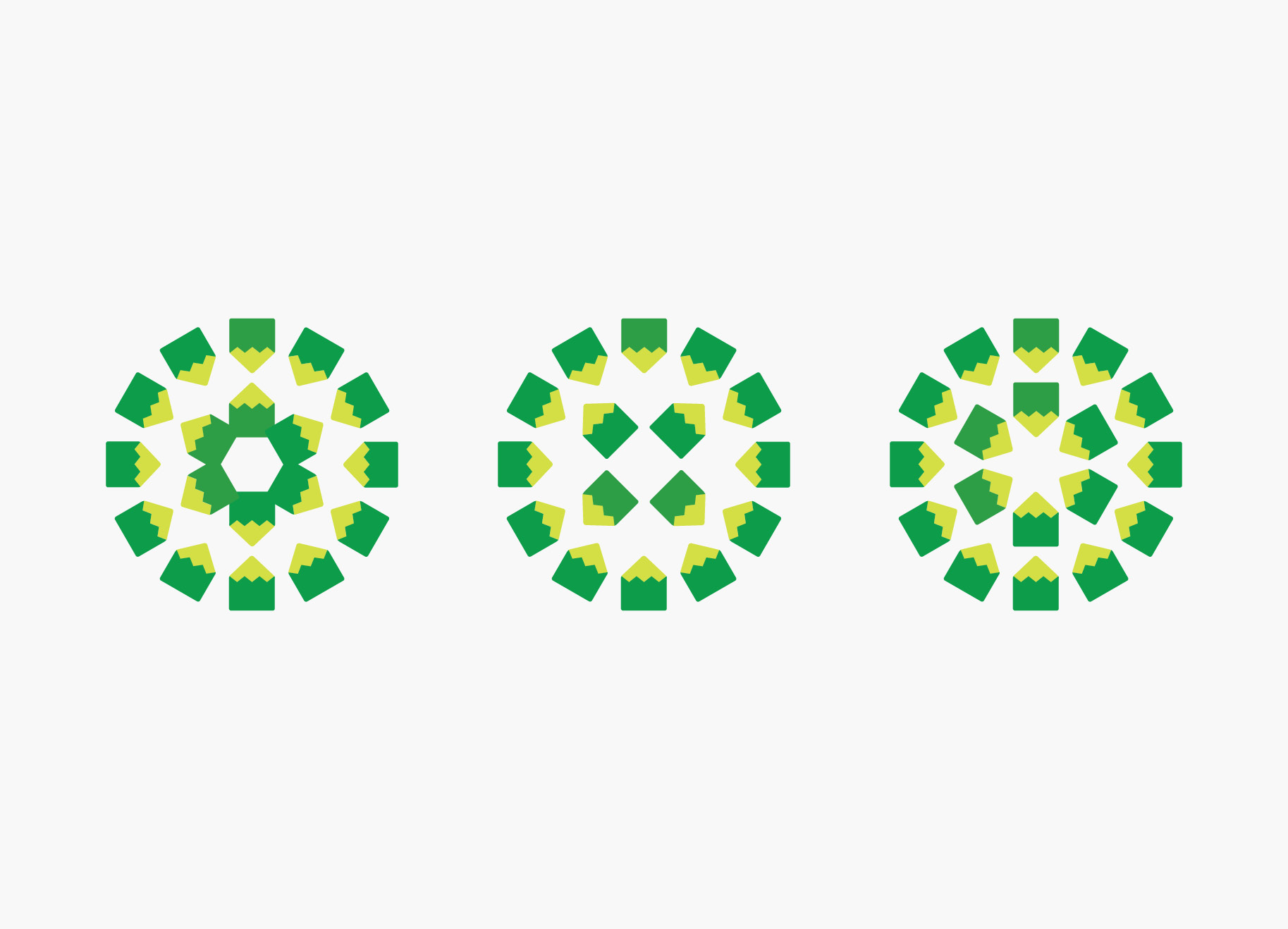
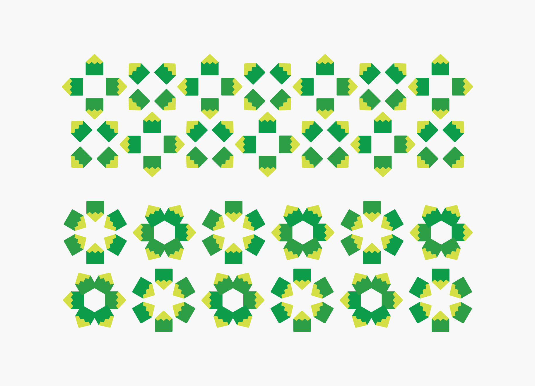
A simple-but-clever juxtaposition of a pencil (symbolising education) with a mountain (goals, achievement) became the stepping stone to the solution.
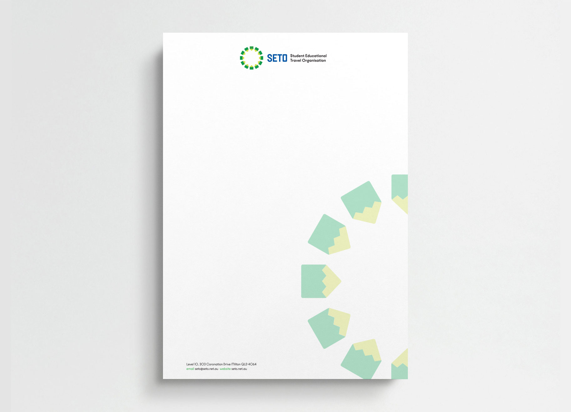
Combined in a circular shape (symbolising global travel) to create the identity, the brand icon can be used in a myriad of ways on print materials, on signage and on the website.