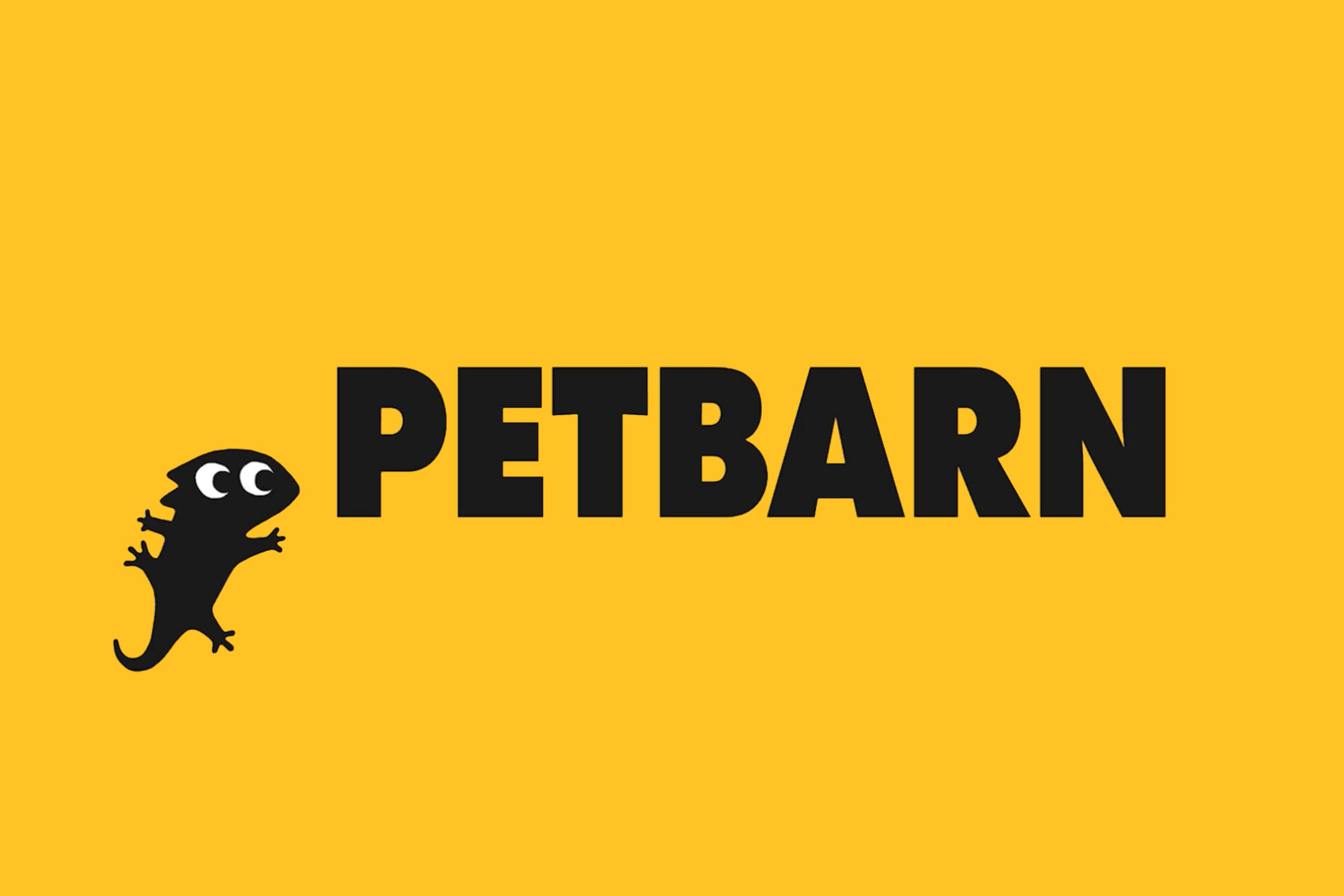
If you’re one of the many people who have a feline, furry or fishy friend, you may already know that Petbarn updated their brand last year.
Perhaps you noticed, maybe you didn’t. Because the logo has stayed the same.
Petbarn have ditched their previous quartet of cat, dog, fish and bird illustrations. And they’ve introduced quite possibly the cutest set of creatures this side of Baby Yoda.
Things we love:
– the yellow/black/white colour palette (the yellow cleverly retained from their existing brand)
– the playful nature of the animals, especially how they interact with the logo
– the more unusual creatures (the gecko is particularly cute)
The work shines in the thoughtful, clever details – staffroom signage, parking bays, an illuminated bus stop sign. We would order something, solely to come home to that box at the door.
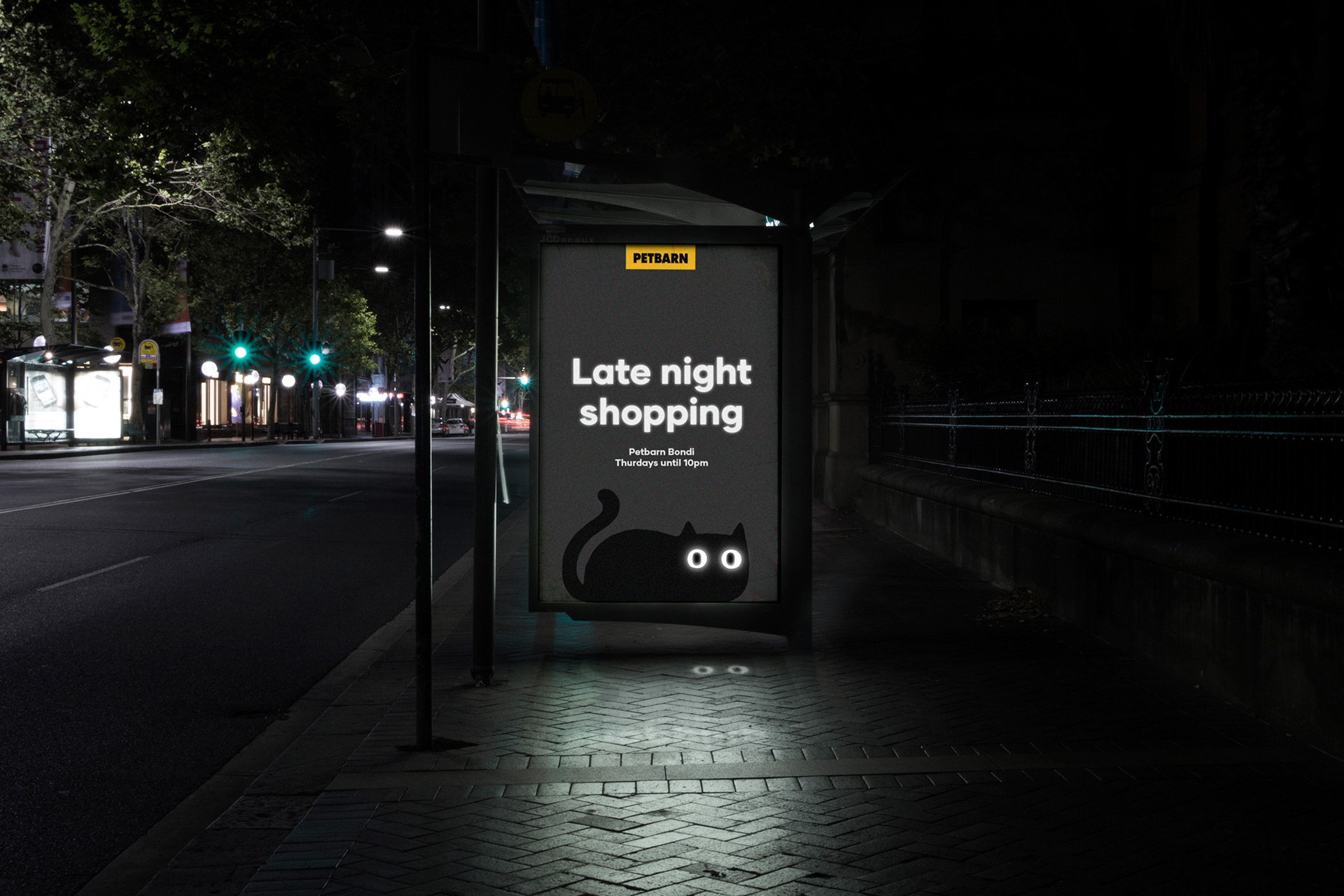
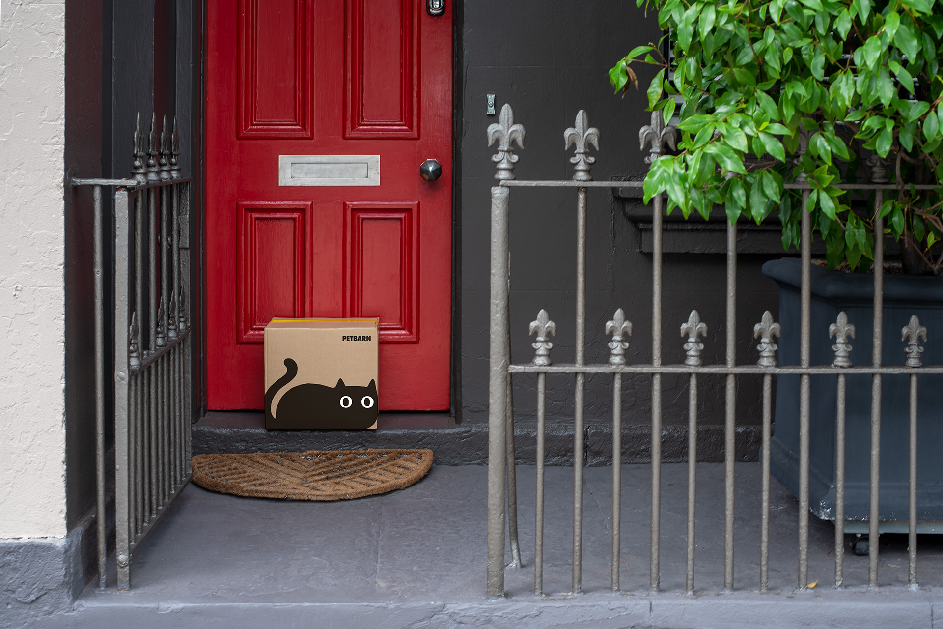
What this branding does so well is to create an emotional connection – without saying so in words, you believe that Petbarn care about your pet, not only about selling product.
And it’s an excellent visual example of why a brand is much more than simply a logo.
A superb job by illustrator/animator Marco Palmieri and Sydney brand agency Landor.

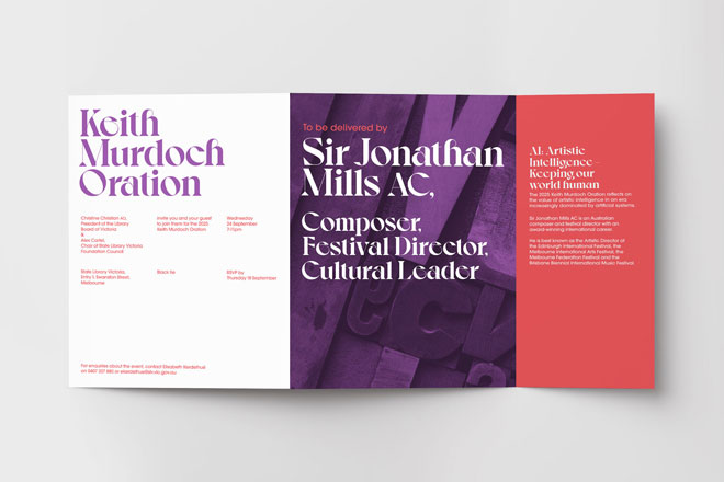
In corporate event branding, you’re often working with a company’s brand guidelines.
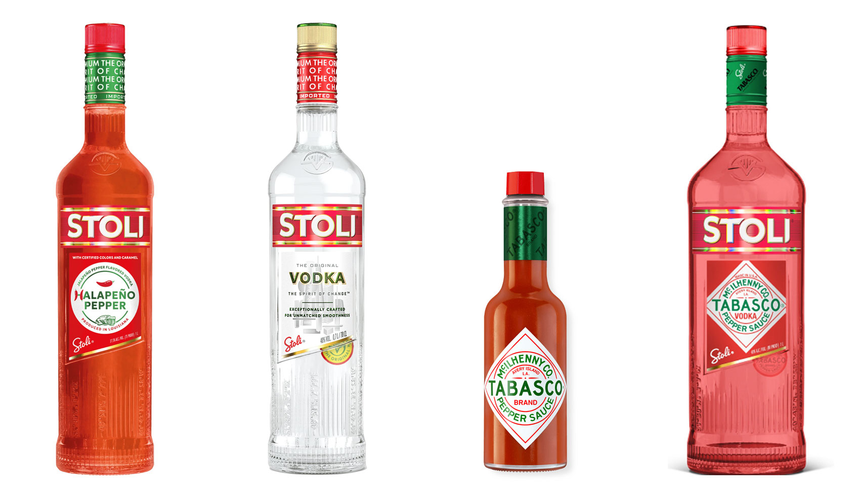
Have you ever heard ‘Change a logo by 10% and then you can legally use it’? We take a look at 2 examples involving Taylor Swift and Tabasco and explain why this is a myth.
Whatever the brief is, it’s exactly the same. Every project. Every time. Every design. It‘s just one word.
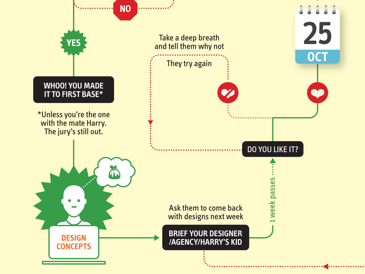
It’s that time of year when we start looking forward to the end of the working year, changes in the seasons, and celebrations over the New year…
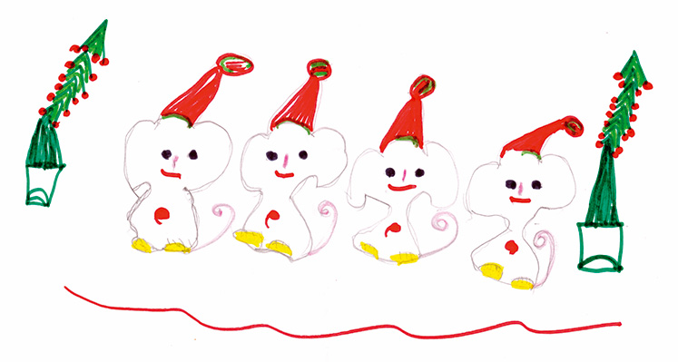
Sometimes it can be hard to think of Christmas Cards (especially when the holiday season is months away). So we present a few ideas to get your creative minds sparking…

For the 2024 President’s Dinner event at State Library Victoria, we created two visual concepts.
This is the concept that didn’t make the cut, and we share some of the additional printing and finishing details.
Email hello@brandbyname.com.au
or call +61 3 8658 7744
105 Wellington St,
St Kilda VIC 3182
© 2025 Brand by Name™
Subscribe to our monthly newsletter — Brand News — filled with Design tips, Creativity hacks, Brand news and Design-related goodness.