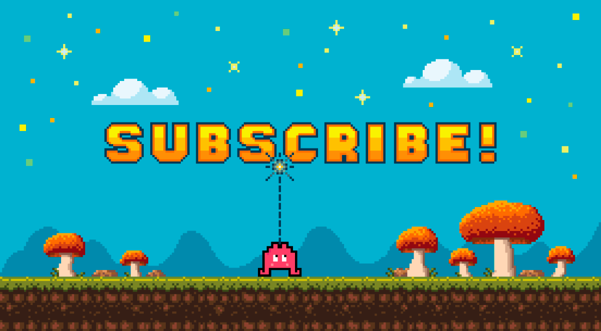
We have 3 rules when designing merch / swag / promotional gifts: 1. Sustainable
2. Usable
3. Quality
How to design merch your customers will keep

We have 3 rules when designing merch / swag / promotional gifts: 1. Sustainable
2. Usable
3. Quality
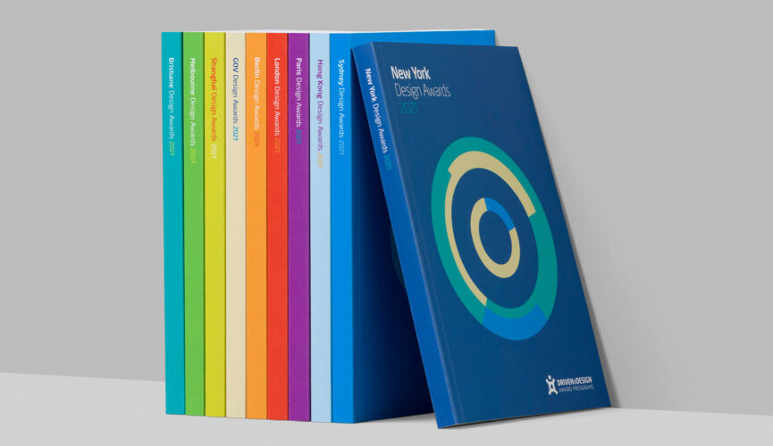
The original cover design featured a blueprint version of the trophy. Each year we build on this graphic element, creating a new design for the award annuals.

That’s right. When specifying black, experienced designers actually use something we call ‘Rich black’.
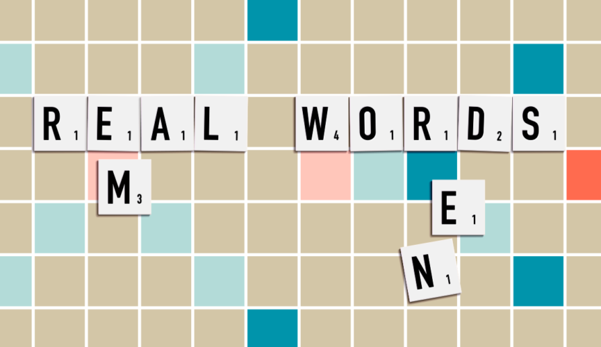
An em is the width of an uppercase letter M, an en is the width of the capitol letter N. And that’s not all the printing industry has contributed to the common phrases we use today.
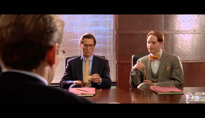
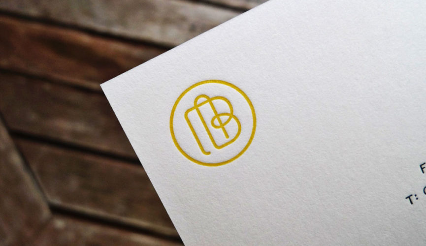
In the film American Psycho, Patrick Bateman and colleagues sit at a boardroom table comparing business cards. The cards themselves? They‘re downright awful.
It’s a nightmare scenario for anyone in marketing: you receive a box full of lovely printed cards, flyers, invitations or brochures with hundreds or even thousands of copies…
We recently received an introduction to letterpress printing at Idlewild Press in Melbourne, and wanted to share a few of our learnings. You’ve probably seen a few examples…