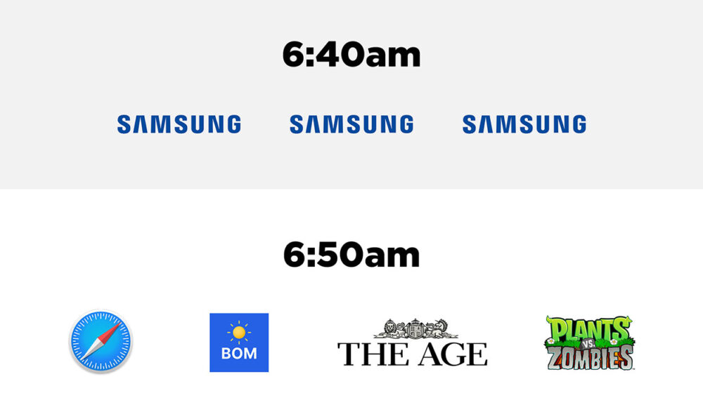
A Day in the Life of Brands
Are you someone who thinks brands don’t matter? That you’re not brand-loyal? Try this exercise tomorrow morning: Get up. Start your day. Take note of the brands you interact with.

Are you someone who thinks brands don’t matter? That you’re not brand-loyal? Try this exercise tomorrow morning: Get up. Start your day. Take note of the brands you interact with.
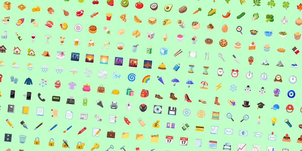
The press release states the re-design focused on ‘making them more universal, accessible and authentic’. The update was conveniently announced on World Emoji Day (WED) on July 17th.

Sometimes, it takes forever, like you’re trying to pull blood from a stone. Occasionally, the process feels easy.
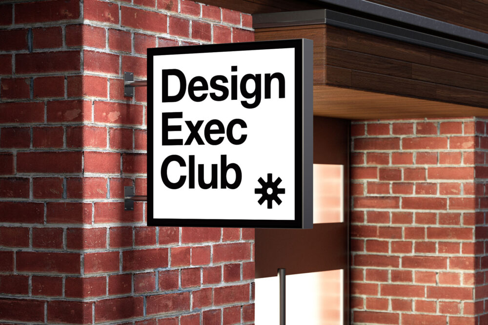
New work—branding for the Design Exec Club – a global network of designers, thinkers and executives who share a unified passion for a better future.
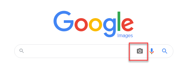
You’ve been asked to check your company owns the rights to the images used on the website. Nobody knows who first sourced them. Use a reverse image search to find out.

It’s interesting that so many have recently zhuzhed up their look this year. Take a look at new brands from Peugeot, Renault, General Motors and Kia.

How can creative agencies foster more ideas? I share how agencies can encourage creativity, based on my observations of brainstorming in 2 different PR agencies. Plus, I talk about the fragile nature of creativity.
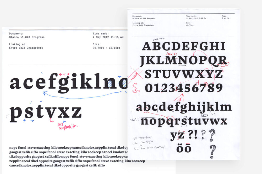
1 month, 2 years, a decade? Recently, Sydney-based designer Dave Foster released a new typeface called Blanco.

Why is a logo like a love affair? In the beginning, it’s all sunshine and roses and possibilities, ie. the ‘research’ or ‘ideas’ phase of designing a logo.
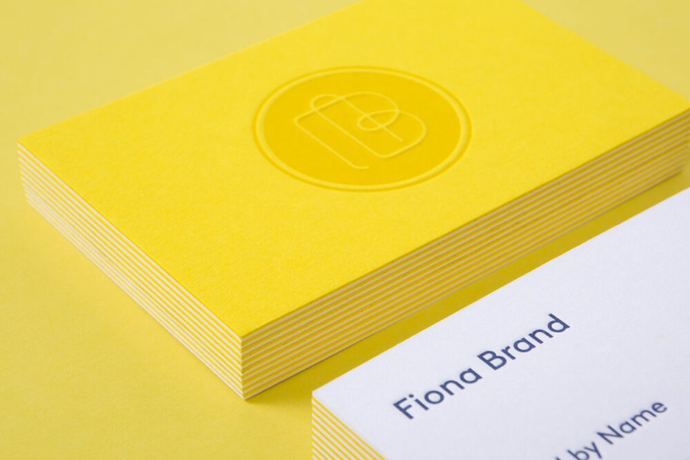
Brand By Name’s business cards include 3 different printing processes. Let’s take a look at what goes on behind the scenes.
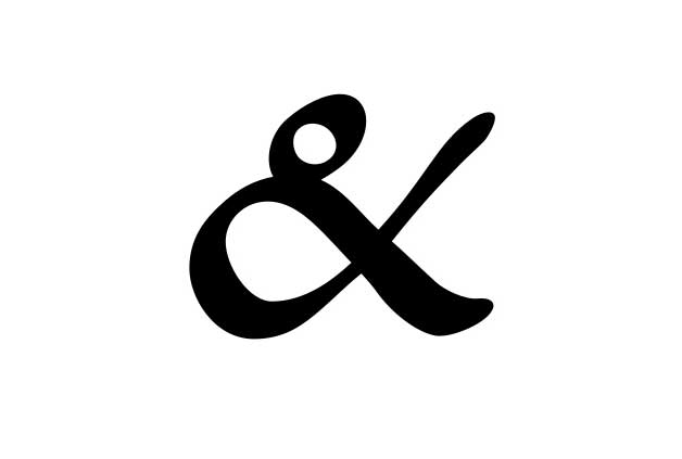
The ampersand’s curly, friendly nature makes it a favourite symbol of many a type enthusiast, whether amateur or professional. But where did it come from?

You’ve got ideas in mind, but how do you share them with your designer? Will they be offended? How to brief your designer to explain what you want.
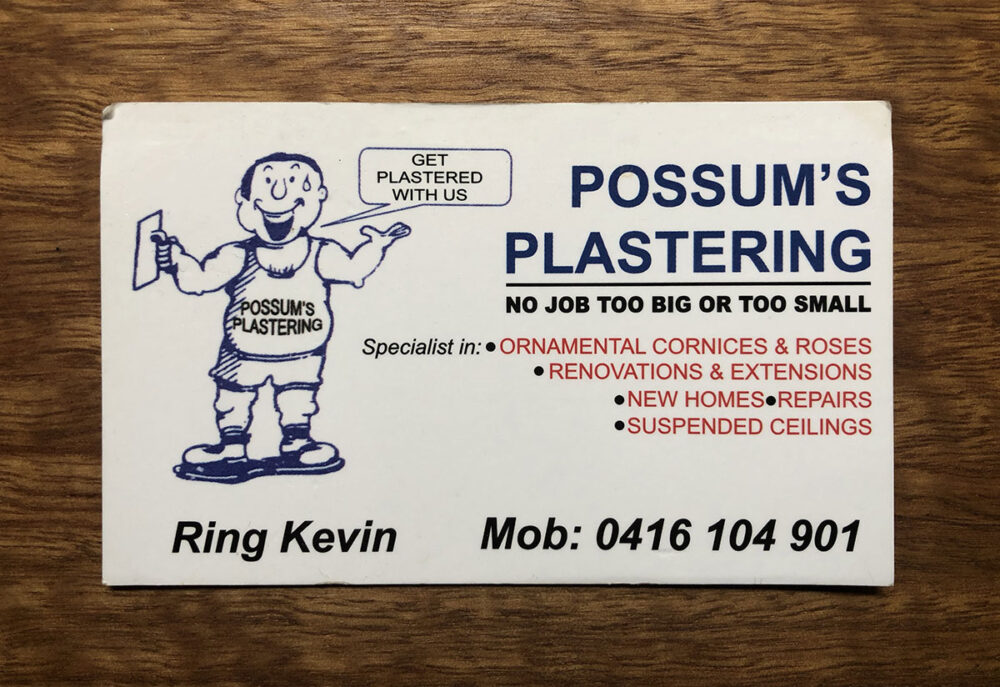
We love designing business cards – for such a small thing, they can make a big impact Brand By Name’s business cards are a tad
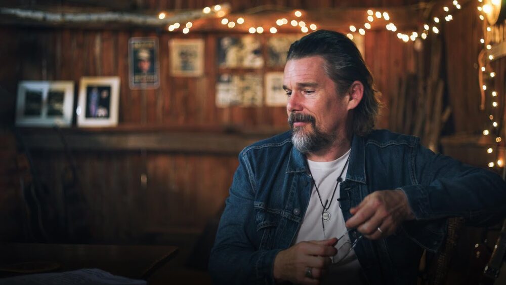
Ethan Hawke talks about the importance of creativity, and why art is so important during major life event events.
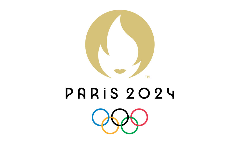
It’s a huge challenge to create a brand for an event like the Olympics. It’s even more difficult when you factor in the stakeholders, committees, meetings, focus groups and opinions.
Email hello@brandbyname.com.au
or call +61 3 8658 7744
105 Wellington St,
St Kilda VIC 3182
© 2025 Brand by Name™

Subscribe to our monthly newsletter — Brand News — filled with Design tips, Creativity hacks, Brand news and Design-related goodness.